New Work
12.18.09
Rolling Stone: The 00s
 With a huge decade in the music/culture business to look back on, Rolling Stone created a cover that couldn't be more perfectly, well, Rolling Stone. We asked RS Art Director Joseph Hutchinson to tell us about the making-of:
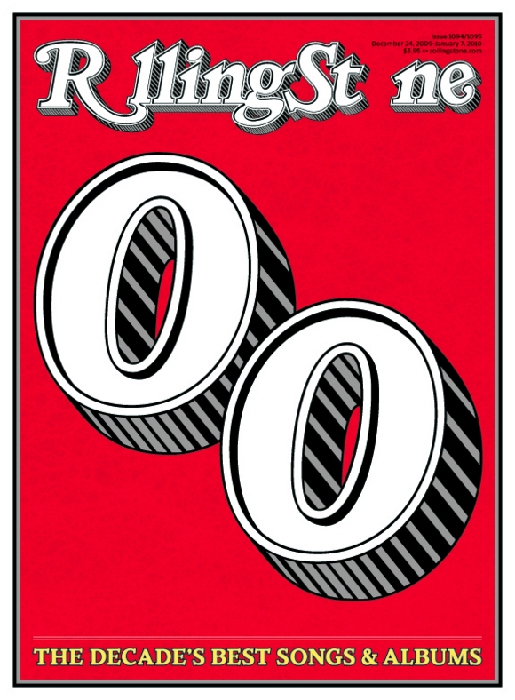
 Traditionally at Rolling Stone, we close out the year with a double issue that looks back at the last twelve months. This year, we decided to review the whole decade. As soon as we started discussing ideas for the issue, we decided that we'd need something different for the cover. I contacted Chip Kidd for ideas. As you know, Chip designed the 40th anniversary covers of Rolling Stone with the oversized logo a couple of years ago (below).

Chip came up with the concept of removing the two Os from the RS logo and dropped them to the center of the page to represent the aughts. Clever idea. Brilliant. At this stage the background was blank because we planned to use a collage of images of the artists of the decade. But as we started to think about it, it seemed that adding photos, not to mention cover lines, would dilute the concept.
I called Jim Parkinson, who designed the logo we currently use in 1981, and asked him to redraw it without the Os and asked him to draw new Os that could run large as display.
Chip and I experimented with wild color combinations, but many of them didn't seem right. So I decided to go with the classic Rolling Stone palette: red, white, black and gray with yellow as an accent for the main cover headline. I also removed the secondary headlines, which made the cover less cluttered. As you know, Rolling Stone has published all-type covers in the past. Roger Black did one for the ten-year anniversary (below, left) and Fred Woodward for the twentieth (below, right).

As a nod to those covers, I used a similar frame to border the cover. In the end, it just felt like Rolling Stone.
-- Joseph Hutchinson, Art Director, Rolling Stone
Anniversary Rolling Stone covers courtesy the Rolling Stone cover archives.
Hey! You've probably got some NEW WORK to share, and we want to see it! We'll welcome anything that's gone to the printer recently, something you're especially proud of and think might be inspiring to the membership and readers of Grids. We'll note the credits and the publication and shine a little light on the latest and greatest in publication design.
Please reduce your layouts to no larger than 1200 pixels wide and don't forget to include all relevant credits and a little background (if you feel like). Send your submissions to tips@spd.org and we'll post them as we get them.
PREVIOUSLY: Dwell: The Future
PREVIOUSLY: New York: The 00s
PREVIOUSLY: Twin Cities METRO
