New Work
03.16.10
UCLA Goes Plush

At the end of almost every term I do portfolio review at Art Center (left). It's like speed-dating for graduating illustrators (and photographers.) In the old days the portfolios all looked pretty much the same. But these days they're all over the map. Apparently, painting and drawing are so last week. Lately, half the illustrators are sewing!
This past December I saw a lot of sewing, and a lot of "supersizing" (which I'm told came out of the Clayton Brothers' illustration class on working with scale.) Some of the most interesting work came from an about-to-be grad named Mashanda Scott. She was creating life-sized objects, like bicycles and ladders, in plush. For those of you who don't hang out at Giant Robot, plush toys are soft, often cute or irreverent, little figures made out of vinyl or a fabric like ultrasuede. Mashanda's sculptures aren't cute or irreverent -- they're more about messing with perception -- like Claes Oldenburg.


(Above, left to right: Mashanda Scott; a typical plush doll; a typical Claes Oldenburg sculpture.)
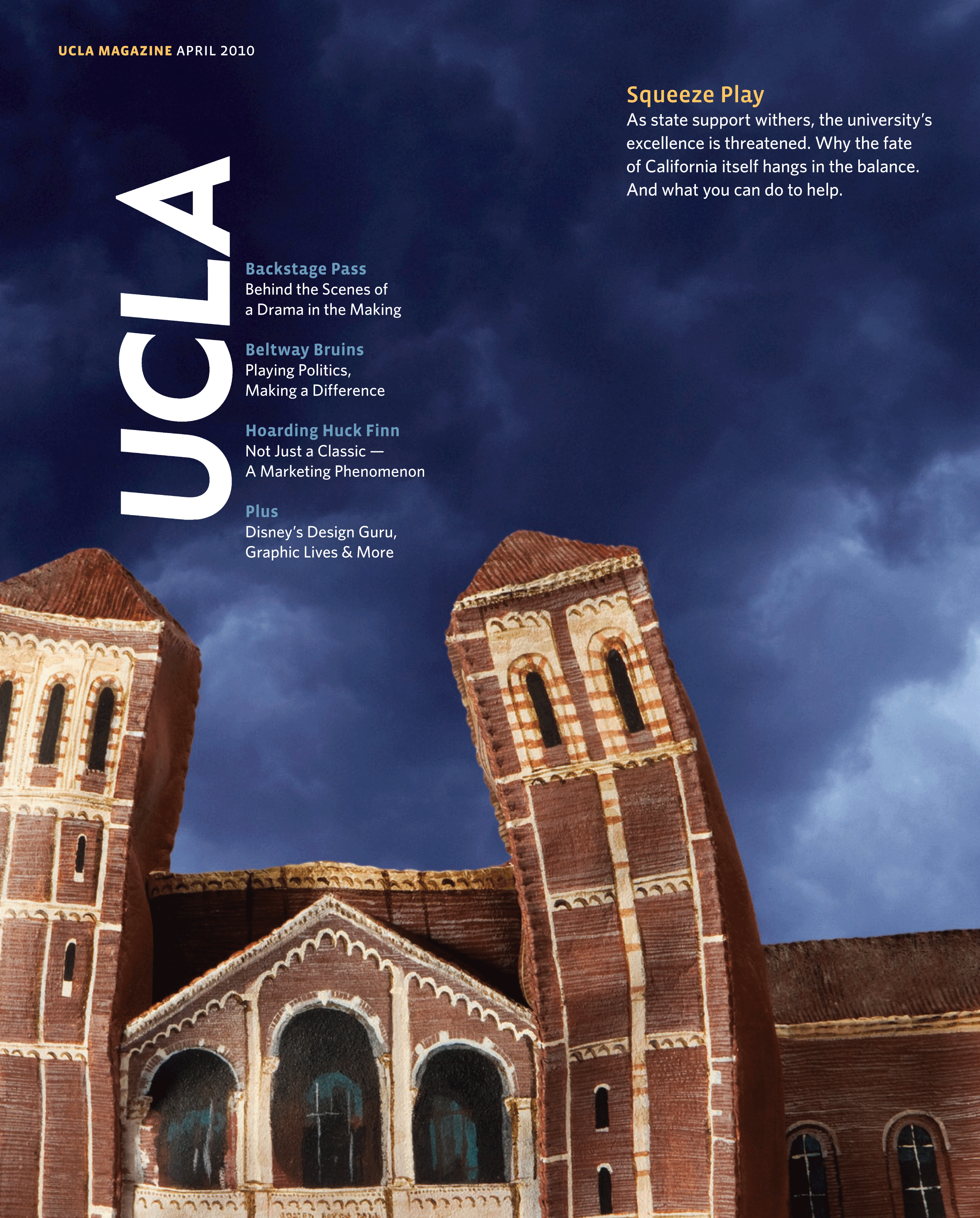
Meanwhile, I had a cover story to design for UCLA Magazine on the California budget crisis and how it's threatening to destroy public schools like UCLA. For those of you who don't live here, thirty years ago we had the best free colleges in the U.S. It's what led to the state's unprecedented growth and wealth. When you give an excellent education to smart students who can't afford USC or Stanford, what you get is Silicon Valley, the invention of the internet and a bunch of other life-changing innovations. If you're interested there was a great piece in The New York Times Magazine recently about the "state" of California, called The Coast of Dystopia.
In brainstorming the cover, I began to imagine a limp, deflated rendition of the most iconic building on campus, Royce Hall. (You've seen it in dozens of films and TV shows.) I've been the Design Director of UCLA Magazine for over a decade, and normally I'd avoid images of Royce like the plague. But this seemed like the perfect opportunity to mess with an icon. So I commissioned Mashanda.


(Above, left to right: Royce Hall; Mashanda's scale drawing of Royce.)
Here's how it worked: We sent her a batch of reference photos of Royce. She studied them, measured them, and sent us a sort of 2-D blueprint. Then she bought this ultrasuede material she works with, and started cutting out the pieces. Then she sewed them all together. The whole idea was to be able to control its softness, or as we called it, "the limposity." We didn't know how it would photograph, and how much sagginess it needed.
Once we signed off on the structure, Mashanda started painting. I don't know how many hours she spent just painting the roof and facade, but the meticulous attention to detail is amazing. Every brick, every shadow is painted with a very fine brush. Finally, about a month after we started, she delivered the final sculpture.
 (Above, left to right: the unpainted sculpture; partially painted; finished, and photographed by me!)
It's only about a foot long and maybe eight inches high, but it really is amazing in person. These photos don't really do it justice. And, actually, that became our biggest challenge. I hired great photographers, Peden + Munk, to shoot it on a seamless, but we could never quite capture its full awesomeness. All the photos of the plush in silhouette were kind of tame and bland, distinctly lacking in drama, and not the makings of a great cover.
Ultimately, we bought a stock image of a dark and stormy sky, stripped it in, feathered the edges, and at last we had our cover. I like the way it blurs the line between illustration and photography -- you almost think it's real, until you look more closely (below).
(My only regret is that I can't show you the even better cover that got killed!)
Design Director: Charles Hess
Sculpture Artist: Mashanda Scott
Photographers: Peden + Munk
Hey! You've probably got some NEW WORK to share, and we want to see it! We'll welcome anything that's gone to the printer recently, something you're especially proud of and think might be inspiring to the membership and readers of Grids. We'll note the credits and the publication and shine a little light on the latest and greatest in publication design.
Please reduce your layouts to no larger than 1200 pixels wide and don't forget to include all relevant credits and a little background (if you feel like). Send your submissions to tips@spd.org and we'll post them as we get them.
PREVIOUSLY: Real Simple's 10th Anniversary Covers
PREVIOUSLY: Fortune Redesigns
PREVIOUSLY: Hockey Challenge 2010
PREVIOUSLY: Monument Re-Imagined
