July 2010 Archives

In Defense of Roger Black and Ready-Media

In Defense of Roger Black and Ready-Media

Arthur Hochstein was the art director of Time magazine from 1994 to the end of 2009. In addition to creating over 1000 covers of the magazine (and putting together Time's annual Top 10 magazine cover list), he has done a number of very smart redesigns and projects for other magazines. We asked him for his thoughts on the new Roger Black Ready-Media project and the controversy that has surrounded it on the SPD site..

Arthur Hochstein: I'm hearing an echo of the Luddite movement here (although I understand that this discussion isn't about resistance to new technology). Like my friend Luke Hayman, I don't quite see what all the fuss is about, and I admire Roger for having the impulse to do this and not be cowed by the criticism of his peers. As others have pointed out, he's always put the business of design on equal footing with designing itself (as if there is something inherently unsavory about that).
MORE
Three Questions for Joshua Gorchov, Principal, The Loud Cloud Creative Agency

Three Questions for Joshua Gorchov, Principal, The Loud Cloud Creative Agency

You have worked for years as an accomplished, award winning illustrator. Having worked with many Art Directors in your day, what is a pet peeve of yours when working with us pushy, needy Director types? Feel free to leave names out for the sake of your professional relations please!
JG: I see, you're up to your old tricks... luring me into a trap with this question. The fact is, every
MORE
Cleveland Newspaper Goes Big When LeBron Leaves

Cleveland Newspaper Goes Big When LeBron Leaves

The news of LeBron James leaving the Cleveland Cavaliers dominated many newspaper front pages on July 9. But the treatment his hometown newspaper, The Plain Dealer, gave to the story stood out.  Designers Michael Tribble and Emmet Smith, directed by David Kordalski, executed a dramatic poster front focused on just one word: "Gone."

Smith describes the thinking behind the design, begun just eight hours before the page went to press, in an interview on Poynter.org: "I was of the thinking that Cleveland would really need to see a straight front with 'HE'S GONE' in 300-point knockout with a picture, but Michael kept pushing me to do something different, less 'boring.' When I brought him that cover, it was half as a joke, not thinking we'd be able to run it. But Michael loved it and was sure it was the right choice."

The Plain Dealer's unusual front struck such a chord with jilted Cavaliers fans that ESPN and the Associated Press wrote stories about it. After the jump, see what The Plain Dealer normally looks like and view other LeBron front pages from around the country.

This post was written by Reed Reibstein.

MORE
More

More "inspired" covers

We're taking a break from the Ready-Made controversy to present a couple more "inspired" cover designs, courtesy of Benjamen Purvis of Seattle Met magazine. On the left is Esquire, from December 2006. On the right, the August 2010 cover of Wizard magazine. After the jump, another pair of "inspired" covers.


MORE

"LA" tour keeps on rollin'

As the 97th Tour de France hurtled head long to its conclusion on Paris' champs élysées on sunday (with no shortage of controversy...Lance say it isn't so!?) photographer Brent Humphreys' now iconic and on-going project "le tour" enters its second week on display at LA's Clark | Oshin Gallery at the Icon.  MORE
Roger Black on Ready-Media

Roger Black on Ready-Media

The post earlier this week on the SPD site about the new Ready-Media project started by Roger Black, Sam and David Berlow, Robb Rice, and Eduardo Danilo, was the most controversial item we've ever published. It attracted passionate and articulate comments, both pro and con, from a huge cross-section of publication designers and art directors. The arc of the comments seemed to go through the classic five steps of grieving, although they skipped the first one, denial, and went straight to number two, anger, followed by bargaining, depression, and finally acceptance.

The discussion over the implications of Ready-Media's "just add content" strategy were picked up on a lot of publication and design websites, including comments by Steven Heller of Print magazine, Jeremy Leslie at Magculture, Andrew Losowsky at Magtastic Blogsplosion, and an interview with Roger Black at the Society of News Design site.

We contacted Roger Black, and asked him to answer some questions about Ready-Media, as well as addressing some of the criticisms that were raised by SPD members. Here's what he had to say:


MORE
Saturday 7/24: Get Out Your Videocamera

Saturday 7/24: Get Out Your Videocamera

Time to bust out your flip cams! Tomorrow, Saturday July 24th an amazing documentary film experiment will take place and ultimately premiere at the 2011 Sundance Film Festival. Here is an excerpt from LIFE IN A DAY:


Life In A Day is a historic global experiment to create the world's largest user-generated feature film: a documentary, shot in a single day, by you. On July 24, you have 24 hours to capture a glimpse of your life on camera. The most compelling and distinctive footage will be edited into an experimental documentary film, executive produced by Ridley Scott and directed by Kevin Macdonald.


Watch the video after the jump.
MORE
Just Add Water

Just Add Water

Publication design maestro Roger Black announced his latest venture today, Ready-Media, a collection of pre-existing templates for print and web publications. Ready-Media is a joint venture along with David and Sam Berlow of Font Bureau, publication designer Robb Rice, and newspaper designer Eduardo Danilo. The service offers a smorgasbord of already-designed magazines in a variety of formats, city/regional, trade, travel, etc., as well as newspaper and web designs. Clients can choose a variety of fonts online and even see how they'll look in the layouts. The new venture's website states "never before has world-class media design been so available, so accessible, so affordable." Pictured above are two of the formatted templates. Left is the "Trumbull," a city/regional magazine format, and right is "Vernier," for trade and B2B mags. … MORE
First Look: Travel + Leisure Redesign

First Look: Travel + Leisure Redesign

As reported, the August 2010 issue of Travel + Leisure features a major redesign for the travel book. Creative Director Bernard Scharf and his Art Directors, Mark Maltais and Wendy Scofield, sent us a look at the new, larger logo and the reformatted interior pages, after the jump...
MORE
VII Photo Agency Now Also VII Publishers

VII Photo Agency Now Also VII Publishers

Bulb's Sortir du Cadre feature and A Photo Editor both carry interesting Q&As with Stephen Mayes, the managing director of VII photo agency, and Scott Thode, formerly photo editor at Fortune and now the editor of VII's new venture, an online magazine featuring the work of their photographers: VII The Magazine. VII says of the new pub...

MORE
SPD@SMASHBOX LA: Shout-outs to our Unsung Heroes

SPD@SMASHBOX LA: Shout-outs to our Unsung Heroes

Do you need a shot of visual inspiration this morning? We have just the solution.
A few weeks back we had the honor and the pleasure of hosting our first ever Speakeasy in LA at Smashbox Studios West Hollywood. "Unsung Heroes of the American West" put the spotlight on five photographers working in the LA area, each with a special perspective on the work they do, both commissioned and personal. Presented to the audience by an art director, photo editor or rep who is a big fan of their work, the rest of us were able to hear about their methods and challenges, ask our biggest questions, and leave at the end of the night as bigger fans of each of them. If you weren't able to join us, we can share the video portfolios that were created to introduce each photographer -- take a look after the jump...

Photos above: a sample from each of the five heroes featured after the jump -- Diana Koenigsberg, Betsy Winchell, Mathieu Young, Ted Soqui and Jill Greenberg.
MORE
Speakeasy, Work Easier: Adobe's CS5

Speakeasy, Work Easier: Adobe's CS5

Add one thing to your checklist today that will improve your skills tomorrow: sign up after the jump advance RSVPs are closed but there are a few spaces open at the door tonight, so please join us for our special Summer Speakeasy and a chance to win a copy of CS5 Design Premium. It's a great night to get up-to-speed on what's new and improved with Adobe's CS5; get all the info on what we'll be learning after the jump...… MORE
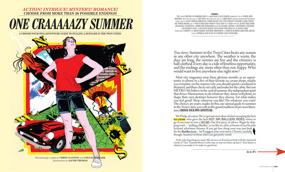
Twin Cities METRO: Choose Your Own Adventure This Summer

Twin Cities METRO: Choose Your Own Adventure This Summer

Twin Cities METRO CD Bryan Nanista sends us their take on the traditional "summer guide" package, done for 2010 in the form of our favorite major life decision-making tool, the Choose Your Own Adventure model.  … MORE
NY Mag's Eat Cheap 2010: Splitsville

NY Mag's Eat Cheap 2010: Splitsville

Time for another 2 covers to duke it out in the name of discount dining--this time, though, New York Magazine's competing against itself. Design Director Chris Dixon says,
We did 2 radically different covers for our Eat Cheap issue this year, out today. We loved both covers, so we did a split run. One is type, one image, so everyone in the office is happy!
Which one will you pick up?


Above, left: photography by Hannah Whitaker; right, typography by Chris Dixon, illustration by Gillian MacLeod.
Three Questions for George McCalman, AD at AFAR

Three Questions for George McCalman, AD at AFAR

You recently helped launch AFAR, a magazine about and for world travelers. When the idea of helping launch a new travel magazine during the worst recession of our lifetime was offered to you what was it that made you enthusiastically say, Yes, I'm your man! Are you just plain crazy?
Yes, a little. Ok: Very much so. I'd just come off of an extremely rewarding (but tiring) 2 year stint at ReadyMade, but the idea of
MORE
Sports Illustrated

Sports Illustrated "Appreciates" a Time cover

Neil Jamieson of People mag submits this cover from his days at Sports Illustrated, for our inspiration, homage, and appreciation collection. The Time cover is from June 7, 1993. Sports Illustrated is from May 30, 2005.

Time: art director, Arthur Hochstein

Sports Illustrated: creative director, Steven Hoffman.


MORE
Everywhere Else It's Called FOOTBALL...

Everywhere Else It's Called FOOTBALL...

Oh the joys of being a magazine art director during the summer months! Smaller issues, a less competitive dress code and editors who are so desperate to head to the beach for the weekend that the decisions just make themselves... Okay who am I kidding, I'm sure everyone is just as swamped as ever with vacation coverage, special double issues and of course iPad development. As a result there is a (VERY) slim chance that you where one of the few people who wasn't able to sneak out to the pub over the last 26 days and have missed what has been unfolding at the biggest sporting event on the planet down in South Africa: The World Cup.  … MORE
Homage, Inspiration, or .......

Homage, Inspiration, or .......

Here's my own contribution to the SPD "Inspiration" discussion. In 1993 I was working as design director at The Village Voice. A few hours before closing, the editors came up with a new cover idea, the diminished mayorality of NYC Mayor David Dinkins. Desperate for an idea, I came across a recent Time magazine cover on President Clinton, "The Incredible Shrinking President." Voice editor Jonathan Larsen loved the idea of expropriating an idea from Time (the cover had gotten a lot of publicity when it came out), so we tweaked it to our own story. Illustrator Eric Palma quickly drew a caricature of Dinkins for us and faxed it over. We scanned the fax, added a credit line on the TOC that acknowledged the cover was "inspired by....," and closed the it all about an hour later.

(Above): Time, June 1993, art director: Arthur Hochstein. The Village Voice, August 1993, art director: Robert Newman; illustrator: Eric Palma.

Send us your stories and examples of inspiration, homage, and just outright theft.

Related stories:

More Inspiration, or....?????

More Inspiration, or....?????

Our post on the similarities between a recent Seattle magazine cover and a New York magazine cover from a few years back attracted so much interest, that it got us thinking about other examples of cover design "inspiration." Then we saw the June 14, 2010 cover of Mediaweek, and thought about how much it reminded us of a cover design from Billboard, 2008.

Meanwhile, a commenter to the original post pointed us to another example of Seattle magazine being "inspired" by New York. See Seattle's 2010 cover here, and the "original" New York cover from 2009 here.

(Above): Billboard, August 23, 2008. Mediaweek, June 14, 2010.

Do you have your own examples of cover inspiration, homage, or just plain rip-off? Send them to us and we'll be glad to post them. We love inspiration and homages, especially when credit is respectfully (or playfully) given. Some of us would be in a lot of trouble if we got busted every time we were "inspired" by another piece of work!
MORE
Shoot This Magazine!

Shoot This Magazine!

Enough with the iPad for 2 minutes, Field & Stream create a different type of interactive magazine experience for its readers. With their July 2010 "Gun Nut" special, readers of the hunting and fishing monthly are encouraged not only buy... but to SHOOT their issue! … MORE

« June 2010 | Archives | August 2010 »