August 2010 Archives

Fast news for August 31, 2010

Fast news for August 31, 2010

SPD MEDIA MIX is our regular collection of publication design, digital, and media news updates. Please send your links and news items to SPD at mail@spd.org and we'll add them to the Mix.


>> Gourmet brand to return to print--as a series of special newsstand-only issues. Gourmet Quick Kitchen hits newsstands September 7...

>> Sarah Vinas has been promoted to art director at Glamour. She takes the place of Theresa Griggs, who moved over to become design director at Women's Health....

>> Time magazine's editor Rick Stengel is "the last man standing." How Time won the newsweekly wars....

>> R.I.P. British fashion photographer Corinne Day (via Magculture.com) ...
Essence 40th Anniversary Cover Mosaic

Essence 40th Anniversary Cover Mosaic

This year marks the 40th anniversary of the first issue of Essence magazine, which was published in May 1970. In honor of that first issue, Mosaic Legends has recreated that first cover, featuring model Barbara Cheeseborough, in mosaic form, using all 496 covers of Essence.
Dueling Covers on the iPad

Dueling Covers on the iPad

No matter how you tilt the iPad, as publication designers, the workload has increased. When it comes to covers, back in the old days (8 months ago) you "only" had to ship a newsstand and subscriber cover. Nowadays, add a portrait and landscape iPad cover to the mix. 

A blessing or a curse? Looking at the August cover of WIRED, they took the opportunity to use an alternative photo of time traveling Will Ferrell. For the September issue, they took this one step further and used the ole "we love them both" approach: "The Web is dead." covers the print and portrait cover, while Joel McHale & "How to Watch TV" grace the landscape mode. 

Wired Creative Director, Scott Dadich weighs in:
MORE
Keith Campbell Sends a Postcard from Germany...

Keith Campbell Sends a Postcard from Germany...

One of our favorite art directors, Keith Campbell, recently wrote us an update on his activities in Hamburg, Germany, where's he's been living and working since June 2006. Keith has been immersed in the world of German tabloid magazines, designing a series of titles that are jammed with color, photos, and type--think Us, Star, People, All You, etc. on mega-design steroids, with lots of photos of Heidi Klum. The covers are crazy, noisy, and chaotic, but also brilliant in their execution. We love what he's doing, even if it does hurt our eyes!

Keith Campbell: One of the best emails I ever received went like this: "Meet me in Hamburg, Germany on Tuesday, April 4 at 1pm for lunch!" It read like some kind of cryptic cold war directive from a sexy Russian operative. Alas, it was an invite from Marc Werthmann, editor of the then-recently launched In Touch Germany. He was on the lookout for a new art director and had gotten my name from In Touch USA's creative director Audrey Razgaitis on one of their fact-finding missions to Bauer Publishing's Englewood Cliffs, NJ offices.
MORE
ASME announces best magazine cover contest finalists!

ASME announces best magazine cover contest finalists!

The American Society of Magazine Editors (ASME) has announced the finalists for the annual 2010 Best Magazine Cover contest. There are six finalists in 12 categories. Winners will be selected by voters on Amazon.com; voting begins September 1, so be sure to vote for your favorites! Congratulations to all the finalists.

Pictured above are four groups of finalists. Row 1: Sexiest; Row 2: Entertainment and Celebrity; Row 3: Fashion and Beauty; Row 4: House and Home.


Fast news for August 26, 2010

Fast news for August 26, 2010

SPD MEDIA MIX is our regular list of publication design, digital, and media news and updates. Please send your links and news items to SPD at mail@spd.org and we'll add them to the Mix.

>> The new Newsweek owner talks about his plans for the magazine, says he wants it to shout at  readers when they pick it up, "Hey man, you're in for the time of your life"...

>> Theresa Griggs has been named the new design director at Women's Health, replacing Andrea Dunham, who moved to People. Griggs was the art director at Glamour....

>> Anita Sarsidi is the new design director at Elle Decor...

>> The New York Times asked 13 young photographers to document the lives of 20-somethings with iPhone cameras. See the results here....

>> Lady Gaga on the cover of the new Vogue Homme Japan: black and white and very butch....

>> Black magazines of the 90s--where are they now? Emerge, Savoy, Honey, a slideshow and update....

>> How Entertainment Weekly embraces the digital age, with iPad app, Youtube channel, and more...


The New York Times Hits a Grand Slam with Flex

The New York Times Hits a Grand Slam with Flex

The U.S. Open, the final grand slam tennis tournament of the year -- and the largest sporting event in tennis --  begins on Monday, August 30. To mark the occasion, Kathy Ryan, director of photography at The New York Times Magazine, commissioned the photographer Dewey Nicks to shoot some of the top players in women's tennis with the new Phantom Flex camera. When it goes on sale next week, the Flex will be the fastest high-definition camera on the market. The Magazine is the first to use the Flex for an editorial assignment. Miki Meek, the magazine's web producer, and Stacey Baker, deputy photo editor, helped produce the amazing imagery. See more after the jump... … MORE
Three Questions with Tim J Luddy, CD, Mother Jones

Three Questions with Tim J Luddy, CD, Mother Jones

Mother Jones makes great use of illustration within its pages. Is this an artistic choice on your end, or the by-product of working with a tight budget?
TJL: We decide on whether to use illustration, photography, or a combination of the two on the basis of which medium will present each story's message most effectively. We appreciate the way that editorial illustration can present and shape ideas, and we have a tradition of strength in that area, going back to
MORE
Cool Nerds Go Negative

Cool Nerds Go Negative

Wired and Scientific American must have called each other up before class this month!

I thought this was too random to pass up. I realize many genres of magazine verticals share similar cover strategies however these two popular titles, while they do share some DNA do not generally have anything close to the same cover idea dropping on the same month.
MORE
A New Look at Parenting

A New Look at Parenting

Creative Director Michael Goesele tells us,
For the redesign of Parenting, the overall goal of the creative team was to design a clean and easy-to-navigate magazine for today's busy parents.
Get a closer look after the jump...
MORE

NSFW Typography

Hot off the press. This is a new single from Cee Lo Green's upcoming album, Lady Killer, called "Fuck You". The song is amazing, but what really got me was the video, all set in type and type only! Kudos to the designer, not sure who did this one but I thought it deserved some designer love.


(You might want to keep your volume low at first. Hard to resist taking it to 11, but... -- Ed.)
Fast news for August 23, 2010

Fast news for August 23, 2010

Welcome to our new quick news update feature, SPD MEDIA MIX. This will be a regular occurring list of publication design and digital updates. Please send your links and news items to SPD at mail@spd.org and we'll add them to the Mix.

>> People magazine has launched its iPad app, with a video introduction by Katy Perry...

>> The new issue of Complex has a cover and photo feature starring Lindsay Lohan, with photography by Marcus Klinko and Indrina, and artwork by noted graffiti artist KAWS...

>> Essence has hired a new fashion director, and it's stirred up some controversy....

>> Shelter magazines: Good Folio article on "The Good, the Bad, and the Survivors"....

>> Drama at Everyday with Rachael Ray? Top editor and creative director leave the mag....

>> New editor announced at Elle Decor.....


Websites for Visual Inspiration

Websites for Visual Inspiration

If you're looking for instant graphic inspiration, great visual ideas, or just want to see some cool images, check out these visual blogs and websites: Words & Eggs, Stephen Kroninger on Drawger, A Journey Round My Skull, Ethan Persoff, and All My Eyes. These five sites are all strong in illustration and publication design, as well as book covers, comics, posters, and much more. I look at all five of these every day, and am filled with respect and admiration for their dedication, love, and overall smartness towards graphic design and visuals of all kinds.

(Above: The Masses, November 1916, illustration by Hugo Gellert, from Words & Eggs.)


MORE
The Cooper Union + the TDC Are Taking You Back to School

The Cooper Union + the TDC Are Taking You Back to School

Do you, like Kanye, get a little emotional over your typography at times? Fret not! You're not alone. (And no, we don't just mean that you and 'Ye will have something to talk about when you hang out at the next shoot.)

Spurred by the resurgence of lettering in design today, and the ways that digital tools are enhancing the process, The Cooper Union and the Type Directors Club have partnered together to create The Typeface Design Certificate Program, a first of its kind in North America.
MORE
Web Fonts Take The Next Step

Web Fonts Take The Next Step

The Roger Black empire grows by one more company: going live today is Webtype--a partnership with The Font Bureau, AscenderPetr van Blokland, and DevBridge.

This new company's goal is to provide quality typography for websites. In the past, for live, searchable, dynamic type websites were limited to the basics (Georgia, Arial, etc.). Otherwise, Photoshop graphics were needed to be cut to add a bit of unique type flavor. 

Webtype is the next step forward in this much needed movement towards "real fonts" on the web. Make sure to read the fine print (monthly subscription) and know what browsers your sites users use as some browsers (desktop and mobile) do not support this new technology. 

Overall, there's fewer reason now for your publication to use the same great fonts in print and online. 
MORE
The Dog Days of Summer Covers

The Dog Days of Summer Covers

It's the Dog Days of Summer, that hot time of year when, according to one 19th century writer, "the seas boiled, wine turned sour, dogs grew mad, and all creatures became languid." And while there's some debate about when exactly the dog days occur (July 24-August 24 for the Ancient Romans, July 3-August 11 according to The Farmer's Almanac), we think it's a good time to look at magazine covers featuring dogs. Here are some of our favorites.

Send us your favorite dog magazine covers and we'll add them to this collection, but please, don't send us the National Lampoon "Buy This Magazine or We'll Shoot This Dog" cover!

(Above): Life, November 3, 1927. Illustration by Will Rannells.
MORE
Face-Off:

Face-Off: "True Blood" Covers

The buzz-worthy HBO series "True Blood" covers this week's issue of Rolling Stone along with a recent issue of Entertainment Weekly. Which gets it bloody better?


MORE
Summer Social: The Morning After...

Summer Social: The Morning After...

Fret not if you missed joining our More Fun, More Often crew last night for an evening of good times at the The Eldridge with some tasty beverages courtesy of Bear Flag*. Another event is on the way, so check back in to hear about the next one!

For your viewing pleasure: Captured moments from the evening can be viewed here or after the jump.

*Special Thanks to our  Members' Outreach committee member, Todd Weinberger  for hooking us up with our awesome sponsor: Bear Flag!
MORE
Small Town

Small Town "Inspiration"

Here's another good example of "Inspiration, or...???" On the left, "The Best Small-Town Cafes," from the December 2008 issue of Texas Monthly, art directed by T.J. Tucker. On the right, "Small Town Trips," from Indianapolis Monthly, July 2009.

Both magazines are owned by Emmis Publishing, so maybe there's some kind of inter-company design sharing program.

Related stories:
Another "Inspiration?" Cover  New York / St. Louis
More "Inspired" Covers  Esquire / Wizard / Texas Monthly
Homage, Inspiration, or ...  TIME / The Village Voice
Rolling Stone: Deja Vu?  Friends / Glee
Inspiration, or...  New York / Seattle
More Inspiration...  Billboard / Mediaweek
Eat Cheap Eats  New York / Time Out New York

Swimsuit covers

Swimsuit covers

2010 has been the hottest year on record, and this summer is a scorcher. It's so hot that Northern Canadian magazine Up Here, based in Yellowknife, Northern Territories, has published their first swimsuit issue, to draw attention to climate change. We can't think of a better way to cool off than to look at magazine swimsuit covers. Here are a some of our favorites.

Above: The New Yorker, June 20, 1925. Illustration by H.O. Hofman.
MORE
Summer Social:TOMORROW NIGHT

Summer Social:
TOMORROW NIGHT

Don't forget to stop by tomorrow night (Tuesday the 17th) to the kick-off to the 2010/11 season at our More Fun, More Often event at The Eldridge. Wine will be provided by our awesome pals at Bear Flag. Details and RSVPing after the jump...
MORE
Eat Cheap / Cheap Eats

Eat Cheap / Cheap Eats

Illustrator Brian Taylor, the wise guy behind the Doppelganger Design website, has compiled this amazing collection of city and regional magazine covers all devoted to the theme of Eat Cheap or Cheap Eats. Besides the fact that it reveals an aggressive sense of sameness in editorial conception, it also appears that a couple of these magazines (Atlanta, StLouis) have found quite a bit of "inspiration" from New York magazine covers. As a special bonus, Taylor has included a ringer cover from the new Ready-Media template collection. See if you can spot it! And be sure to check out Doppelganger Design for many more examples of design "inspiration."… MORE
New York magazine vs. The Social Network: An 'Inspired' Poster?

New York magazine vs. The Social Network: An 'Inspired' Poster?

Ladies and gentlemen of the jury: On the left, the April 13, 2009 cover of New York magazine, "Facebook Revolt," with a photograph of Facebook CEO Mark Zuckerberg. On the right, the poster for the upcoming Facebook movie, The Social Network, directed by David Fincher, which debuts on October 1.

The New York cover was art directed by Chris Dixon. You can find a fabulous archive of every New York cover from 1998-2010 here. See the trailer for The Social Network here.

Related stories:
Another "Inspiration?" Cover  New York / St. Louis
More "Inspired" Covers  Esquire / Wizard / Texas Monthly
Homage, Inspiration, or ...  TIME / The Village Voice
Rolling Stone: Deja Vu?  Friends / Glee
Inspiration, or...  New York / Seattle
More Inspiration...  Billboard / Mediaweek
Eat Cheap Eats  New York / Time Out New York
MORE
Arthur Hochstein's 15 Favorite Time Magazine Covers

Arthur Hochstein's 15 Favorite Time Magazine Covers

Arthur Hochstein was the art director of Time magazine from 1994 to the end of 2009. He created over 1000 covers during that time, including some he did as deputy to Rudy Hoglund before 1994. Hochstein created what I consider the greatest contemporary body of cover design at any one magazine over the past 15 years. Hochstein's Time covers are by turns momentous, funny, pointed, provocative, intelligent, and highly creative. They feature the top photographers (and occasionally illustrators) in the business, along with Hochstein's own considerable creative Photoshop work. To my mind this is as close as contemporary American cover design will get to the legendary work of George Lois at Esquire in the 60s and 70s

Hochstein's Time covers skewed to the homemade, self-created. An early adapter to Photoshop, he created many of the images himself with stock and archival photography and found images (he used the same globe of the world from his office for at least six covers!). There's a sense of creativity, fun, excitement, passion, and ingenuity that is lacking from many of today's highly-scripted and tested magazine covers. I can remember sitting in Hochstein's Time office one afternoon a few years ago and watching him work on a cover on two computer screens, with a mouse in each hand, gleefully manipulating and changing the image. This is a person who loves the process of visual creation, and it comes through in the printed covers. Hochstein's bespoke imagery is reminiscent of much of the work currently appearing on the covers of alternative newsweeklies like The Dallas Observer, Riverfront Times, Miami New Times, and Westword, although with a much greater budget and resources.

While we await the inevitable book collection of his work, here is Arthur Hochstein on his favorite covers and how they came together. This is a great inside look at the sausage-making process of creating covers at the largest American newsweekly.


MORE
Behind the Scenes: Fortune Goes to the iPad

Behind the Scenes: Fortune Goes to the iPad

Fortune joined the other members of the Time Inc. family on the iPad (TIME, Sports Illustrated, EW's Must List, and the LIFE Wallpaper app) this month with their own iPad launch. Deputy Design Director Emily Kehe and Fortune.com editor Dan Roth sent us an in-depth look at the newest addition and some of the thinking behind its development:
When we set out to bring Fortune to the iPad -- and, down the road, to whatever tablets arise -- we laid out a few goals: Find a way to bridge the timeless narratives of the magazine with the timeliness of the Web; look for new methods for telling the best stories in business; amplify our historic dedication to photos and illustrations; and use the new technology to bring even more service to our readers.
Much more after the jump...
MORE
GreenSource Magazine: Forward-Thinking Design

GreenSource Magazine: Forward-Thinking Design

GreenSource is a building trade magazine that is producing amazingly bright, intelligent, original design, filled with spectacular imagery, cutting-edge graphics, and sparkling typography. It's the work of Francesca Messina, Senior Group Art Director at the McGraw-Hill Construction group, and GreenSource art director Ted Keller. This is state-of-the-art magazine design, smartly produced with a small staff and a limited budget. 

Ted Keller was hired as the GreenSource art director in March 2009, and he and Messina quickly began work on a redesign. Says Messina, "Our goal was to create a design that communicated the authoritative and inspirational message of the magazine--that sustainable architecture, and living, can be practiced on every level." The result is a design that Messina describes as "forward thinking and authoritative, but also cool."

GreenSource, "The Magazine of Sustainable Design," is a bi-monthly, primarily controlled circulation magazine. Copies go to members of the U.S. Green Building Council, and additional subscriptions are sold. It's produced in New York City by the McGraw Hill Construction magazine group, with editorial partners Building Green, based in Brattleboro, Vermont.

(Above): "Curves Over Chicago" cover, January/February 2010.
MORE
Runner's World Goes to the Dogs

Runner's World Goes to the Dogs

September issues aren't only big for the fashion bibles, but the fitness books as well. Kory Kennedy, DD for Runner's World, sends along a cover shot better suited for a gatefold and this note:
At Runner's World we love runners of all shapes, sizes, and species.
See the full cover after the jump...
MORE
Trade magazine art directors talk about Ready-Media

Trade magazine art directors talk about Ready-Media

The recent launch of Roger Black and friends' new project, Ready-Media, created a storm of controversy within the publication design community. The post about the project that ran on the SPD site garnered almost 80 comments, from some of the top publication designers in the field. Many of the comments were highly critical of the project's concept to create out-of-the-box newspaper and magazine templates that require the users to "just add content." 

A good amount of the comments, both pro and con, centered on Ready-Media's potential impact on trade and business-to-business (B2B) magazines. We asked four art directors with extensive experience in the trade and B2B area to share their opinions on this controversy. Here are comments from art directors Francesca Messina, Don Morris, Mitch Shostak, and Florian Bachleda.

Trade magazines above: HQ (Francesca Messina), Snap (Mitch Shostak), Government Executive (Don Morris), What Matters (Florian Bachleda).


MORE
Covering Google

Covering Google

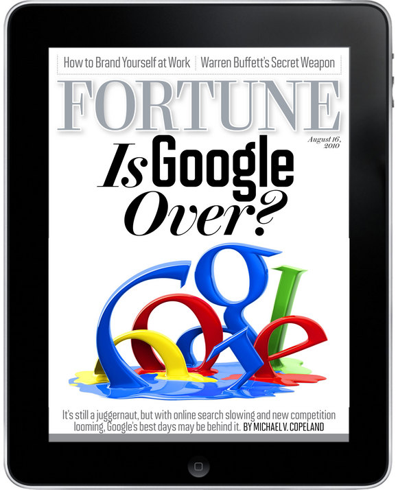
Fortune magazine hits newsstands and debuts on the iPad with a bold question: Is Google Over? If so, what a wild ride its been since Stanford computer science grad students Larry Page and Sergey Brin began collaborating on a search engine in 1996. 

Here's a look back at a collection of magazine covers featuring Google--most playing off Ruth Kedar's colorful logo. How different these covers would have been, had they gone with their original proposed name: BackRub.

MORE
Collected Cover

Collected Cover "Inspiration"

Illustrator Brian Taylor has put together a blog dedicated to documenting magazine cover "inspiration," i.e., covers that look alike. It's called Doppelganger Design, and it includes some of the ones that we've been posting here at SPD the past couple weeks, and a lot more. Head over to his site immediately for much cover ripoff(?) fun.

Above: The New York Times T magazine and the cover from Coast that it "inspired."

Related stories:
Another "Inspiration?" Cover  New York / St. Louis
More "Inspired" Covers  Esquire / Wizard / Texas Monthly
Homage, Inspiration, or ...  TIME / The Village Voice
Rolling Stone: Deja Vu?  Friends / Glee
Inspiration, or...  New York / Seattle
More Inspiration...  Billboard / Mediaweek
Eat Cheap Eats  New York / Time Out New York

SUMMER SOCIAL Tuesday, 08.17.2010

SUMMER SOCIAL Tuesday, 08.17.2010

It's summer, it's HOT, and we can all use a nice cool drink.
So while things may seem quiet during the past few months at the SPD offices, there's a ton of planning in the works for another great year chock full of events for the 2010/11 season.
We've even decided to throw a bash as an early kick-off to it all, so come join SPD for another More Fun, More Often event at The Eldridge on Tuesday, August 17. Wine will be provided by our awesome pals at Bear Flag. Details and RSVPing after the jump... … MORE
10 Essential iPad Apps for Publication Designers

10 Essential iPad Apps for Publication Designers

Those of us excited about the possibilities of the tablet have already seen the big-name magazine apps for iPad, like Time, Wired, Sports Illustrated, Popular Science, Popular Mechanics, and Entertainment Weekly's Must List. (If you haven't, take a few minutes to check them out now.) But there are many other apps of interest to publication designers that have not yet received as much publicity. Below is a sampling of ten apps, many of them free, to kick your iPad imagination into high gear. This is, of course, nowhere near a definitive list. With new releases appearing almost every day in the "News" category of the App Store, many more apps with innovative navigation schemes and vibrant animations await your download.

This post was written by Reed Reibstein.

Above: Launch screen from the Getty Images app.
MORE
Another

Another "Inspiration?" Cover

Sharp-eyed (and obsessive) Seattle Met magazine art director Benjamen Purvis submits this latest in our ongoing "Inspiration, or.....???" series. The cover on the left is from New York magazine's Cheap Eats issue, from July-August 2007. The cover on the right is from St. Louis magazine's Cheap Eats issue, June 2009.


MORE
amNewYork: Newspaper covers for commuters

amNewYork: Newspaper covers for commuters

Christopher Sabatini has been the design director at amNewYork for most of its existence, since its launch in 2003. The free daily newspaper is given away at NYC subway stops and in news boxes around the city, and competes for eyeballs with another daily freebie, Metro New York. am New York publishes five days a week with a circulation of between 350,000-400,000, mainly in Manhattan. Their target audience is commuters 18-40 who don't read other newspapers.

Sabatini has given the covers of amNewYork a bright, sassy, tabloid feel, like a funner, hipper New York Post, complete with funky Photoshop constructions. It's all done on the fly, with no time and a very limited budget. The covers pop off the pages, grabbing commuters as they head into the subway. Sabatini says, "We see ourselves as the initiator of conversation with our readers, whether it's about the story of the day or about trends that New Yorkers are seeing or experiencing."

amNewYork's covers are all self-created and produced, usually with stock photography. They have that wacky, bespoke news magazine feel of alternative weekly papers like the Dallas Observer, Westword, and Riverfront Times. The design confronts myriad challenges, like multiple cover ads and limited production values, but it still comes off as smart, original, engaging, and full of passion, qualities we like and admire.

Sabatini gave us comments on some of his favorite cover designs for amNewYork.

Christopher Sabatini: (Left): November 17, 2008. I went away on vacation and designer Sara Baumberger and her Photoshop skills did this amazing cover. (Right): October 1, 2008. We have a small staff, and I try to give them a chance to do covers (or any other pages). This is another cover design and image by designer Sara Baumberger.
MORE

« July 2010 | Archives | September 2010 »