11.22.11
Conde Nast: All Fire'd Up
 One week after its launch, the Kindle Fire is proving to be a platform for publishers that rivals Apple's iPad. The industry is estimating 4-5 million devices to be sold this holiday season. Its smaller screen and 16:9 proportions does have its challenges for those reformatting magazine pages to the tablet screen, but the size of the potential audience is considerble.
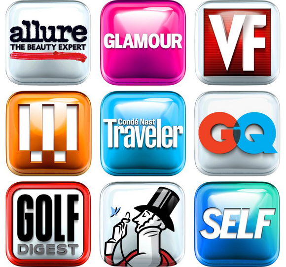
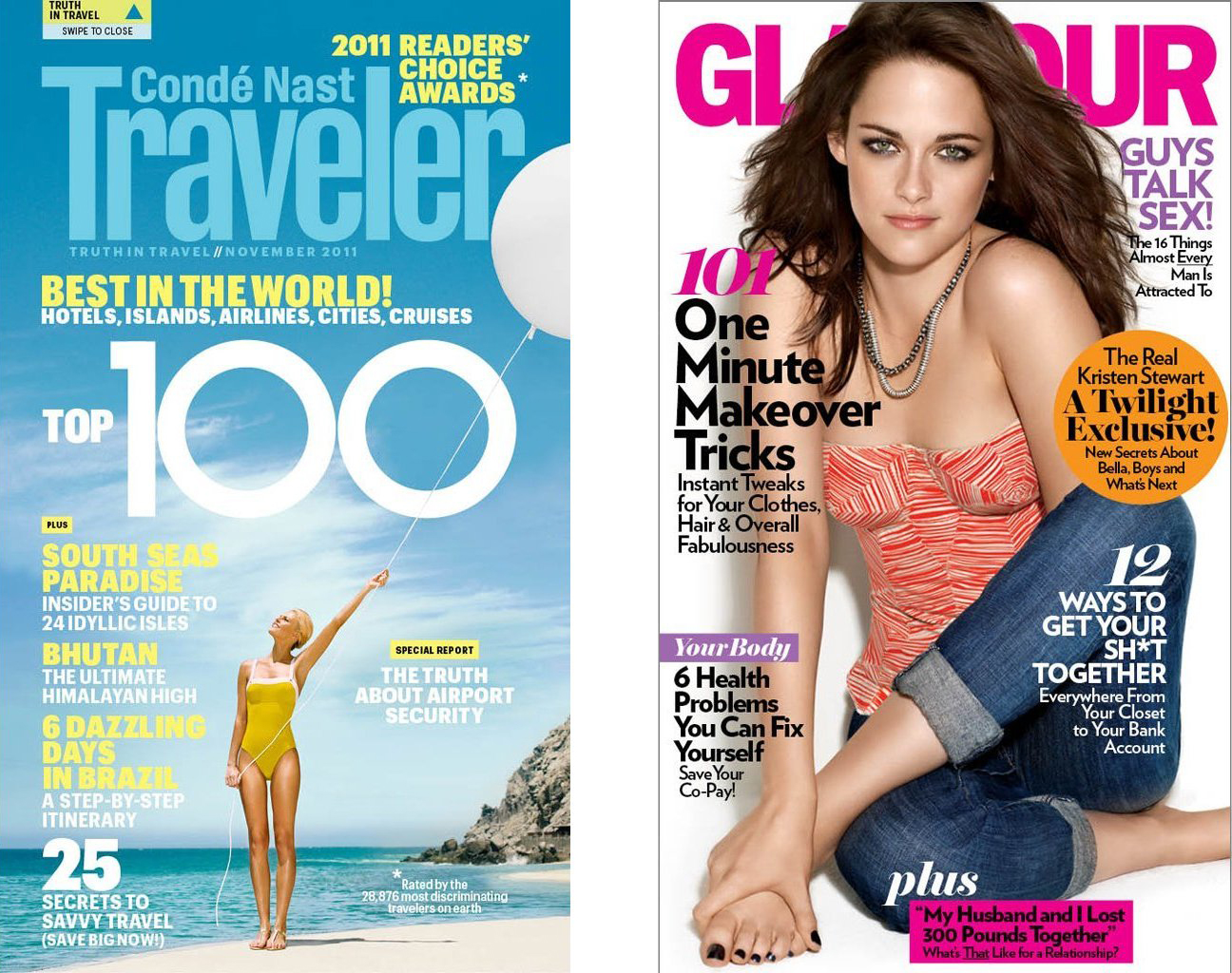
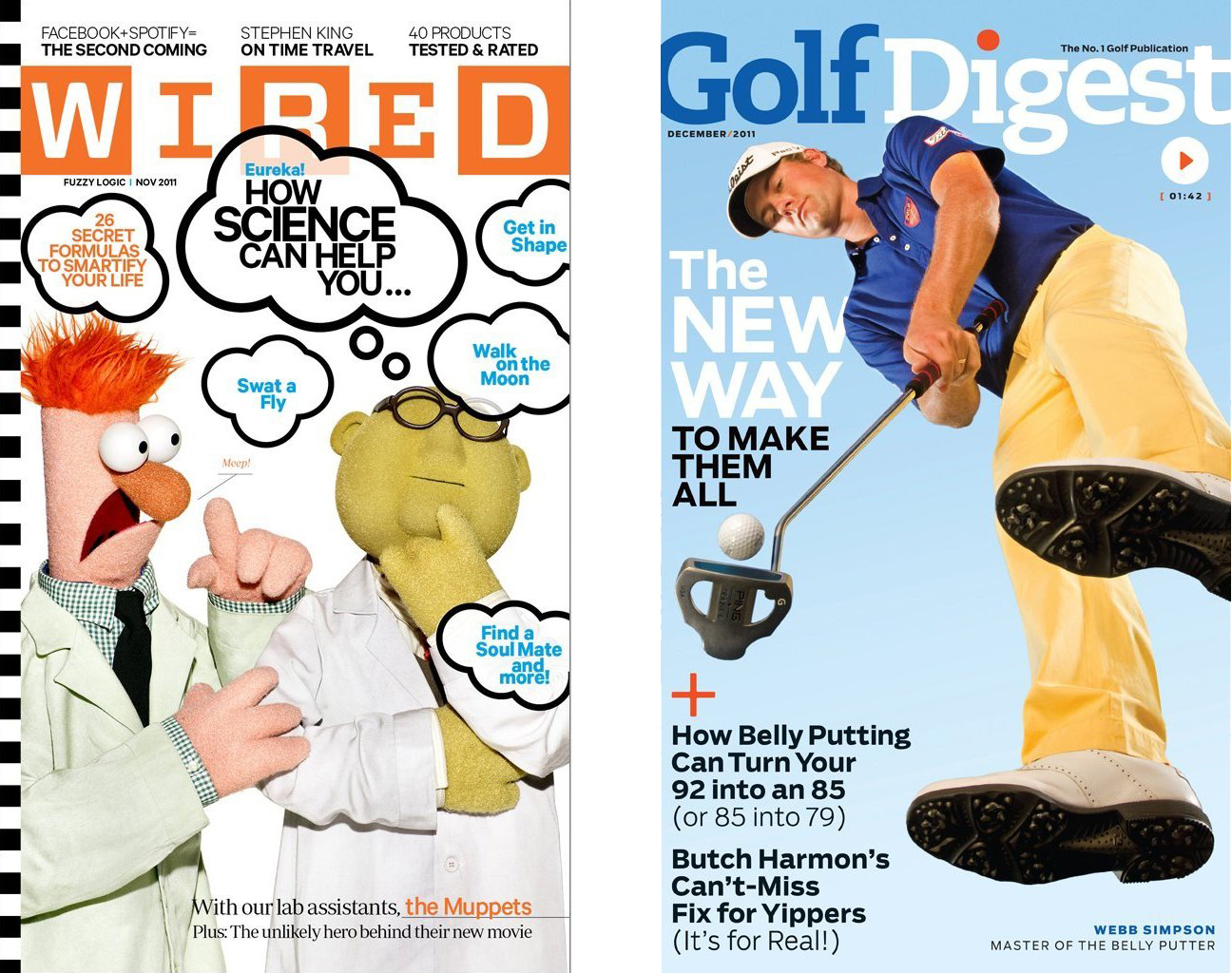
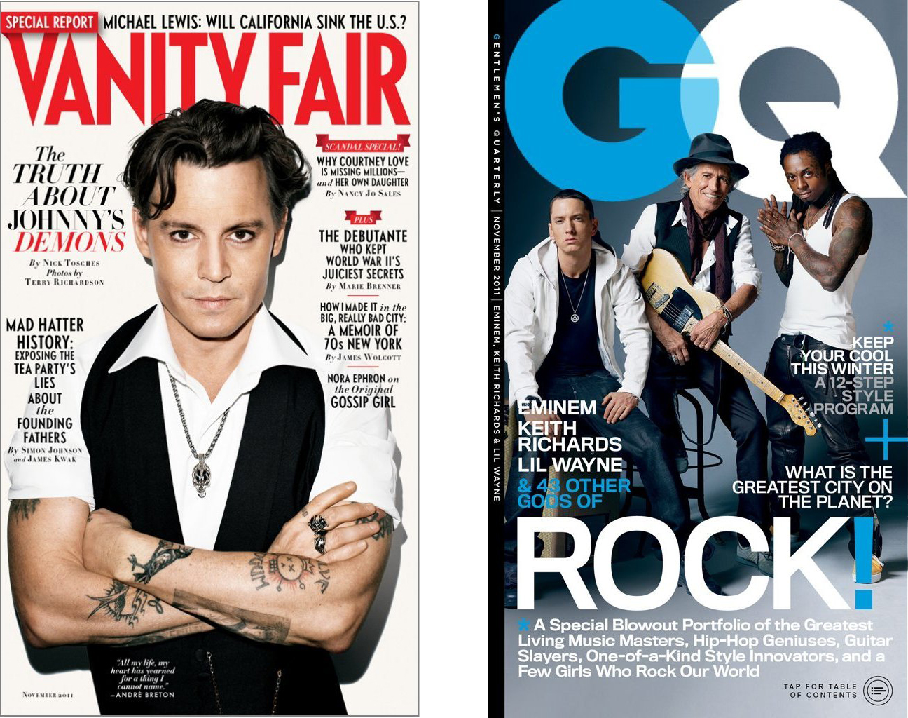
 In sync with the launch last week, Conde Nast debuted on Amazon's Newsstand with nine titles -- Allure, Glamour, Vanity Fair, Wired, Conde Nast Traveler, GQ, Golf Digest, The New Yorker, and Self (above). We spoke to Scott Dadich, Vice President of Digital Magazine Development, about the process.
When you and your team dove in, what did you see as the perceived difference in user environment between the iPad and Kindle Fire; are you approaching this with two different intended audiences?
As is immediately obvious, we are dealing with a considerably smaller screen than the iPad. The Fire has the same pixel dimensions as the iPad in the longest dimension (1024), but those pixels are more tightly packed, so we get the benefit sharper text and crisper images than we've grown accustomed to. All of this leads to a conversation around portability of the device and the consumers ability to use--or not use--the Kindle in certain situations. We thought a lot about hand-held interactions, ease of browsing/scrolling/paging, and the immediacy of iconographic calls-to-action. Given the low price point, we'll certainly be dealing with a new set of readers, perhaps some who are adopting a Fire as their first tablet, maybe even their first touchscreen device. Bottom line, we tried to be especially cognizant of usability as we explored this new kind of magazine layout.
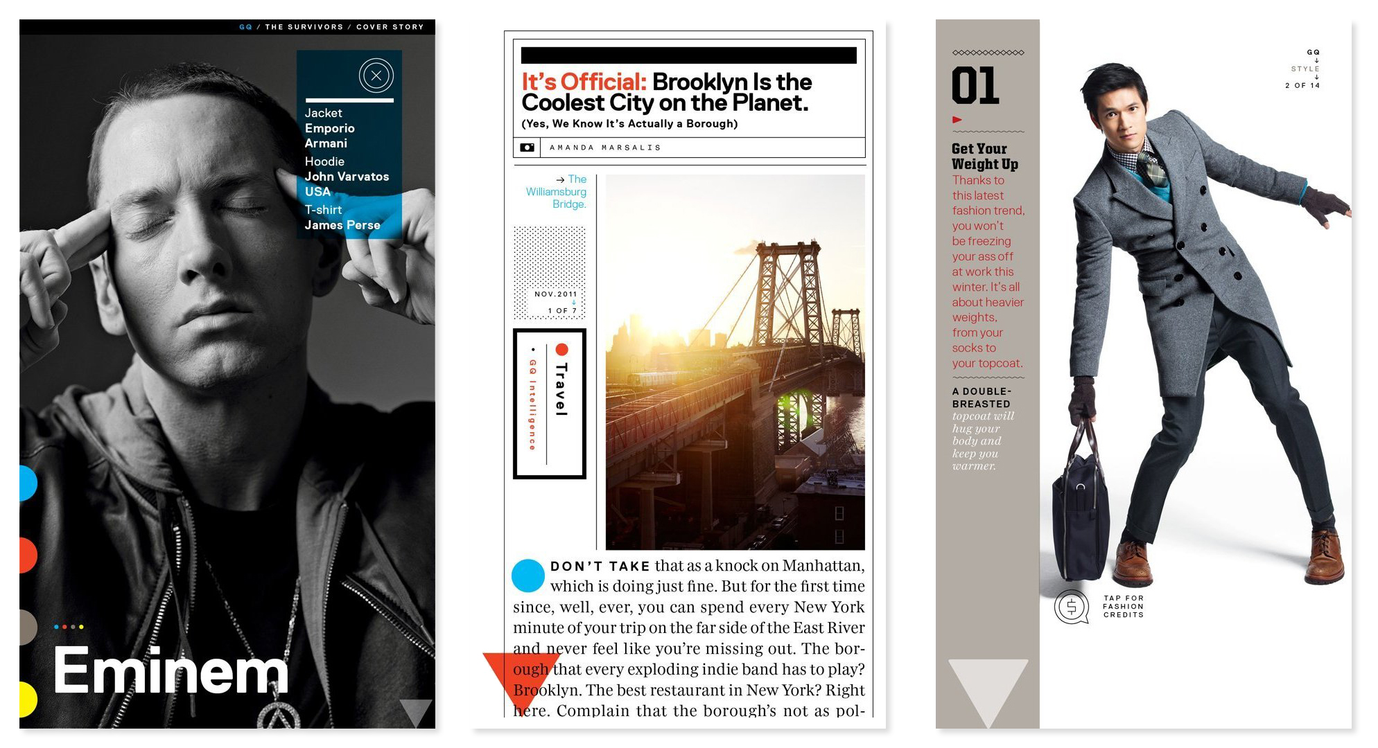
What were the challenges redesigning magazine pages for the 7-inch 16:9 screen? More scrolling? More taps? Any design ramifications for this wi-fi only device?
Again, with the smaller screen, our teams are forced to apportion a lot of the content over greater real estate -- more screens over more stacks. But Alyson Cameron -- who ran the design side of the initiative here in the Editorial Development Group -- and her colleagues in the brand design departments took great care create experiences that are easy to navigate, fun to consume, and beautiful to look at. In some places, we did end up nesting a bit more of the content than we do in iPad, but that often makes for a more revelatory discovery process, which is quite fun to work through as a reader. But throughout, we were always careful to preserve the spirit of the original brand design principles. The narrower screen is tough on landscape photography, so we employed a neat little trick with MSOs (multi state objects) we call a "tap-and-turn", which allows the display of a full-screen horizontal image with a single extra touch. And in regard to text, we're big fans of the single-column layout.
How are the editorial teams able to design for both editions at once; what efficiencies can you achieve and what things have to be done for each system?
I wouldn't say it's easy, but I think across the board most of our friends in the art departments here would agree that it isn't the back-breaker we had initially feared the extra layout would be. Kristen Rayner, who develops our editorial design systems and production best practices, set up some really ingenious procedures around style mapping, saving countless hours of work. And the design tools themselves continue to improve, so we're optimistic this is increasingly going to be a natural part of the brand design workflow. The key point is this: proper styling on all text is essential at the start--in print print layout. The better articulated all style sheets are, the more consistent the mapping and translation can be on the derivatives, and the less time the design departments have to spend on reflow. And with the coming advances in HTML5 and liquid layout, we'll only see this process improve.
These Guys Kick Apps: Q&A (Part 1) - Your biggest challenge?
These Guys Kick Apps: Q&A (Part 2) - Making the leap from print to apps
These Guys Kick Apps: Q&A (Part 3) - User feedback
10 Essential iPad Apps for Publication Designers (2nd Edition)
From SXSW: SPIN Play App for iPad
