New Work
01.25.12
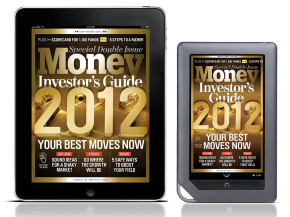
How to (re) Make Money: Part 2, Tablet
As a follow up to last week's post all about the print redesign, design director Neil Jamieson gives us more Money with some insight into the development of their tablet versions.

Photo-Illustration by Joe Zeff Design
Getting Started: As mentioned in the previous post, our print redesign at Money coincided with the big push over here at Time Inc to get all the company's titles up and running on both the iPad and 16x9 ratio devices (kindle fire, nook color, samsung galaxy etc). The timing couldn't have been better as it meant that we where able to work out the navigation and structural logic of the print with the design of the tablet in mind and vice versa. This meant that rather than the tablet being a reaction to the print, the design/architecture and logic of one was able to inform the other.

Photograph by Travis Rathbone

Photograph by Travis Rathbone
A "simple" app. Our app has all the usual "global" navigation devices (page viewer, dossier links, web links, library, store, etc) and we organize our "cells" to let the readers swipe and scroll their way through the content...but that really is about the extent of our functionality...why? Well what we learned pretty early on about our readers is that they really don't use (or seem to care for) much functionality when they consume our content on their devices. With the exception of access to current stock market info (we gave them lots of web links) all they really want to do is read....and read...and read some more! The trick to the design of our app and the goal from the start was to keep it as simple as possible and make sure that the reading experience while bold and surprising was easy easy easy...we paid close attention to how the reader holds his device, where he is when he's reading it, where he puts his thumbs etc (thats right, print designers playing around with ergonomics...madness!). So what we came up with was what you see here. Lots of arrows and bold "openers", big type and few design tricks.


Photograph by Jason Hindley

Photograph by Jose Mandojana

Infographics by Luke Shuman

Infogaphic designed by Laura Renga Illustrations by L-Dopa
We have to keep in mind all formats when conceptualizing ideas for the magazine. Ryan Cadiz (our photo director) will add extra images to the shot list to help with pacing and to further flesh out ideas that we just didn't have the room for in print.
(Tap the images for a closer look)

Photograph by Adam Vorhees
Pacing as a story telling device: In the "Health" section below we added in a second shot of the empty glass to give a little punch line to the narrative, and we where able to crop the stethoscope above so the reader doesn't see the entire still life in one frame, giving a bit more of a pay off to the twist of the concierge bell. Controlling the "reveal" is something I encourage my designers to think about.

Photographs by Jason Hindley
Spreading it out: Having the ability to use as many cells as we need to tell a story has been liberating for our design and photo teams. We try and let our cells breath so the content is easy to read and the viewer knows where to look. We often run the photos across multiple cells for greater impact. The the seamless effect keeps the reader advancing through the app.

Photograph by Travis Rathbone

Photograph by Maurico Alejo

Photograph by Joe Pugliese
A second chance: Designing tablet versions of layouts often means the designer can fully explore ideas that where ultimate killed in print because of space (and some times paper quality!) restrictions. We run a lot of knocked out type treatments in our tablet versions and refine packaging ideas used in print for the tablet. We always emphasize that this app is more than just a straight translation of the print with the design of our covers by changing colors/ typography. The readers have been responding well to this extra effort.

Illustration by Alex Verenese

Photograph by Nathaniel Welch

Photograps by Evan Kafka
Art Department
Design Director: Neil Jamieson
Deputy Art Directors: Rich Morgan, Laura Renga
Tablet Art Director: Linda Tran Tutovan
Photo Department
Photo Director: Ryan Cadiz
Deputy Photo Editor: Shayla Hunter
Associate Photo Editor: Ryan Messina
~~~~~~~~~~~~~~~~~
Katachi Magazine: An Engaging iPad Publication Launches
Fast Company's United States of Design Cover Challenge
UCLA's Tribute to Coach WoodenBehind the Scenes: Fortune Goes to the iPad
Twin Cities Metro: Choose Your Own Adventure This Summer
The ABCs of XYZ
Complex with No Coverlines (Sort of)
SPIN Turns 25, Zips Up, Counts Down
Psychology Today Gets Serendipitous
Runner's World Takes on Bigfoot
American Cowboy Redesigns
