Cover of the Day: Friday Edition
Cover of the Day 03.30.12
 Welcome to SPD's Cover of the Day, a portfolio of brilliant magazine and newspaper cover design from around the world.
Art Director: Miche Ratto
Cover of the Day 03.30.12
Welcome to SPD's Cover of the Day, a portfolio of brilliant magazine and newspaper cover design from around the world.
In Memoriam 03.30.12

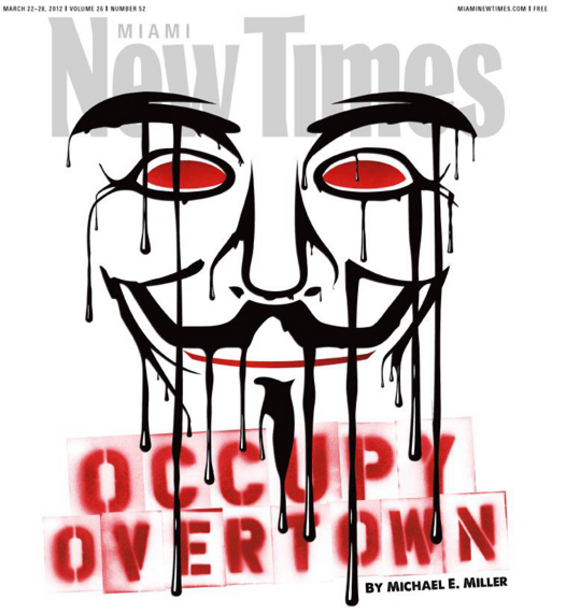
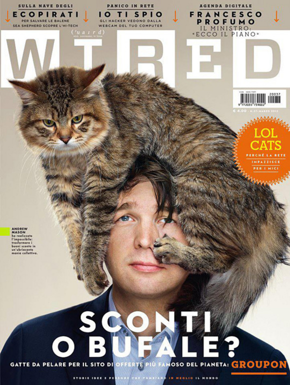
News 03.28.12
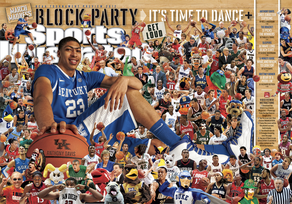
Cover of the Day 03.28.12
Welcome to SPD's Cover of the Day, a portfolio of brilliant magazine and newspaper cover design from around the world.
Behind-the-Scenes 03.27.12
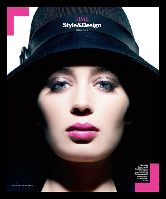
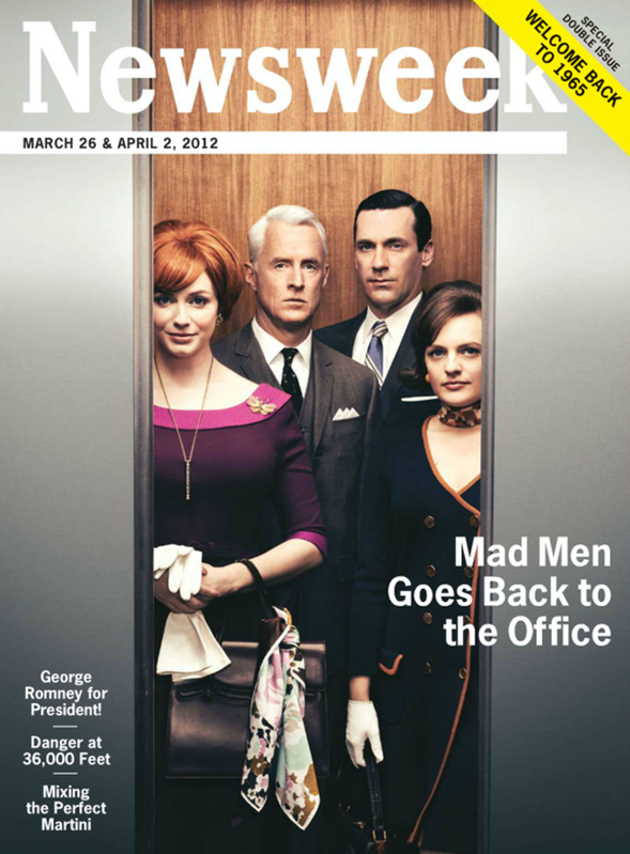
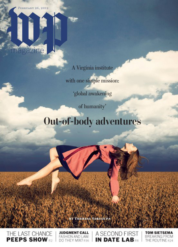
Cover of the Day 03.26.12
Welcome to SPD's Cover of the Day, a portfolio of brilliant magazine and newspaper cover design from around the world.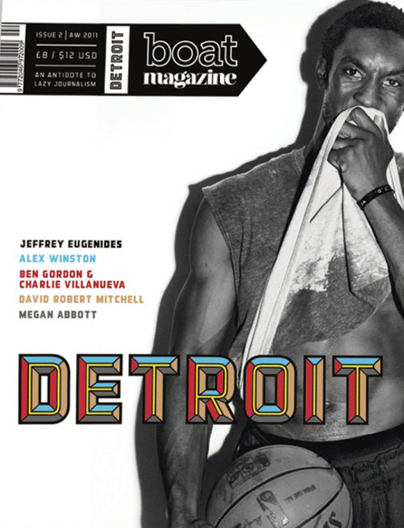
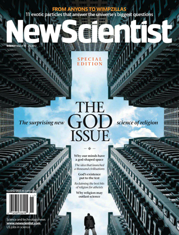
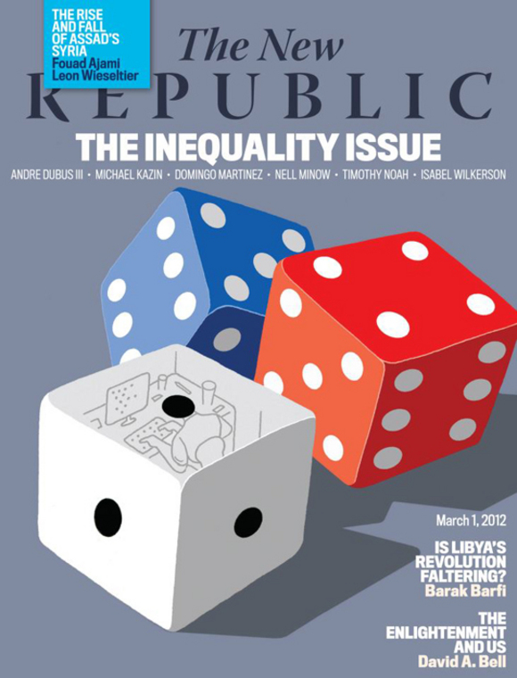
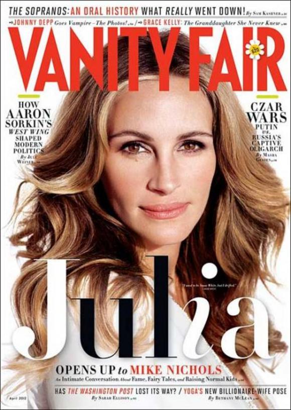
Cover of the Day 03.23.12
Welcome to SPD's Cover of the Day, a portfolio of brilliant magazine and newspaper cover design from around the world.
47 03.22.12
I was introduced to LOTUS Magazine at the photographer Tom Schierlitz's studio. He shot an entire portfolio with over 25 pages of Lotus car parts. The pictures were quite beautiful and so was the magazine, I immediately dove in and took notice.
The architecture in the FOB is easy to get through but it never gets old and formatted. Each page is a new adventure but the brand stays consistent and alive. Other features include tons of sexy women, fast cars and travel stories. The photography is amazing and is always accompanied by super powerful type that owns the page. The canvas on this over-sized mammoth is well used. Lotus magazine is aggressive but sophisticated, all in the same breathe. Respect to the CD, Anton Ioukhnovets.

47 03.21.12
When I first moved to Japan over 10 years ago and started digging into the Japanese magosphere, Brutus was one of the first titles I latched on to, and it introduced me to the idea of entire issues that focus on a theme. Sure, this wasn't a new notion, but it was interesting to me how so many of Japan's culture magazines used this, and how these themes really ended up touching on sections beyond the feature well. Brutus continues to do this, and although I won't check out every issue, I will pick it up if it's a topic I'm interested in, like the current issue's "Mellow Out" theme, which points us to some of Japan's best spots to take in a coffee or drink, accompanied by a soothing soundtrack. It was also one of the first mainstream magazines I encountered that regularly included beautiful inserts using a different paper stock in the current issue, it acts as a pull-out guide to the featured spots.
Cover of the Day 03.21.12
Welcome to SPD's Cover of the Day, a portfolio of brilliant magazine and newspaper cover design from around the world.
Life Outside of Work 03.20.12

47 03.20.12
I've chosen Uppercase because I love the whole package. It is playful and "up," without being over designed. I tip my hat to Janine Vangool who is the publisher, editor and designer. She has created a beautiful format and each page is kind of a feast for the eyes-- not just the design but the featured content. If you love "how-to," and are the "curious sort," about how beautiful graphic things are made it's hard not to enjoy this publication. This issue included intricately carved crayons and the art of paper cutting. Loved the "handy guides," collection. I admit that I am seduced by the beautiful paper and even the smell of fresh ink when I open the package. In this time of troubled publishing it's nice to learn that this wonderful publication, is created by a small team (3 people I think!) in Calgary, Alberta, Canada.

47 03.19.12
Blabworld is an annual collection of articles, sequential art, cartoons, paintings, drawings, and sculpture, all beautifully reproduced. There are no photographs or advertisements, which creates a unique reading and viewing experience from cover to cover. Blabworld is curated and designed by its founder, Monte Beauchamp, which has allowed the periodical to maintain a clear editorial voice over the years.
Cover of the Day 03.19.12
Welcome to SPD's Cover of the Day, a portfolio of brilliant magazine and newspaper cover design from around the world.
iPad 03.16.12
Covers 03.16.12

47 03.16.12
My favorite magazine? Impossible to name one. But my fave discovery in the past year was Vintage magazine, which gives an obvious nod to the great FLAIR in it's mission statement, to bring "the eloquent voices of today's writers and artists, the impact of history on our present culture. The term "vintage" is used in its broadest sense-- focusing on the excellence of, the finest of things, both in content and presentation". Handcrafted with die cuts, foldouts, and hand-stitched binding, it represents the current craving for handcrafted zines that live alongside the tablet apps that are flooding the magazine landscape.
Cover of the Day 03.16.12
Cover of the Day 03.16.12

Typography 03.16.12

47 03.15.12
DON'T HATE ME! My fave magazine? Please! I've been in the publishing business way to long to have a simple answer to that question.
Yesterday it was one magazine; last week, another; and last month it was definitely an old issue of FMR that I came across in my partner's studio. And for those 20 minutes, FMR was the only thing that mattered in the entire world. Amazing photography. Simple, elegant layout. Content that thrilled and titillated. You don't know FMR? An Italian art magazine that showcased art from around the world, but they specialized in more obscure artists. They introduced me to many artists I never knew about (Like Romaine Brooks; American portrait artist from the 20s). Yes, I'm using the past tense on purpose...they ceased publication. No more.
You can always Google "FMR" and we'll chat at the next SPD Gala.
Speaking of finding things online, a constant new source of design inspiration comes to me currently from eBay: OLD MAGAZINES! The crazy stuff they did in the '60s, '70s, hell, even the '80s. Check out these spreads from Family Circle (excuse my bad photography). Turns out we have a whole collection at home of old Family Circles. I've spent way too many hours with them....
So, for all those folks that hate me for being so retro...I'm ALSO really loving some of the cool things magazines are doing on the iPad, and other digital devices, these days. There's some totally cool stuff out there that takes the 2D of the printed page and throws you into a multi-dimensional world, way beyond anything print could do. Let's hand out a few more SPD awards for these innovative guys!

New+Notable 03.14.12

47 03.14.12
There are lots of fun magazines in Australia. And happily there is a resurgence of independent and creatively different magazines being published.
Frankie Magazine is building a really dedicated following http://www.frankie.com.au/ it seems to have tapped a new energy and a non-traditional female demographic. Monster Children Magazine http://monsterchildren.com/magazine/ is lots of fun and new indie magazines like Collect Magazine are looking beautiful, http://www.collectmag.com.au/
My favorite is more about what magazines do better than anything else; the ability to connect with a 'club' of readers, to tantalize and transport them through imagery, words and unspoken style. It's Vogue Living Australia, an interiors, travel and food magazine that is really a magazine about beauty. A throwback to the idea of luxury being an inspiration for all. Finely edited and assembled, it is a high point of commercial magazines in Australia because it proves the power of the medium. I'm looking forward to Vogue Living grappling with their digital future. If they do it well, a whole new world of readers opens up to them.

New+Notable 03.14.12
Cover of the Day 03.14.12

47 03.13.12
Case Da Abitare has a bold visual identity and content structure that supports it's distinctive editorial vision issue after issue that I find appealing. I love the rigor of the content, photography and typography. I have all of the issues since it's redesign in 2008.

Designers 03.13.12

47 03.12.12
Esquire is my favorite magazine. It is the perfect marriage of smart design and smart editorial content. Every page is a visual surprise; I am consistently in awe of the graphics and imagery. How do they do it? Not only is the print edition spectacular but they have done an amazing job of translating that energy and spontaneity into a fantastic iPad edition. In my estimation they are the benchmark of what a print magazine or a digital magazine should be. Cool. Fun. Surprising.
Cover of the Day 03.12.12
Welcome to SPD's Cover of the Day, a portfolio of brilliant magazine and newspaper cover design from around the world.
47 03.09.12

47 03.09.12
Beer is the member magazine for the Campaign for Real Ale (CAMRA), the independent voluntary organisation promoting good-quality real ale and pubs in Britain. Jes Stanfield is the creative director and it's produced by Think Publishing.
The magazine makes you feel part of a club. Each cover has a unique design which generally has a handmade quality that reflects the craft beers promoted inside. The design is warm and chatty and follows the seasons, just like the ale and pubs celebrated throughout. The photography and illustration capture the perfect drinking moment and almost force you to pop into your local, sit down in front of the fire with a packet of pork scratchings and sip a warm pint of great beer!
Cover of the Day 03.09.12
Welcome to SPD's Cover of the Day, a portfolio of brilliant magazine and newspaper cover design from around the world.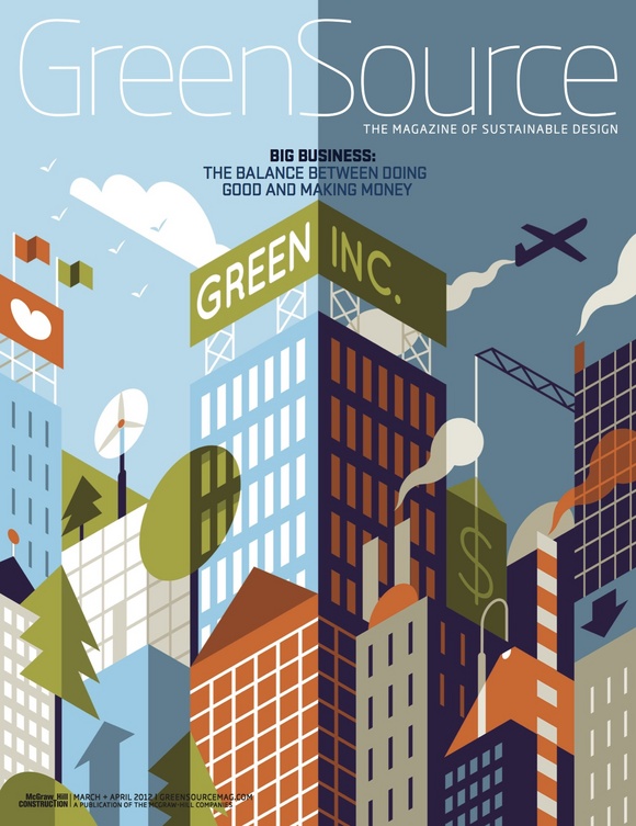
Cover of the Day 03.08.12

47 03.08.12
Picking just one mag is hard. My mag addiction gone kind of 'meta' of late. I've been going through phases of following certain art directors and editorial teams, so my faves have been flipping about. There are constants though and Little White Lies is the only magazine I've re-subscribed to year upon year. Even when I went to Australia for a year, I made sure I was getting my bimonthly fix.
Why Little White Lies above all else? Let me count the ways... Firstly the editorial format is so well considered, the way the mag is divided into chapters--I heart that. Secondly, it looks like nothing else. The imagery contained within borrows, not from other magazines, but from the vast history of visual culture, using cinema as it's starting point. The use of illustration over photography not only solves the problem of dealing with the over-photoshoped hell that is the modern movie marketing gumph but also contributes to it's unique and vibrant feel.
It's one of those mags that I don't want to imagine the world without. It's a rare gem of a mag that suggests it should be collected and coveted. It is also the very antitheses of the throw-away culture mainstream magazines have cultivated and has become their un-doing. Long may it, and the team behind the title at Church of London, survive and prosper.

Behind-the-Scenes 03.08.12

47 03.07.12
BUTT, Fantastic Man and The Gentlewoman are my three favourite magazines... a triptych of first class editorial design emulated (and envied) on many an art desk. Classic fonts (old fashioned, even), simple columned pages, honest photography, no fuss. These magazines are less "look at me" and more "go on, you know you wanna read me". And, as editorial designers, isn't this our job???
Art director Jop van Bennekom's work is the antidote. Respect.
Cover of the Day 03.07.12

47 03.06.12
OK, I admit it. Undivided magazine loyalty evades me. It always has.
To me, magazines are like food. Different publications satisfy different needs on different days in various periods of my life.
That said, I have do have reoccurring cravings and Eye is one of the titles I revisit.
Many magazines on Graphic Design excessively focus on showcasing the talents of the publication's art direction. Eye understands and resists this trait.
Although multiple stocks and special inks are the norm, they are used to celebrate and aid the content providing a beautifully restrained but highly produced platform. Layouts have this understated confidence born from brilliant, unexpected and thoroughly researched content.
It's beyond fashion. Encyclopedic in nature but accessible in spirit. You don't manically devour
Eye, you quietly savour it.

47 03.05.12
Cover of the Day 03.05.12