Redesigns
01.24.13
Billboard Relaunches in Print, Web and Tablet
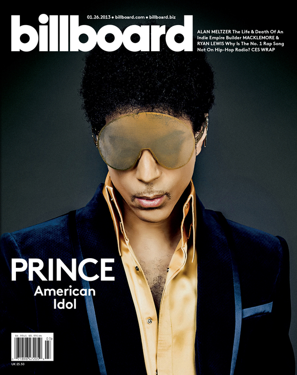
Every magazine has a variation on a "List Issue," whether if be the Fortune 500, Time's Person of the Year, or Rolling Stone's Hot List. The beginning of these issues can arguably be ascribed to Billboard, the music industry's bible and the home to information about every No.1 single, album and artist in recorded music history.
Led by Bill Werde (Editorial Director), Andrew Horton (Creative Director) and Joe Levy (Editor) Pentagram's Michael Bierut & Laitsz Ho have redesigned Billboard in a manner befitting its OWN No.1 position. Billboard leads and informs the essential conversations around music and
the music business. This redesign was all about making that a reality.
-
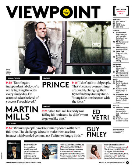
The new TOC
-
-
-
-
CODA for iPad
-
-
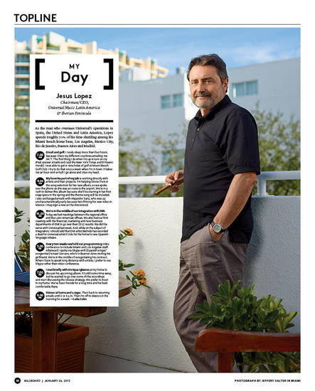
My Day for iPad

-
-
-
-
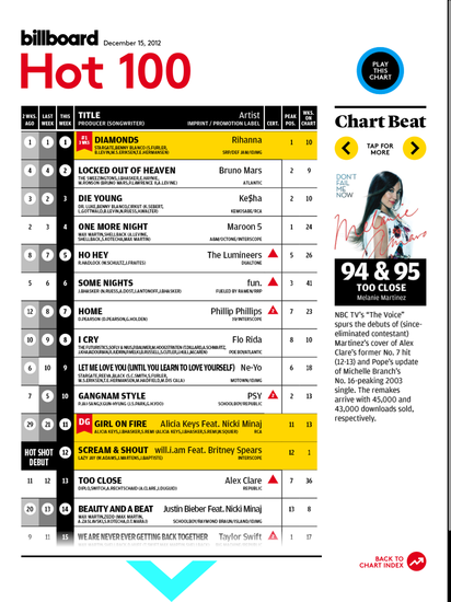
The Billboard Hot 100 for iPad
Creative Director Andrew Horton describes the flow of the new magazine:
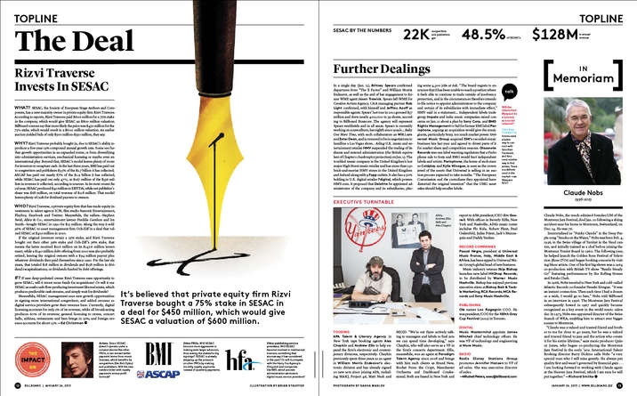
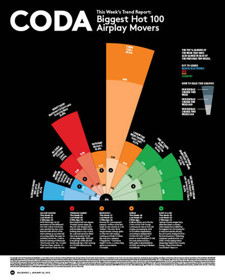
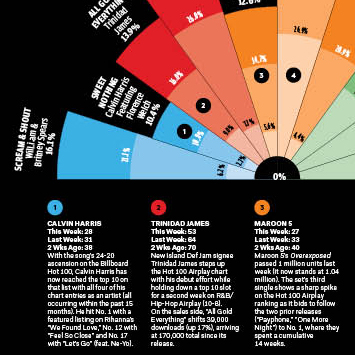
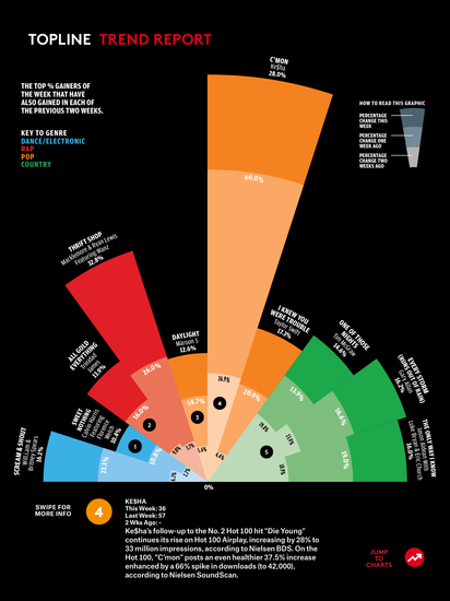
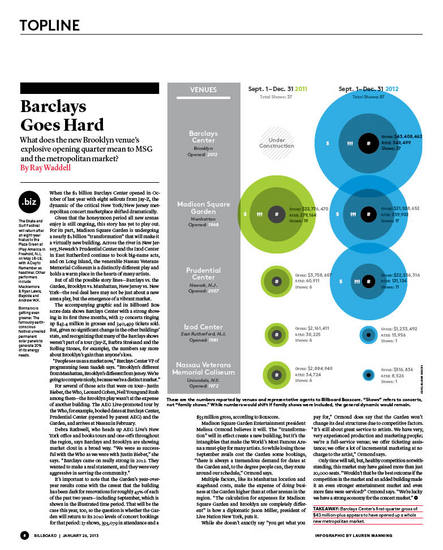
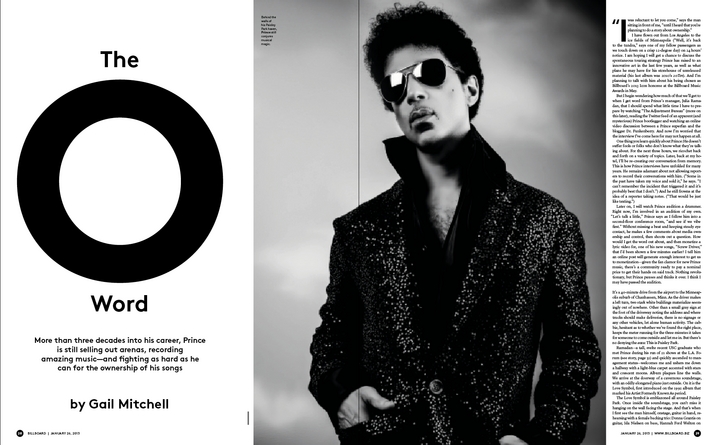
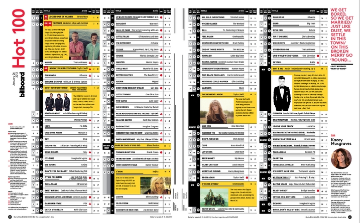
We structured the table of contents as a page of dialog. We elevated top news stories and comments from our community on .biz (Billboard's B2B website) right into the design of the print mag. The layouts have been opened up in such a way that doesn't diminish the amount of information published every week. And of course, we wanted to bring the charts to even more life. Some of that shows up in the designs of the charts pages, where the Billboard Hot 100 and Billboard 200 charts have been given additional space to better tell the stories of the music of the moment. Additionally, we've brought our data and the music insights they fuel into sharper focus throughout the book. For example our back page, or Coda, will show what's trending fastest each week, and our Topline info graphic will tell a story of a different segment of the industry each week.
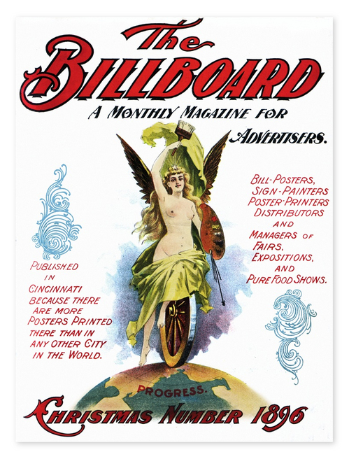
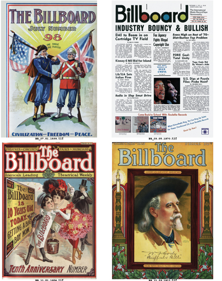
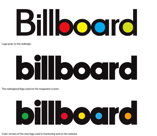
Founded in 1894, Billboard originally got its name from billboard advertisements for live entertainments like carnivals and fairs. It started publishing musical charts in the 1930s, launched its signature "Hot 100" in 1958, and by the 1960s was exclusively covering music. In the past decade the publication has have transitioned from looking like a trade newspaper--text-filled covers in black and white--to a mainstream music magazine, with color portraits of artists and cover lines.Since 1966, the magazine's familiar masthead identity has featured lettering with strong circular forms that suggested records (and later CDs) and kicky "mod" colors. As part of the refresh the logo has been completely redrawn to emphasize the basic geometry of the name, creating a typeface that echoes the circles of the original and still looks "pop." The designers have set the name entirely in lowercase, tightened the spacing and, perhaps most importantly, removed the colors from the circles. This makes the print version look immediately more grown-up and serious, and a lot easier to design with full-bleed color photographs. The color version of the logo will be retained on the new website (designed by Area 17) as well as in retail uses and event marketing.
Billboard's iPad app also launched this week, and the first issue is available for a free download. Take a look!
Recent Redesigns:
