New Work
09.11.14
The Secrets Behind PORT's Success
Gym Class editor-in-mischief Steven Gregor's back on SPD. This time chatting with Port magazine's creative director Kuchar Swara. Can't get enough of the mag love!
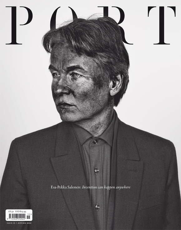
Hey Kuchar, thanks for chatting with us. Wow... the 15th issue of Port is rockin' an epic cover by photographer Pieter Hugo. Congrats. He's a favourite of yours. Talk us through the decision to have Pieter shoot the cover, and for the shoot to be in his signature 'pigmented' style.
Always a pleasure, sir. We have a new photo editor working with us at Port, Rebecca McClelland. She initially pitched the idea. I'd always considered Pieter a great art photographer, so working with him on an editorial feature was a real honor.
I wanted Pieter's aesthetic to be as prominent as the cover star. The cover is not only a well art directed cover and interesting subject, but also an art object in its own right.


Finnish orchestral conductor Esa-Pekka Salonen is the new issue's cover star. What makes a great Port cover story? And, talking design, what makes a great PORT cover?
A great cover star for Port is usually the unexpected personality; someone who hasn't been on the cover of many magazines; who has made a significant contribution to the field that they work in.
In terms of design, the cover needs to feel iconic or memorable. We have the luxury of not publishing 10 or 12 issues a year. So whenever we produce a cover it should feel collectable.
Only the one cover line. Does this make it harder... or easier... for Port on the newsstand?
I think those who are acquainted with Port know what the magazine stands for. Those that are not will hopefully be attracted to the unusual cover treatments and give the magazine a try.
I don't think anyone really knows what covers will sell or not. For example, Port's issue 11 (Michael Shannon by Nadav Kander) sold out very quickly despite the lack of any cover lines.
The cover lines question for independent magazines is a different one from the established mainstream titles. These two different worlds co-exist but don't play by the same rules.
We can decide to have a single cover line and respect the cover image in the way we believe it should be - I guess we're lucky!
Describe your working relationship with Port editor-in-chief Dan Crowe?
Working with Dan is a treat. He's half art director, half editor - with a great sense of aesthetic and knowledge of magazines. Like any good team we discuss what stories we want in the magazine and what shape they will take on page. The great thing we have in common is that we get bored quite easily; that's probably why Port hasn't become static.
I hope people expect the unexpected with Port.
Beyond Port, which other magazines do you believe are producing interesting, innovative covers?
You've put me on the spot... let's see... The Gentlewoman can't be bought; Gail Bichler at The New York Times Magazine is doing an incredible job; Russian and Spanish Esquire; Zeit Magazin; MIT Technology Review; The Independent Review; IL; apartamento; New York; and Reportagen (even though it's just colour changes and neat type). I could go on, but I suspect we'll be here for some time.
Again, talking design... inside the new issue, what are your highlights?
I think our fashion in the latest issue has really pushed forward; Robin Broadbent's still life story; new photographer Jack Davison's work in the fashion well; and a lovely fishing for lunch feature. I also enjoyed playing with vertical feature openers.
Thanks Kuchar. We're big fans!
Thank you, mate.
