Recently in Appreciation Category

Art Director Tom Bentkowski Remembers New York Magazine in the 70s

Art Director Tom Bentkowski Remembers New York Magazine in the 70s

Editor's Note: The recent SPD event, For the Love of ...New York Magazine, featured nine former and current design directors and art directors of the magazine. Missing was Tom Bentkowski, who worked as an associate art director in the 1970s under design director Milton Glaser and art director Walter Bernard. For eight months, from June 1977-February 1978, Tom was the New York art director. He was in charge during a period when the magazine was sold, and there were a number of staff changes. Eventually J.C. Suares was hired as design director, and Tom left New York to pursue a very distinguished career at Time Inc, working as the longtime, multi-award winning art director of Life magazine. He continues to design and consult on a myriad of publication projects.

Tom sent us this highly personal and very rich history of his experiences at New York magazine. It's accompanied by a series of covers designed during his time as art director.

(Above): New York, November 14, 1977. Illustration: Ed Sorel.

BY TOM BENTKOWSKI
By now, people might take for granted that the concept and content of New York magazine have always existed, But it was, in its day, a wonderfully fresh and innovative idea. It's longevity is a testament to its intelligence and creativity. The magazine, in its history, not only became the indispensable guide to the difficulties and delights of living in New York, it made an enormous contribution to the world of design and art direction. The ripples and reverberations are felt everywhere.

My own connection with the magazine was, in fact, quite a long one. I happily and gratefully had the most basic, entry-level position during some of the magazine's most exciting times, and I was the art director (for a very short time) through some of the magazine's most turbulent days.
MORE
Dorothy and Otis: Designing the American Dream

Dorothy and Otis: Designing the American Dream

On Tuesday, March 3, Dorothy and Otis authors Norman Hathaway and Dan Nadel will present a free illustrated lecture at the New York Public Library on 42nd Street. Don't miss this rare look at the amazingly talented illustrator/designer team of Dorothy and Otis Shepard.

Dorothy and Otis Shepard were groundbreaking modernist graphic designers and illustrators, whose work, particularly in the 1930s and 40s, but also well into the 1960s, helped define the look of American billboards, advertisements, sports teams, and much more. Norman Hathaway and Dan Nadel have compiled Dorothy and Otis: Designing the American Dream, an astonishing visual life of this husband and wife team, thanks to a treasure trove of photographs, artwork, sketches, and diaries compiled by Dorothy before her death in 2000 and passed along by her son and granddaughter. Hathaway is an accomplished illustrator and art director in his own right (I've worked with him on many projects over the years), and he brings that multi-disciplinary approach to compiling this book.

Dorothy and Otis is rich in both visuals and biographical detail. The Shepards, singularly and together, designed and illustrated a series of billboards for Wrigley's chewing gum in the 1930s and 40s. Otis Shepard later became the defacto creative director for the Chicago Cubs baseball team (they were owned by Wrigley), designing program covers, logos, and even uniforms. His cover illustrations for the Cubs programs and yearbooks are probably his most well-known work, striking graphically modern images that pop off the pages.

(Above): Chicago Cubs program designed and illustrated by Otis Shepard, 1953
MORE
Entertainment Weekly. The Covers, Part 8: Tim Leong

Entertainment Weekly. The Covers, Part 8: Tim Leong

-1.jpgOn September 30 at the SVA Theater in NYC, every design director from Entertainment Weekly's 25 year history will gather for an historic event, For the Love of Enterainment Weekly. The evening is part of SPD's 50th anniversary celebration, as well as an advance notice of EW's 25th anniversary, which is February 16, 2015.

Former EW design directors Michael Grossman, Robert Newman, John Korpics, Geraldine Hessler, Brian Anstey, Kory Kennedy, and current DD Tim Leong will show their work and give an inside look at the magazine's creation. There will also be a special tribute to former DD Amid Capeci.

As a lead up to the event, SPD will be showcasing the cover pages of each design director. Here are the EW covers of the magazine's eighth (and current) design director, Tim Leong. These covers all date from 2014. The photo director for these covers was Lisa Berman.

(Above): Photographer: Robert Trachtenberg, photo editor: Natalie Gialluca

MORE
Entertainment Weekly. The Covers, Part 7: Kory Kennedy

Entertainment Weekly. The Covers, Part 7: Kory Kennedy

-1.jpgOn September 30 at the SVA Theater in NYC, every design director from Entertainment Weekly's 25 year history will gather for an historic event, For the Love of Enterainment Weekly. The evening is part of SPD's 50th anniversary celebration, as well as an advance notice of EW's 25th anniversary, which is February 16, 2015.

Former EW design directors Michael Grossman, Robert Newman, John Korpics, Geraldine Hessler, Brian Anstey, Kory Kennedy, and Tim Leong will show their work and give an inside look at the magazine's creation. There will also be a special tribute to former DD Amid Capeci.

As a lead up to the event, SPD will be showcasing the cover pages of each design director. Here are the EW covers of the magazine's seventh design director, Kory Kennedy, plus comments by Kory on how the covers were created. These 16 covers date from the years 2012-14. The photo director: for these covers was Lisa Berman; managing photo director: Sarah Czeladnicki.

(Above): October 5, 2012. Photograph: Ruven Afanador, photo editor: Michele Romero.
MORE
Entertainment Weekly. The Covers, Part 6: Amid Capeci

Entertainment Weekly. The Covers, Part 6: Amid Capeci

-1.jpgOn September 30 at the SVA Theater in NYC, every design director from Entertainment Weekly's 25 year history will gather for an historic event, For the Love of Enterainment Weekly. The evening is part of SPD's 50th anniversary celebration, as well as an advance notice of EW's 25th anniversary, which is February 16, 2015.

Former EW design directors Michael Grossman, Robert Newman, John Korpics, Geraldine Hessler, Brian Anstey, Kory Kennedy, and Tim Leong will show their work and give an inside look at the magazine's creation and visual legacy. There will also be a special tribute to former DD Amid Capeci.

As a lead up to the event, SPD will be showcasing the cover pages of each design director. Here are the EW covers of the magazine's sixth design director, Amid Capeci, plus comments on how they were created. The covers date from the years 2009-2010. The director of photography for all of these covers is Lisa Berman.

Note: Amid Capeci passed away in 2012.

Above: July 30, 2010. Typography by Joe Zeff Design.
MORE
Entertainment Weekly. The Covers, Part 5: Brian Anstey

Entertainment Weekly. The Covers, Part 5: Brian Anstey

-1.jpgOn September 30 at the SVA Theater in NYC, every design director from Entertainment Weekly's 25 year history will gather for an historic event, For the Love of Enterainment Weekly. The evening is part of SPD's 50th anniversary celebration, as well as an advance notice of EW's 25th anniversary, which is February 16, 2015.

Former EW design directors Michael Grossman, Robert Newman, John Korpics, Geraldine Hessler, Brian Anstey, Kory Kennedy, and Tim Leong will show their work and give an inside look at the magazine's creation. There will also be a special tribute to former DD Amid Capeci.

As a lead up to the event, SPD will be showcasing the cover pages of each design director. Here are the EW covers of the magazine's  fifth design director, Brian Anstey, plus comments on how they were created. The covers are from the years 2008-2009. The photo editor of Entertainment Weekly during this period was Fiona McDonagh, followed by Lisa Berman.

Above: Stephen Colbert and John Stewart parody The New Yorker cover, October 3, 2008.MORE
Entertainment Weekly. The Covers Part 4: Geraldine Hessler

Entertainment Weekly. The Covers Part 4: Geraldine Hessler

-1.jpgOn September 30 at the SVA Theater in NYC, every design director from Entertainment Weekly's 25 year history will gather for an historic event, For the Love of Enterainment Weekly. The evening is part of SPD's 50th anniversary celebration, as well as an advance notice of EW's 25th anniversary, which is February 16, 2015.

Former EW design directors Michael Grossman, Robert Newman, John Korpics, Geraldine Hessler, Brian Anstey, Kory Kennedy, and Tim Leong will show their work and give an inside look at the magazine's creation. There will also be a special tribute to former DD Amid Capeci.

As a lead up to the event, SPD will be showcasing the cover pages of each design director. Here are the EW covers of the magazine's fourth design director, Geraldine Hessler, plus comments on how the covers were created. These 16 covers date from the years 1999-2008.

Above: The Dixie Chicks, March 2, 2003.

The Dixie Chicks: We shot this cover right after Natalie Maines spoke out against President Bush while on tour in London, and the band was being called all kinds of horrible names. It was actually their idea to pose nude with all the slurs on their bodies. The original idea was to have bumper stickers made and to plaster their bodies with them, but we had a body painter on set just in case the stickers didn't work. It was a good thing, because the shipment of stickers never made it. The band loved this image so much that they used it for the poster for their movie.


MORE
Entertainment Weekly. The Covers, Part 3: John Korpics

Entertainment Weekly. The Covers, Part 3: John Korpics

-1.jpgOn September 30 at the SVA Theater in NYC, every design director from Entertainment Weekly's 25 year history will gather for an historic event, For the Love of Enterainment Weekly. The evening is part of SPD's 50th anniversary celebration, as well as an advance notice of EW's 25th anniversary, which is February 16, 2015.

Former EW design directors Michael Grossman, Robert Newman, John Korpics, Geraldine Hessler, Brian Anstey, Kory Kennedy, and Tim Leong will show their work and give an inside look at the magazine's creation. There will also be a special tribute to former DD Amid Capeci.

As a lead up to the event, SPD will be showcasing the cover pages of each design director. Here are the EW covers of the magazine's third design director, John Korpics, along with some fun behind-the-scenes comments from John about how they came together. These 13 covers date from the years 1996-1999.

(Left): Howard Stern, March 7, 1997. Photograph by Jill Greenberg.


MORE
Entertainment Weekly. The Covers, Part 2: Robert Newman

Entertainment Weekly. The Covers, Part 2: Robert Newman

-1.jpgOn September 30 at the SVA Theater in NYC, every design director from Entertainment Weekly's 25 year history will gather for an historic event, For the Love of Enterainment Weekly. The evening is part of SPD's 50th anniversary celebration, as well as an advance notice of EW's 25th anniversary, which is February 16, 2015.

Former EW design directors Michael Grossman, Robert Newman, John Korpics, Geraldine Hessler, Brian Anstey, Kory Kennedy, and Tim Leong will show their work and give an inside look at the magazine's creation. There will also be a special tribute to former DD Amid Capeci.

As a lead up to the event, SPD will be showcasing the cover pages of each design director. Here are the EW covers of the magazine's second design director, Robert Newman (that's me!) from the years 1994-96. The photography directors for these covers were Mary Dunn and Doris Brautigan.

(Cover left): April 22, 1994, published after the death of Nirvana's Kurt Cobain.
MORE
Entertainment Weekly. The Covers, Part 1: Michael Grossman

Entertainment Weekly. The Covers, Part 1: Michael Grossman

-1.jpg
On September 30 at the SVA Theater in NYC, every design director from Entertainment Weekly's 25 year history will gather for an historic event, For the Love of Enterainment Weekly. The evening is part of SPD's 50th anniversary celebration, as well as an advance notice of EW's 25th anniversary, which is February 16, 2015.

Former EW design directors Michael Grossman, Robert Newman, John Korpics, Geraldine Hessler, Brian Anstey, Kory Kennedy, and Tim Leong will show their work and give an inside look at the magazine's creation. There will also be a special tribute to former DD Amid Capeci.

As a lead up to the event, SPD will be showcasing the cover pages of each design director. Here are the EW covers of the magazine's first design director, Michael Grossman (and, he hastens to add, art director Mark Michaelson) from the years 1990-94. The photography directors for most of these covers were Mary Dunn and Doris Brautigan.

(Cover shown: Arsenio Hall, April 27, 1992)
MORE
My Favo(u)rite Magazine: LIFE, November 1983

My Favo(u)rite Magazine: LIFE, November 1983


MyFavouriteMagazine5813134538.png
Earlier this year I was asked to contribute to a project called "My Favo(u)rite magazine" to help raise money for our dear friend and comrade Bob Newman who was seriously injured, and is now on the long road to recovery. At the time I was going through the last stages of cancer with Muggs, my 11 year old Boston Terrier and was unable to pull it together in time. About a month ago I realized I could still contribute by posting my own story about my favorite magazine on SPD in effect extending the story of Bob's continuing recovery. By pure coincidence my favorite magazine has quite a lot in common with a pretty significant anniversary happening this weekend.

MORE

"Namaste" to Tim J Luddy of Mother Jones

When the editors of Mother Jones recently announced that longtime creative director Tim J Luddy was leaving the magazine "to build his yoga-teaching practice," it sounded to some like the West Coast equivalent of "spending more time with his family" or "pursuing other interests." In this case, though, the story is true. Luddy, who has been creative director for six years, is a longtime yoga practitioner and an RYT-200 certified teacher, even leading the Mother Jones staff in Down Dogs in the magazine's conference room.

That may explain the sense of zen calmness that Luddy has brought to the magazine's design and production. He has continued the Mother Jones tradition as a showcase of smart, provocative illustration, while giving the design a look of grace and elegance. His cover designs remind me a lot of the first years of Mother Jones, when it was art directed by Louise Kollenbaum. The covers lean heavily on illustration, but tend to be understated, often humorous, provocative without being off-putting, and always smart and engaging.

For more on Luddy at Mother Jones, see this SPD Three Questions With interview (it also gives you a sense of Luddy's personal style).

The good news is that as Luddy builds his new yoga teaching website and prepares for a yoga retreat in Hawaii, the new creative director of Mother Jones will be Ivylise Simones, former art director of The Village Voice and Rides magazine, among others. Meanwhile, I can think of a few magazine staffs who could benefit from some of Luddy's calming yoga practice! We here at SPD say "namaste" to Tim, and wish him the best in his new career.

Here are 10 of our favorite Mother Jones covers created by Luddy, plus a hilarious "47 percent" wine label designed in honor of a Mother Jones custom blend of Cabernet Sauvignon and Malbec. (According to Luddy, the wine is much better than the Presidential candidate who inspired it!)

(Above): July / August 2013, illustration: Tim O'Brien
MORE
A Friends of Bob Newman Update

A Friends of Bob Newman Update

Our beloved friend and colleague (and former SPD President) Bob Newman was severely injured in March. He spent several days in critical condition, was in a coma for weeks, hospitalized for months, and is still spending his days rehabilitating--receiving physical therapy, undergoing tests, working hard to get back to health.

In the months since the accident, not only has Bob been unable to work to support his family, but the expenses involved in his ongoing care have been huge, and they continue to mount.

A group of Bob's friends (Florian Bachleda, Michael Grossman, and Emily Smith) launched the Friends of Bob Newman donation site in April as a tangible way to help Bob and his family as he continues his road to full recovery. The outpouring of support from Bob's extended family and community through the donation site has been remarkable. The funds raised to date have made a significant contribution to paying off Bob's extensive medical bills and providing him and his family with much-needed living expenses while he's recovering. 

There is good news about Bob's rehabilitation, and the Friends of Bob Newman site has announced a new goal to raise even more money to continue to help.
MORE
Remembering George Delmerico, Longtime Art Director of The Village Voice

Remembering George Delmerico, Longtime Art Director of The Village Voice


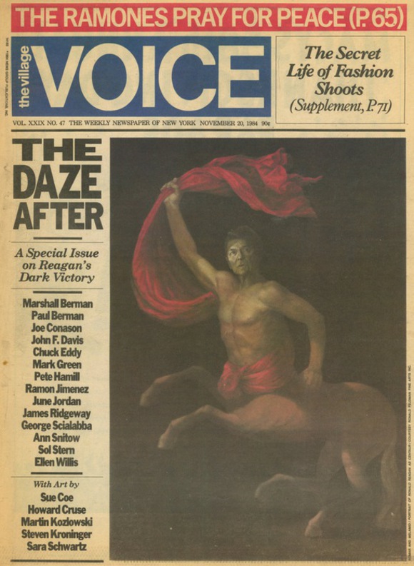
Longtime Village Voice art director George Delmerico passed away in early August in Santa Barbara, California at the age of 67.

Delmerico was a talented and eclectic art director who designed LP covers (most notably Donald Fagen's The Nightfly), posters, books, alternative newspapers, and much more, but it was his work as art director of The Village Voice from 1976-85 where he produced the most memorable and influential imagery. Delmerico took over from previous art director Milton Glaser, and created a design that was notable for its studied elegance, spare use of color and typography, and bold imagery. Delmerico worked with and introduced a generation of Voice photographers and illustrators, including Sylvia Plachy, James Hamilton, Walter Gurbo, Philip Burke, Stephen Kroninger, Mark Alan Stamaty, and many more, while becoming perhaps the most influential alternative weekly newspaper art director of all time.

On the turn page we've collected some of Delmerico's most memorable Voice covers, as well as a remarkable set of remembrances from some of his Village Voice co-workers and collaborators.

(Above): The Village Voice, November 20, 1984. Art director: George Delmerico. Art: Komar and Melamid.

MORE
The Going Away Cover

The Going Away Cover

We've all either made 'em or received 'em: The infamous "Going Away" cover. Here's a look at a great tradition in magazine publishing:… MORE
The Art of Political Caricature on Magazine Covers, 1960-76

The Art of Political Caricature on Magazine Covers, 1960-76

If you're as stressed-out as we are from the current political campaign, here's an antidote. Julie Mihaly (Boom Underground) and myself (Newmanology) have collected a big set of images of 1960s-70s politicians, and are posting them daily on our Facebook and Tumblr pages. It's a rich collection of campaign goodies, including comic books, posters, buttons, photographs, and general fun political merchandise (Spiro Agnew mouthwash, JFK bubblegum cards, a Barry Goldwater coloring book). And of course, there are many brilliant vintage magazine covers, featuring illustrated portraits by a great selection of artists. We've collected some of our favorites here, with illustrated portraits by Paul Davis, Ben Shahn, David Levine, David Stone Martin, Andy Warhol, Norman Rockwell, and more.

(Above): Newsweek, November 12, 1973. Illustration of Richard Nixon by Robert V. Engle
MORE
The New Republic Cover Retrospective, 2001-12

The New Republic Cover Retrospective, 2001-12

For the past 11 years, Joseph Heroun and Christine Car have been art directing and designing The New Republic. Working remotely from New York City and Boston (TNR has been based in Washington, DC), they redesigned the magazine twice, produced it on a weekly, and since 2007, a bi-weekly schedule, and created a series of powerful, provocative, and distinctive covers, featuring a remarkable line-up of illustrators.

The New Republic recently went through a change of ownership and a move to New York City, and with that they've hired Dirk Barnett as their first full-time, on-site art director. Heroun and Car will be working on The New Republic through the end of the year, while Dirk Barnett cooks up some coolness of his own behind the scenes. It seems like a good time to look back at the amazing body of work created over the past decade by Heroun and Car.

(Above): The New Republic, December 30, 2010. Illustration: Sean McCabe
MORE
The 50th Anniversary of the First George Lois Esquire Cover

The 50th Anniversary of the First George Lois Esquire Cover

This month marks the 50th anniversary of the first cover that George Lois designed for Esquire, (October 1962), and Fast Company is making note of it in their new design issue and on their iPad app. This photograph of Lois holding his first Esquire cover, by Platon, appears exclusively in the October 2012 Fast Company iPad app issue. There are other great Lois portraits by Platon, and a conversation between the two on creativity and courage. And there's a brilliant video on the iPad app of Lois reciting the lyrics to Bob Dylan's "The Times They Are A-Changin.'"

Fast Company creative director Florian Bachleda has unearthed a classic story about that first Lois cover, and the Esquire publisher's worried response.


MORE
The Centenarian Magazine Club

The Centenarian Magazine Club

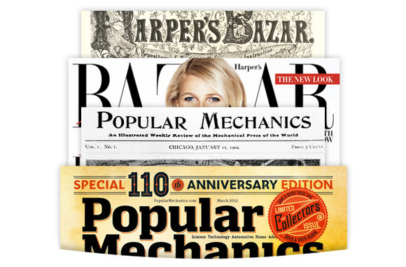
Popular Mechanics celebration of their 110th Anniversary, sparked an interested to see what other (still publishing) magazines that have joined the centenarian club. Here's a look...… MORE
The Guardian's G2 Section Covers

The Guardian's G2 Section Covers

G2 is the daily (Monday-Friday) features section of the Guardian newspaper, based in London. It was the launching pad for Richard Turley, now the creative director at Bloomberg Businessweek. His successor, Joanna Cochrane, has been continuing the marvelous graphic tradition of the section's covers. Most of their covers are done in a day, on a limited budget, and are brilliant visual solutions, smart, funny, engaging, and graphic. Cochrane is an art department of one, and creates a lot of the imagery herself, turning out state-of-the-art cover design, every day. We love it!

Here's Joanna Cochrane's description of her cover design process: "I usually don't get more than a few hours to decide on a solution for the cover. We have an editorial meeting at midday. Prior to that I don't know what the content that day will be. All the covers are turned around in a matter of hours. I discuss concept ideas with my editor, then execute the strongest one. Often there's a complete rethink to react to news at 4pm, and we go to press at 6.30. I use our imaging department or Steve Caplin if I need any retouching or manipulation done, and work to a strict budget, with an occasional illustration commission."

(Above): February 4, 2011. Photo illustration by Sarah Plane / Guardian Imaging.
MORE
Bloomberg Businessweek: The Features

Bloomberg Businessweek: The Features

It's the covers of Bloomberg Businessweek that get lots of attention (and rightly so), but their feature spread design is just as smart, original, groundbreaking, and fun. Here are 10 of our favorites from the past year.

On Thursday, April 21, SPD is presenting Bloomberg Businessweek: Process, an evening that will look behind the scenes with creative director Richard Turley and the Businessweek visual team. Tickets are on sale now. We expect they'll be sold out in the next couple days, so make your plans and reserve your space ASAP!

You can see these features and more on the Bloomberg Businessweek feature Flickr page here. You can get comments and smart visual ideas from Richard Turley on his Tumblr blog here. And if you're on Twitter, you can see the latest Businessweek covers as they're posted by following  @BizWeekDesign.
MORE
Bloomberg Businessweek: The Covers

Bloomberg Businessweek: The Covers

One of the great joys over the past year has been to watch the cover design of Bloomberg Businessweek develop, find its voice, and then explode with a multiplicity of powerful, smart, original visuals, and brilliantly understated typography. On Thursday, April 21, SPD is presenting Bloomberg Businessweek: Process, an evening that will look behind the scenes with creative director Richard Turley and the Businessweek visual team. Tickets are on sale now, and are selling out quickly, so make your plans and reserve your space ASAP!

You can see most of these covers on the Bloomberg Businessweek cover Flickr page here. You can get comments and smart visual ideas from Richard Turley on his Tumblr blog here. And if you're on Twitter, you can see the latest Businessweek covers as they're posted by following  @BizWeekDesign.

Pictured above are 30 Bloomberg Businessweek covers from the 10 months. Get full illustrator and photographer credits here. Get tickets after the jump...
MORE
Happy Birthday Ronald Reagan!

Happy Birthday Ronald Reagan!

February 6 marks the 100th birthday of President Ronald Reagan. Thanks to the combined efforts of the Newmanology Facebook page and the Stephen Kroninger Drawger page, we've collected a batch of classic Reagan publication covers, posters, and illustrations from the 1980s. These feature the talents of Gary Panter, Sue Coe, Anita Kunz, Ralph Steadman, Julian Allen, Robert Grossman, and more, as well as art directors Roger Black, Louise Kollenbaum, and the Gran Fury design collective.

(Above): The Progressive, April 1982. Illustration by Steve Brodner, art director: Patrick Jb Flynn.
MORE
Up: In-Flight Magazine Designed by +2 Designers

Up: In-Flight Magazine Designed by +2 Designers

Up is the in-flight magazine for Portugal's TAP airlines. Since its launch in November 2007, the magazine has been designed by +2 designers, who are Vasco Colombo and Raquel Porto. It's published monthly in mixed languages, Portuguese and English. Each cover is uniquely designed, featuring illustrative typographic treatments by Colombo. And the magazine features fonts by Portuguese font designers (Van by Ricardo Santos and Glosa by Dino Santos). To see an entire issue of Up, you can download the iPad app version for free from the Apple app store.

(Above): April 2009. Photograph: Alexander Koch, styling: Martin Kulik.

Post-production on all covers: Fernando Martins.
MORE
The Art Direction of Musician Magazine: Patrick Mitchell

The Art Direction of Musician Magazine: Patrick Mitchell

For much of the 1980s and 90s, Musician magazine served as a home for creative art direction and imagery. It was a place where art directors learned their trade while producing cool covers and feature spreads. Art directors during this period included Gary Koepke, David Carson, Patrick Mitchell, John Korpics, and Miriam Campiz.

This is the fourth part of our month-long celebration of the art direction of Musician, featuring the work of Patrick Mitchell, who was the art director from 1989-1991. He had been doing Sunday newspaper magazines at The Dallas Morning News and Detroit Free Press before moving to Gloucester, Massachusetts, where Musician was based. Mitchell left Musician to be the art director of Garbage magazine, and in 1995 became the design director of Fast Company. In 2003 he launched PlutoMedia, where he is currently creative director.

(Above): November 1991.
MORE
The Art Direction of Musician Magazine: Miriam Campiz

The Art Direction of Musician Magazine: Miriam Campiz

For much of the 1980s and 90s, Musician magazine served as a home for creative art direction and imagery. It was a place where art directors learned their trade while producing cool covers and feature spreads. Art directors during this period included Gary Koepke, David Carson, Patrick Mitchell, John Korpics, and Miriam Campiz.

This is the third part of our month-long celebration of the art direction of Musician, featuring the work of Miriam Campiz. After stints as an art director at The Boston Globe and Entertainment Weekly, Miriam headed up the art direction of Musician from 1983-85. After leaving she went on to art direct for Newsweek, Latina, Time, Allure, and many more publications, as well as teaching typography and graphic design at SVA and CUNY Baruch.

(Above): August 1994, Glenn Danzig. Photograph by Norman Watson.
MORE
The Art Direction of Musician Magazine: John Korpics

The Art Direction of Musician Magazine: John Korpics

For much of the 1980s and 90s, Musician magazine served as a home for creative art direction and imagery. It was a place where art directors learned their trade while producing cool covers and feature spreads. Art directors during this period included Gary Koepke, David Carson, Patrick Mitchell, John Korpics, and Miriam Campiz.

This is the second part of our month-long celebration of the art direction of Musician, featuring the work of John Korpics. Korpics was the design director for 11 months, in 1992. Before that he had been the art director at Regardie's magazine in Washington, DC. After Musician, Korpics went on to be the design director of Premiere, GQ, Entertainment Weekly, Esquire, and InStyle. He is currently the design director at Fortune.

(Above): John Korpics: "My favorite Musician cover. I always hated the logo though. It was the ugliest logo I've ever had to design with. It was like putting a big turd on my covers."


MORE
The Art Direction of Musician Magazine: Gary Koepke

The Art Direction of Musician Magazine: Gary Koepke

For much of the 1980s and 90s, Musician magazine served as a home for creative art direction and imagery. It was a place where art directors learned their trade while producing cool covers and feature spreads. Art directors during this period included Gary Koepke, David Carson, Patrick Mitchell, John Korpics, and Miriam Campiz.

SPD is going to be hosting a month-long celebration of the art direction of Musician, starting with the work of Gary Koepke. Koepke was an art director at Polaroid before moving to Musician in the mid-80s, where he worked with a staff of two others (a typesetter and an assistant). He describes his design approach at the magazine as "Simple and elegant. The articles were always by great writers, and the photos were all by amazing photographers, so I always respected the word."

After working at Musician from 1984-87, Koepke went on to be the founding creative director of Vibe, designed publications as diverse as Colors, World Tour, and Businessweek, and is the co-founder and executive creative director at creative agency Modernista!

(Above): April 1984. Photograph by Deborah Feingold.
MORE
Details Magazine, 1990-2000, Part 2

Details Magazine, 1990-2000, Part 2

This fall marks the 20th anniversary of the relaunch of Details magazine by Conde Nast. Earlier this month we profiled a set of Details covers from 1990-1998. Now we've got a feast of photography and illustration, from a stellar set of visual creators, including David LaChapelle, Helmut Newton, Dan Winters, Sue Coe, Moshe Brakha, Anton Corbijn and more. Through all its iterations, brilliant photography and illustration has been a Details mainstay. The photos in this collection were all produced by longtime Details photo director Greg Pond.

(Above): April 1996. Photographer: David LaChapelle, design director: Markus Kierzstan, photo director: Greg Pond.
MORE
U.S. News & World Report, R.I.P.

U.S. News & World Report, R.I.P.

U.S. News & World Report was always an also-ran among the newsweeklies. I shunned it both because of its plodding visual design and its conservative, "traditional" American lifestyle politics. And in recent years the magazine had slowed down to a monthly print schedule that seemed confined to circulation in doctors' offices. So this week's news that the magazine was finally killing its print edition was no great loss (they'll continue with their website as well as printing special issues, like college rankings). However, U.S. News did some wonderful covers in the 50s and 60s that were graphic, engaging, and very stylized. We've got a dozen of the coolest, courtesy of their archives.

(Above): November 18, 1949, March 17, 1950, December 26, 1951.
MORE
Bloomberg Businessweek

Bloomberg Businessweek

When Bloomberg Businessweek launched their redesign (and re-imagination) of the magazine at the end of April, the response from the publication design community was somewhat underwhelming. The first couple covers were solid but not remarkable, the insides were crisply formatted but a bit overstuffed, and the imagery had yet to find its full voice. 

It's time to take another look. In the succeeding months, the new design has grown and matured into a remarkable visual package. Week after week, creative director Richard Turley and his crew are producing stunning covers and features, along with tightly formatted interior pages that rival New York for their texture, density, creativity, and attention to detail. This is state-of-the-art magazine design, with highly-original and intelligent photos, graphics, and illustrations. It's a look that fuses the formatting brilliance of New York and the smart visual approach of The New York Times Magazine, with a hierarchy and architecture lifted from the best British and European publications (the Guardian chief among them). Most impressively, Businessweek has a high level of visual intelligence, challenging its readers, pushing the boundaries of traditional newsweekly and business magazine design.

(Above): November 1, 2010, illustration by Nick White.
MORE
Details magazine, version #2, 1990-2000

Details magazine, version #2, 1990-2000

This fall marks the 20th anniversary of the relaunch of Details by Conde Nast, under the editorship of James Truman, along with creative director Derek Ungless, photo director Greg Pond, and fashion director Bill Mullen. The first issues under Ungless's direction were truly groundbreaking, filled with bright, tabloid-inspired design, provocative photography, and cool fashion. Subsequent design directors included B.W. Honeycutt, Markus Kiersztan, and many others, but the constants were Pond and Mullen, who combined to create some of the most memorable magazine imagery of the 90s. Here are some of our favorite Details covers from 1990-1998. Unless noted, all credits include Greg Pond, photo director, and Bill Mullen, fashion director.

(Above): Creative director: Derek Ungless, photographer: Isabel Snyder

MORE
SPOTS (Light) Party Recap

SPOTS (Light) Party Recap

On behalf of SPD and this year's SPOTS co-chairs Criswell Lappin and Matthew Lenning, we would like to congratulate our recent Gold & Silver winners that were celebrated last week with drinks courtesy of our friends at Grolsch. The night was filled with lots of toasts, laughs, and everyone's favorite: cards exchanging and a few personal updates about happenings in the industry. A peek at some folks who attended can be viewed here. A list of the winners, after the jump.

*VERY special thanks to SPD's diligent volunteers, Lauren Heffron & Adri Ramdeane for their hard work!
MORE
Atomic Magazine: Cool Retro Style

Atomic Magazine: Cool Retro Style

Atomic magazine was published from 1999-2004. Jeff Griffith was the co-publisher and creative director of this "essential guide to the retro revival." He describes the magazine's mission as "to bring back the best of a bygone era--the music, the clothing, and the lifestyle--and remind our readers what it means to have fun!" Atomic was filled with retro-styled design, typography, and photography, featuring tons of great talent. The design was lovingly styled to reflect the vintage look of the magazine. Fans of 40s-50s design and imagery will love the pages of Atomic. We've collected some covers and inside pages to celebrate the wonders of this great magazine project, a labor of love by Griffith and editor Leslie Rosenberg.

(Above): The last cover of Atomic. Photograph by Guy Powers.


MORE
Happy 10th Birthday to the Staff of O Magazine

Happy 10th Birthday to the Staff of O Magazine

Oprah Winfrey visited the Hearst Building on Tuesday to deliver a 10th anniversary present to each staff member of O magazine: a brand new iPad, an engraved leather case, and a check for $10,000. Read the story here.
Complex magazine: Tim Leong retrospective

Complex magazine: Tim Leong retrospective

Tim Leong was the design director at Complex magazine for the past four years. He recently left the magazine to move to San Francisco and be the art director at Wired. At Complex he developed a look that was fun, energetic, sexy, and diverse, reflecting the magazine's hip, street attitude. Leong used a rapid-fire mix of cool photography, photo illustration, cartoony illustration, and high-powered graphic typography to create a very original and totally rocking design. Here's a short retrospective collection of Leong's Complex covers and feature spreads.

(Above): Keri Hilson, August/September 2009. Photograph by Matt Doyle, illustration by So-Me.
MORE
25 Years of Spin Magazine

25 Years of Spin Magazine

This month marks the 25th anniversary of Spin magazine. Founder Bob Guccione Jr. was listed on the masthead as Editor, Design Director and Publisher, and was responsible for the original look of the magazine. That look was cool: simple, understated, elegant, geometric, with large photos and plenty of white space. Spin went through a lot of art directors in its day, but the overall look always owed a lot to Guccione's original design. 

Spin has had a lot of great art directors and has a rich visual history. Here are some classic covers. If we missed any of your favorites, please let us know.

(Above): The first issue of Spin, May 1985. Photograph by Herb Ritts; design director: Bob Guccione Jr.
MORE
Black and white covers of The New Yorker

Black and white covers of The New Yorker

This week's cover of The New Yorker by illustrator Bruce Eric Kaplan reminded me of how much I love straight-up black and white magazine covers. And it got us wondering how many other covers of The New Yorker were run totally in black and white (and grey....no color). Kaplan himself has done four others in all black and white, and there are a bunch of others as well, running all the way back to 1925.

This story was co-produced by Linda Rubes.


MORE
Rare Specimen No.9: Don't Run In Socks

Rare Specimen No.9: Don't Run In Socks

I just loves me some good old school illustration gorgeousness. And there's no other illustrator who makes my toes curl quite like Milton Glaser. Therefore, I found myself sifting through my classical record albums over the weekend (silence those guffaws, please) and I came across this lil' honey of an illustration job that Glaser did, back in the 70's (fact checking that). You all know he'd done a whole bunch of lovely album covers, and I knew I had one, I just had to hunt it down. After that, I skittered across the hardwood floor in my socks to a book shelf where I'd stashed an old book Glaser did the cover art for, that I'd bought for a buck at a neighbor's tag sale a year ago. Grabbed it, and then limped over to another bookshelf (acquired sudden back spasm during that prior sock-on-wood move) and … MORE
The Fortune 500 cover legacy

The Fortune 500 cover legacy

The 2010 edition of the Fortune 500 issue will hit newsstands later this week. We don't care whether Wal-mart is #1 again; what we want to know is what creative director John Korpics will do with his first cover of the Fortune 500, the magazine's most celebrated franchise.

First published in 1956, over the years the Fortune 500 has inspired some brilliant covers by legendary Fortune art directors such as Leo Lionni and Walter Allner. Here are 10 of our favorites.

(Above): July 1961. Art director: Leo Lionni; designer: Walter Allner. This cover is an actual chart of the Fortune 500 companies by revenues. Each division in the large circle is five companies. The small circle on top is the key. Dark red indicates companies that had over $5 billion in sales, yellow equals over $2 billion, etc. (Granular chart info courtesy of Linda Eckstein, former graphics editor of Fortune).

This post was written and produced by Linda Rubes, former associate art director of Fortune.


MORE
Classic TV Guide covers

Classic TV Guide covers

For the past three months I've been working with an expert team on a redesign project for TV Guide. The issue featuring the new look of the mag will drop the week of April 12. One of the best parts of the project was digging back into the magazine's rich visual history. Since it launched in 1953, TV Guide has had a long series of spectacular covers. In the 60s and 70s the magazine used a regular stable of illustrators, including Richard Amsel, Al Hirschfeld, Bob Peak, Ronald Searle, and Jack Davis, to create highly engaging and artful covers. They also used occasional guest artists like Andy Warhol, Romare Bearden, and Salvador Dali.

Sadly, there's no central archive of the entire run of TV Guide covers. But there is this wonderful Flickr page, run by fan and collector Jim Ellwanger, that collects over 350 of the greatest covers from the 1950s-2004. And there's also TV Guide: The Official Collectors Guide, a book that collects every cover from 1953 to 2005, when the magazine abandoned its digest size to become a full-size magazine.

(Above): November 29, 1975, Tony Curtis of McCoy, illustration by Bernard Fuchs.


MORE
The Greatest Hits of Saul Bass

The Greatest Hits of Saul Bass

If you ever wanted a quick, one-stop spot to see the greatest hits of Saul Bass, now you can, courtesy of Richard Ashcroft, lead singer of the Verve. Ashcroft has a cool website that collects all of his favorite obsessions, including a tribute to designer-supreme Bass. You'll find a dozen posters, his greatest corporate logos, and six of his most masterful movie titles, including Vertigo, North By Northwest, and of course, The Man With the Golden Arm. When you're done with the Bass goodies, you'll probably enjoy the rest of Ashcroft's Brain Page, which includes visual tributes to Steve McQueen, the art of Blue Note Records, and much more. And of course, there's lots of music, too.


Celebrating 'On Language'Part 2

Celebrating 'On Language'
Part 2

In 2005 The New York Times Magazine began showcasing a different artist's interpretation of each week's 'On Language' column. Five years and well over two hundred contributors later, the space has become a weekly showcase for contemporary typography. On Thursday, April 22nd, the The New York Times Magazine opens the exhibition of these works, "Wordplay: The lettering of 'On Language.'" Last week we featured a few of the selected pieces from 2005-2007 that are part of the show; after the jump, some of the highlights from 2008 on...
MORE
A Fine Thanks

A Fine Thanks

Last week I attended what I thought was going to be a retrospective exhibit of 10 years of editorial and design excellence at Metropolis magazine. As a relatively new New Yorker, and a long-time fan of the magazine's creative director, Criswell Lappin, I was excited to be invited to such a distinguished affair.… MORE
Celebrating 'On Language'

Celebrating 'On Language'

In late 2005, The New York Times Magazine's On Language column, a weekly reflection on current usage of the English language (traditionally written, since 1979, by William Safire), took a new visual turn. Instead of simply typesetting the headline each week in standard fashion, then-Art Director Arem Duplessis (who is now the Design Director) saw an opportunity to create something more; a forum for typographic play. He proposed that a different artist, designer or illustrator interpret that headline every week instead. … MORE
The New York Observer's Cover Illustrations

The New York Observer's Cover Illustrations

The New York Observer describes itself as "New York's Smartest Tabloid." Although for many years it was a full broadsheet, The Observer, known for printing on salmon-colored paper, switched to the tabloid format several years ago. Brilliantly art directed by Nancy Butkus, the paper has long been outstanding for both its graphic crispness as well as the distinctive roster of illustrators that grace its cover each week.

Most weeks the cover art is by Drew Friedman, Philip Burke, Robert Grossman, Barry Blitt, or Victor Juhasz, although other illustrators occasionally make an appearance.  

(Above): August 24, 2009, illustration by Drew Friedman.
MORE
Magazines Go To The Movies

Magazines Go To The Movies

This week's Time Out New York cover (illustrated by The Red Dress), reminded me of several movie-inspired magazine covers and layouts. With the Oscars this weekend, why not look back on cinema-inspired layouts. It looks like its been fertile ground for John Korpics (both at Entertainment Weekly and Esquire). Remember seeing others? Done some yourself (I include a few of mine)? Send us yours... we'll post them here.MORE
Art director Nai Lee Lum and the Fortune international edition covers

Art director Nai Lee Lum and the Fortune international edition covers

Nai Lee Lum has been an art director at Fortune magazine for over 27 years, longer than many SPD members have been alive. She has been an integral part of the art department there, most notably for her work as international art director for the magazine's Europe and Asia editions. The covers of those editions have featured work from an incredibly talented array of illustrators. In addition, Nai has worked in Hong Kong consulting with Fortune China, and has also consulted on the many Fortune editions from Turkey, Korea, and almost a dozen other countries. We've got a great selection here of some of the best of Nai's work at Fortune over the past decade. Nai will be leaving Fortune in December 2009 as part of the latest round of layoffs and packages from the company, and SPD salutes her and her talent. She tells us that she's hoping to continue her relationship with some of the overseas Fortune editions, so we look forward to more covers in the near future. For a full gallery of over 25 international Fortune covers, visit here. You can visit Nai Lee Lum's website here.MORE
The First Issue (Part 1)

The First Issue (Part 1)

With each week that goes by, we're hit with the news that another magazine is being shut down. It seemed appropriate to celebrate the first issue as much as the last.

Here is a small collection of pop-culture/entertainment debut issues...
MORE
Blue Q, Baby

Blue Q, Baby

I heart Blue Q. And I heart the guy who runs it; Mitch Nash. Think you're not familiar with Blue Q? If you've seen Cat Butt magnets, Dirty Girl soap or Boss Lady compacts, then you know the wise guy stuff that the Pittsfield, MA company creates. 

MORE
The last days of Gourmet magazine

The last days of Gourmet magazine

Kevin DeMaria was an art director at Gourmet magazine for eight years. On October 5, 2009, he photographed the offices as they closed down and moved out. The Last Days of Gourmet is a powerful, intimate look at the final moments of a legendary publication. You can find more information on DeMaria and see examples of his Gourmet work here. We've got three photo samples after the jump. Visit The Last Days of Gourmet for the full documentation.… MORE
Wilco as Design Resource

Wilco as Design Resource

I find the rock band Wilco's poster collection a handy resource for some of the most elegant, witty graphic fine-artists working today. Jeff Tweedy and Wilco, including Uncle Tupelo and the whole constellation of side-project bands associated with them, have contributed substantially to the elevation of extraordinary, modern poster design. Like Pearl Jam--and countless others, though the latter band really sets a contemporary high bar for execution and profligacy--Wilco just gets it, and gets it good.  Below only a fractional sampling of their limited edition posters with links to the studios or individuals who created them. The first image you see is called "Fractured" by FloraFauna. --ad … MORE
The Wilde Years [at SPD]

The Wilde Years [at SPD]

If you're an SVA graphic design department alum, then you remember sitting in the darkened 23rd Street amphitheater, hoping that your work would appear on screen in Richard's class. If you're as old as I am, you designed your name in many moods on the large handouts that were distributed each week, or created a work of art on a printout of a brick wall. Maybe you even had that assignment where you mailed Richard an envelope that said something about YOU. I can't remember what I had for dinner last night, but I remember those Richard Wilde assignments like they were yesterday.… MORE
Why I love magazines...

Why I love magazines...

...its all in the details!… MORE
Can't Touch This

Can't Touch This

You may have your fancy SPD medals, but I gotta tell you, I think I have something that's pretty hard to top. I have an original Paul Davis portrait of my own--literally.

MORE

"Are You Doing the Makeup On My Page?"

It's been over 15 years since I worked with and "designed" Nat Hentoff's often controversial column at the Village Voice, but I was still very saddened to hear that he was laid off last week after 50 years of service. Hentoff, Robert Christgau, Stan Mack, and an army of other giant writer-editors there made it such an exciting office to work in.

I'll never forget the first words he said to me, shortly after I had been hired. "Are you doing the makeup on my page?"

In some ways, I always thought that term was better than "layout".

Good luck Nat.


(Yeah, yeah, I know: that's not a Voice cover -- but it's just so perfect!)

« April 2015