Recently in Inspiration Category

Inspiring Covers and Front Pages Remember Nelson Mandela

Inspiring Covers and Front Pages Remember Nelson Mandela

Nelson Mandela's passing last week has inspired numerous magazine covers and newspaper front pages in his honor. We've collected some of our favorites, and will add more this week as additional covers are published.

New York magazine has a great collection of Mandela newspaper front pages from around the world.

See a gallery of Nelson Mandela portrait illustrations featuring work by Robert Risko, Anita Kunz, Philip Burke, and more here.

(Above): Vrij Nederland, special issue. Illustration: Noma Bar, art director: Guido van Lier (thanks to Coverjunkie for the image).
MORE
An Interview with Fortune Creative Director Brandon Kavulla

An Interview with Fortune Creative Director Brandon Kavulla

This is an excerpt from an interview I conducted earlier this year with Fortune creative director Brandon Kavulla. The interview appears in the new issue of Gym Class Magazine, "the magazine about magazines." You can see more of Gym Class, at Magculture, which describes the publication as "a gloriously mad 32-page psychedelic comic book format featuring commissioned illustrations." At the time of the interview Kavulla had just left his job as creative director of Wired and had not yet been hired by Fortune.

In 1997 I was hired as design director at Vibe magazine. I knew legendary photo director George Pitts from our days working together at Entertainment Weekly. And he gave me a good rundown of what to expect. What I found in the middle of a bustling office of young hip-hopper and urban style-istas was a power-packed surfer-type dude who looked like he had just wandered in from Cali. That was Brandon Kavulla, the art director, who I soon learned had a laser focus and a passion for magazine design that totally belied his laid-back dude look.

In those Vibe days, we all worked in tiny offices with big glass windows on the front side. Brandon would lock himself inside and go to work, blasting Van Halen, Nine Inch Nails, and all kinds of hip-hop. Soon pages would start to appear on the floor, and in a few hours there would be dozens of feature layouts in as many different styles. Brandon would come out of his laboratory, show me a couple of brilliant versions, and then go back to work on the next story. I've never seen someone who loved his work so much. It didn't matter whether he was creating page designs for stories on U.S. Presidential candidate Bill Bradley, rockers Rage Against the Machine, or Wu Tang Clan member Old Dirty Bastard. Brandon attacked each graphic challenge with hearty enthusiasm and great love. It was remarkable to watch, and it was impossible not to get caught up in his energy.


MORE

Not to be Missed: Richard Avedon's "Women" at L.A.'s Gagosian Gallery

avedon02.jpg
Photograph by Richard Avedon ©The Richard Avedon Foundation. Courtesy of Gagosian Gallery. Photography by Douglas M. Parker Studio.

GQ's Director of Photography Dora Somosi fills us in on this inspiring new exhibit of Richard Avedon's work in Los Angeles.
--
Looking at photographs is my job and I do it all day, so it's rare that I am emotionally overwhelmed by a gallery show. Sure, there have been occasions when a museum retrospective has left me in awe -- but a gallery show? Usually they're so much smaller, highlighting one specific moment in a career, and so the experience, for me, tends to be more educational than emotional. 
But then I went to Richard Avedon's show currently on display on the Gagosian Gallery in LA, and the moment I walked in I knew that this space was meant to show his work, and that it might not be possible to pull off a better curatorial arrangement of this particular body of work, titled simply, Women. 


MORE
Surfing + Espresso Bar + Apparel = Saturdays Surf

Surfing + Espresso Bar + Apparel = Saturdays Surf

....and now a bi annual magazine!
We caught up with Colin Tunstall, one of the co founders of Saturdays Surf The downtown NYC surf shop on Crosby St (with new locations--the West Village, and their Tokyo flagship,) and talked to him about his pseudo return to publishing as the editor-in-chief role in their first issue of Saturdays Magazine.  while ringing in their 3rd anniversary. More after the jump...


MORE
SVA: Off Course Show

SVA: Off Course Show

Step away from your desk for an hour soon and get over to the School of Visual Arts (209 East 23rd Street). You have to see Kevin O'Callaghan's most recent MFA Designer as Author first-year show; OFF COURSE. I have to admit that I'm just a bit partial here, having taught this talented group of students last fall--but they really are a spectacular bunch. And they've created 18 holes of phobias (!!) that you can actually play through, so give make sure to take a long lunch...
MORE
Inspiration, or....???

Inspiration, or....???

Here's the latest example of cover "inspiration, homage, or.....?" On the left, the current issue of Woman's Day, dated April 2011. On the right, the May 2003 issue of Real Simple. … MORE
Inspired: God and The Web

Inspired: God and The Web

In the latest titillating issue of WIRED (November 2010), Design Director Wyatt Mitchell shares the inspiration behind their "The Web is dead" cover:


[The WIRED cover] was inspired by the April 8, 1966, Time, which famously asked, Is God Dead? "The idea was to take that general architecture and make it WIRED," design director Wyatt Mitchell says.

They go on to share how they got that vibrant neon background: Two hits of ink (90% PMS 811 and 10% PMS 805).
MORE
Still More Inspiration, or...???

Still More Inspiration, or...???

We've got another example of cover design inspiration, one of the boldest to date. Portland Monthly art director Jason Blackheart sent us two covers "inspired" by his original December 2006 cover. Read his comments after the jump...

(Left) : Portland Monthly, December 2006. Art director: Jason Blackheart, photographer: Steve Bonini. (Center): Sacramento, June 2010. Art director: Debbie Hurst, photographer: Gabriel Teague.  (Right): Toronto Post, The Kids edition, Fall 2010. Art director: Lance Garvey, photographer: Steve Bonini.
MORE
Another Inspiration, or....???

Another Inspiration, or....???

Sharp-eyed SPD student member Travis J. Bonilla passes along this recent example of "inspired" cover design. On the left, the current issue of Rolling Stone's Brazil edition. On the right, the September 2008 cover of Esquire.

We're not sure about the extent of the "inspiration" on this one, but it seems like it's time for some new approaches to hand-crafted cover typography!

Check on Travis's new blog, Mags and Stuff, for some nice examples of magazine design. The Rolling Stone cover is courtesy of NASCAPAS, our favorite magazine cover website.
MORE
New cover of The Stranger

New cover of The Stranger "inspired" by Time

The latest cover of Seattle alternative weekly newspaper The Stranger is a straight knock-off of the recent Time magazine cover of novelist Jonathan Franzen. The Stranger profiles novelist Tao Lin. This is the kind of homage/inspiration we like!

The Stranger cover: art director, Aaron Huffman. Time cover: art director, D.W. Pine


MORE
Small Town

Small Town "Inspiration"

Here's another good example of "Inspiration, or...???" On the left, "The Best Small-Town Cafes," from the December 2008 issue of Texas Monthly, art directed by T.J. Tucker. On the right, "Small Town Trips," from Indianapolis Monthly, July 2009.

Both magazines are owned by Emmis Publishing, so maybe there's some kind of inter-company design sharing program.

Related stories:
Another "Inspiration?" Cover  New York / St. Louis
More "Inspired" Covers  Esquire / Wizard / Texas Monthly
Homage, Inspiration, or ...  TIME / The Village Voice
Rolling Stone: Deja Vu?  Friends / Glee
Inspiration, or...  New York / Seattle
More Inspiration...  Billboard / Mediaweek
Eat Cheap Eats  New York / Time Out New York

Eat Cheap / Cheap Eats

Eat Cheap / Cheap Eats

Illustrator Brian Taylor, the wise guy behind the Doppelganger Design website, has compiled this amazing collection of city and regional magazine covers all devoted to the theme of Eat Cheap or Cheap Eats. Besides the fact that it reveals an aggressive sense of sameness in editorial conception, it also appears that a couple of these magazines (Atlanta, StLouis) have found quite a bit of "inspiration" from New York magazine covers. As a special bonus, Taylor has included a ringer cover from the new Ready-Media template collection. See if you can spot it! And be sure to check out Doppelganger Design for many more examples of design "inspiration."… MORE
New York magazine vs. The Social Network: An 'Inspired' Poster?

New York magazine vs. The Social Network: An 'Inspired' Poster?

Ladies and gentlemen of the jury: On the left, the April 13, 2009 cover of New York magazine, "Facebook Revolt," with a photograph of Facebook CEO Mark Zuckerberg. On the right, the poster for the upcoming Facebook movie, The Social Network, directed by David Fincher, which debuts on October 1.

The New York cover was art directed by Chris Dixon. You can find a fabulous archive of every New York cover from 1998-2010 here. See the trailer for The Social Network here.

Related stories:
Another "Inspiration?" Cover  New York / St. Louis
More "Inspired" Covers  Esquire / Wizard / Texas Monthly
Homage, Inspiration, or ...  TIME / The Village Voice
Rolling Stone: Deja Vu?  Friends / Glee
Inspiration, or...  New York / Seattle
More Inspiration...  Billboard / Mediaweek
Eat Cheap Eats  New York / Time Out New York
MORE
Another

Another "Inspiration?" Cover

Sharp-eyed (and obsessive) Seattle Met magazine art director Benjamen Purvis submits this latest in our ongoing "Inspiration, or.....???" series. The cover on the left is from New York magazine's Cheap Eats issue, from July-August 2007. The cover on the right is from St. Louis magazine's Cheap Eats issue, June 2009.


MORE
Sports Illustrated

Sports Illustrated "Appreciates" a Time cover

Neil Jamieson of People mag submits this cover from his days at Sports Illustrated, for our inspiration, homage, and appreciation collection. The Time cover is from June 7, 1993. Sports Illustrated is from May 30, 2005.

Time: art director, Arthur Hochstein

Sports Illustrated: creative director, Steven Hoffman.


MORE
Homage, Inspiration, or .......

Homage, Inspiration, or .......

Here's my own contribution to the SPD "Inspiration" discussion. In 1993 I was working as design director at The Village Voice. A few hours before closing, the editors came up with a new cover idea, the diminished mayorality of NYC Mayor David Dinkins. Desperate for an idea, I came across a recent Time magazine cover on President Clinton, "The Incredible Shrinking President." Voice editor Jonathan Larsen loved the idea of expropriating an idea from Time (the cover had gotten a lot of publicity when it came out), so we tweaked it to our own story. Illustrator Eric Palma quickly drew a caricature of Dinkins for us and faxed it over. We scanned the fax, added a credit line on the TOC that acknowledged the cover was "inspired by....," and closed the it all about an hour later.

(Above): Time, June 1993, art director: Arthur Hochstein. The Village Voice, August 1993, art director: Robert Newman; illustrator: Eric Palma.

Send us your stories and examples of inspiration, homage, and just outright theft.

Related stories:

Woodtyper

Woodtyper

Nick Sherman is a young type designer at MyFonts.com, and a lover of wood type. He did a residency at the Hamilton Wood Type & Printing Museum in Two Rivers, Wisconsin, has taught typography and letterpress printing at MassArt, and advised on Typeface, a documentary about the Hamilton Museum. 


I met Nick last year at TypeCon in Atlanta, and recently came across his blog, Woodtyper: Notes on Large and Ornamented Type and Related Matters. Definitely a person to watch, and clearly, to read. http://woodtyper.com/


MORE
Film Titles Galore

Film Titles Galore

Christian Annyas is a web designer who created an exhaustive, rich site, for his collection of screenshots of film titles. The site's organization and design make it easy to navigate and a great type resource. There's even a quick synopsis of each film plot, end cards, trailers, and Amazon links for purchase. Thank you, Christian.


MORE
Incredible Archive of the Day

Incredible Archive of the Day

"Memory of the Netherlands" is an exhaustive archive of hundreds of thousands of Dutch images. I don't know who put this together, but that's one tired intern.


MORE
Easy Inspiration

Easy Inspiration

I'm finding I'm spending an inordinate amount of totally not-free time ogling the AIGA collections for much needed (hell, save-my-job-needed) inspiration for feature design. 
Have at it. Your boss will not likely thank you, but you'll be damn thankful.
MORE
Praising The Drawbridge

Praising The Drawbridge

Visiting London recently, I got my first hands-on chance to appreciate The Drawbridge. It calls itself a magazine, but it can be more specifically described with two words that almost never appear side-by-side: new broadsheet.… MORE
Bite Sized Snack: A New, Tasty Visual Blog

Bite Sized Snack: A New, Tasty Visual Blog

Bite Sized Snack is a new visual blog conceived and curated by illustrator and website organizer Robert Zimmerman. He describes the site as: "a daily serving of visual goodness, delivered by a team of trusted graphics professionals. One lite snack is offered each day, a snack that's easy to swallow and has been prepared with care to leave you feeling satisfied and inspired."

Zimmerman has collected a group of 30 "chefs," who include illustrators Lou Beach, Marc Burckhardt, David Goldin, Catherine Lazure, Ross MacDonald, Tim O'Brien, Laurie Rosenwald, and more (plus a few stray non-illustrators like myself). The chefs each post one interesting visual example and link a month, and the postings are randomly selected and rotated on to the site. The offerings range from illustration to photography to found objects, from the artwork of Harpo Marx and Mark Mothersbaugh to portraits made out of used joints.

Recent Bite Sized Snack posted images, clockwise from top left:


MORE
Pretty Distraction Before Morning Meeting

Pretty Distraction Before Morning Meeting


Sigh. Some people.... Jessica Hische is on my sh*t list this am for being so bloody talented. See her Daily Drop Cap: An Illustrative Initial Every Day for a little pick-me-up and to, as she would say "beautify" your blog posts.

http://dailydropcap.com/

5 Questions for The Wonderfactory on the Apple Tablet

5 Questions for The Wonderfactory on the Apple Tablet

Next week it is almost certain that Apple will announce the iTablet (or iPad, product name TK). This Kindle size device could be a game-changer for the magazine industry by enabling and launching new and innovative paid digital content products. Sports Illustrated has worked with The Wonderfactory (TWF) to prototype their magazine's look and feel for the new platform. Late last year, TWF posted a video of the prototype on YouTube that has been viewed over 580,000 times. I sat down with David Link, co-founder of TWF, and had five questions for him about the experience and his thoughts for what's coming next.… MORE

NYT: Magazines Get Ready For Tablets

Good piece today in the nytimes.com about Wired and Sports Illustrated taking the initiative -- both creatively and business wise -- by developing prototypes for the inevitable release of the Apple tablet. Check it out here.
Babylon Falling: A website of progressive graphic inspiration

Babylon Falling: A website of progressive graphic inspiration

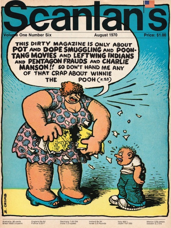
Babylon Falling is a great visual blog/website filled with scans of 60s graphic imagery, flavored by an emphasis on magazines and newspapers and the left-wing politics of the era. Site founder Sean Stewart has packed the site with Ramparts magazine covers, Black Panther Party newspaper pages, political posters, underground comics, book covers, photographs, and lots of cool ads from publications of the period. There's a heavy emphasis on Bay Area 60s left-wing politics, not surprising since Stewart lives out there and ran what he called "the 'anti-revolutionary bookstore' revolutionary bookstore" (Stewart also posts LP covers, photos, and ads from his other great love, hip hop music). 

The site was originally the website for the Babylon Falling bookstore that operated from 2007-2009. When the store closed earlier this year, Stewart started posting images from his personal collection on the site. Fans of 60s music, culture and progressive politics will love Babylon Falling and the cool, progressive curative sensibility that Stewart brings to it. We love it because it's one of the best and most fun websites around. (The cover of Scanlan's above is from August 1970, illustration by R. Crumb.)

We talked with Sean Stewart and asked him to share some of his personal favorites from Babylon Falling.
MORE
Layer Tennis: Friday Afternoon Diversion

Layer Tennis: Friday Afternoon Diversion

If, like me, you've come to work only to discover you're the only even in today on the floor, you might be interested in a little creative break this afternoon--if yes, why not check out the Layer Tennis match that starts at 3pm (EST) between illustrators Jillian Tamaki (our friend from our recent DWI night) and Jennifer Daniel (she of the longest URL ever, possibly).
Per the rules of Layer Tennis,
Two competitors will swap a file back and forth in real-time, adding to and embellishing the work. Each artist gets fifteen minutes to complete a "volley" and then we post it to the site live. A third participant, a writer, provides play-by-play commentary on the action, as it happens. A match lasts for ten volleys and when it's complete, the Season Ticket holders help declare the winner.
No matter what, always something fun to watch from start to finish, and you might just find today's a day you've got a little extra time, no?
Up, Down and All Around

Up, Down and All Around

When I'm running out of the subway, walking to work, riding in a cab (which is quite often), I wish I could save a few images captured in my mind of all the various (and interesting/attractive/riveting/compelling) type I see around me and archive it for those special moments when the inspiration is needed.

As it turns out, Mandy Milks has done just that in her blog, Villatype where she has (what seems) so effortlessly done for herself.

She's wonderfully created a forum where we can view and discuss type and lettering found in the public domain. Kudos, Mandy!
Paula Scher: One of a Kind

Paula Scher: One of a Kind

In 1984 I moved to New York from Calgary to go to the School of Visual Arts. Richard Wilde said "I think we will put you in Paula's class." I had no idea at the time who she was or what I was in for. The whole move was a big adventure. I was actually following my talented boyfriend Garnet Henderson (AKA Eddie Guy) to New York and thought I would take a few classes to improve my portfolio. Who wanted a job in Winnipeg anyway????
MORE
Paula Scher (class of '84)

Paula Scher (class of '84)

I was one of those quiet, diligent students who worked hard, but said little in class. In the fall of 1983, my portfolio teacher at SVA, Paula Scher, wasn't having any of that; she actually asked me what I thought, and expected a response--out loud. That smoke-filled class changed my life.… MORE
New Work for the New Year

New Work for the New Year

Well, we're knee-deep over here at Union Square West. And not just in snow! Now begins the work of unpacking the boxes and boxes of Pub 44 entries in preparation for Judging Weekend, set for January 30-February 1. There's little doubt it's going to be a great competition; thanks to one and all for getting your submissions in.

But what are you working on now? Most of us are already sweating our March, April, and May issues, which is virtually half a magazine-year gone by (hello, Pub 45!). So while we're thrilled about celebrating last year's design and photography stand outs, we here at SPD.org are looking for great work getting published this very minute.

So email us a recent layout or two! We'll welcome anything that's gone to the printer recently, something you're especially proud of and think might be inspiring to the membership and readers of Grids. We'll note the credits and the publication and shine a little light on the latest and greatest in publication design.

Please reduce your layouts to no larger than 1200 pixels wide and don't forget to include all relevant credits and a little background (if you feel like). Send your submissions to tips@spd.org and we'll post them as we get them.


the Cinematic Art of Batiste Madalena

the Cinematic Art of Batiste Madalena

I've always been a fan of these early, hand painted treasures of poster art, but to see the the vibrant colors, elegant type design (all drawn by hand!) and bold graphics at the Museum of Modern Art's new exhibition of Batiste Madalena's surviving posters will transport you back to the early years of American cinema. 


MORE
Inspiration: Télérama

Inspiration: Télérama

If you've read my recent blogs, you've probably figured out by now that I'm not only a bit of a francophile, but also a huge Avedon fan, so forgive moi, but here comes just one more... On my recent trip to Paris, I also caught the very last day of the Avedon show at the Galerie de Jeu De Paume. Richard Avedon: Photographs 1946-2004 was an awe-inspiring retrospective that showed the photographer's span of work from the beginning of his career to his death in 2004, from his fashion photographs for Vogue and Harper's Bazaar, to his portraits in the American West. In case you missed this exhibition, you can check out most of the work shown in his series of books at amazon.com. But since sadly, the Avedon show is over, so I wanted to share what I happened to pick up when as I was leaving the gallery, a little French magazine called Télérama.

MORE
Type-spiration

Type-spiration

It's fantastic to see the efforts that have shaped typography into what's determined some of our current design direction today. A great example is this rad vintage design annual I found laying on W's Art Intern (Krzysztof Piatkowski's) desk called Typographic Directions - Trends in Visual Advertising, Designed by Herb Lubalin.
MORE
Get Me Patrick!

Get Me Patrick!

We all remember the scene in, "The Devil Wears Prada" where Meryl Streep, as Anna Wintour yells at her assistant, played by Anne Hathaway, to get Demarchelier on the line, his name being tossed around throughout the film as if he were Madonna or Prince. Well the Musée du Petit Palais did get Patrick, and the result is truly inspiring.

MORE
Robert Pollard's Album Art

Robert Pollard's Album Art

I love records, not just because they're more fun to play, but because they feel good in the hand and you can see the album art better.  Who hasn't bought a record based on cover art alone?    
MORE
Office Inspiration

Office Inspiration

What do you tack up to keep the juices flowing? … MORE
Beautiful Books

Beautiful Books

When I'm looking to get my creative juices flowing sometimes I log on to Optosbooks.com.
Here are some beauties I find rather inspiring. Take a peek.
MORE
Nothing Like the First Time

Nothing Like the First Time

The Premiere Issues Project is a site dedicated to magazine covers of first issues. Click on a cover and get stats like name, dimensions, publisher and -- most importantly -- art direction and design.

MORE
Avedon & BRIDES

Avedon & BRIDES

In preparation for BRIDES' big birthday in January (a girl never tells her age!), my photo team and I have been muddling through decades of archived issues, starting in the 1930's. So, in the next few weeks, for your viewing pleasure, I will be posting a blog about BRIDES covers through the decades, some are just ASTOUNDING, others--umm, less so. (thank you, 1970's).

MORE
Inspiration: Milk Magazine

Inspiration: Milk Magazine

Since Fabien Baron left French Vogue to come back to America, you might think you need to bid the city of lights "adieu", but don't give up on France until you've checked out Milk magazine. I came across this French mag for kids' fashion (le magazine de mode enfantine) when I was in Paris a few years ago, at a tiny newsstand near my hotel.… MORE

Spines of Slovenia

1 Spines3_thumb_w_580.JPG
The payoff from a recent speaking trip to Ljubljana for EMZIN magazine: Some of the most beautifully designed book spines I've ever seen, tucked away on the shelves of the town's antiquarian bookshop. WOW.


MORE

« December 2013