Recently in Redesigns Category

Cooking Light's Redesign with Creative Director, Rachel Lasserre

CL_MagDes_(4)_KB.gif
While reaching 30 years in publication is no small feat, the Cooking Light team also had something more to celebrate with their recent September issue. The 30th Anniversary Issue featured an unveiling of a fresh new redesign and rebranding. The issue revealed both new content and a new design that emphasized a shift toward focusing on "fresh and healthy" and less attention on "light." 

Cooking Light's Editor-In-Chief, Hunter Lewis and Creative Director, Rachel Lasserre collaborated with design consultancy Area of Practice on the new design. We spoke with Rachel about the collaboration and what went into producing Cooking Light's new look.

Read on for Rachel's answers and to see more images from the redesign after the jump!
MORE
Inside JCK Magazine's Redesign

Inside JCK Magazine's Redesign

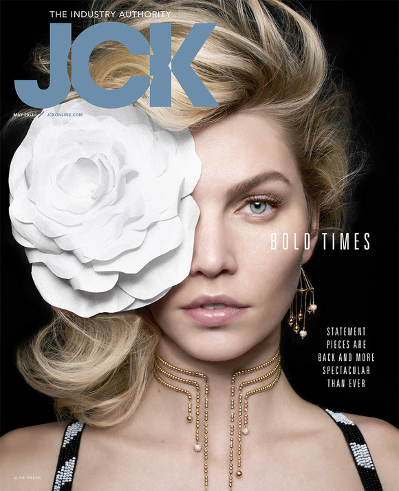
JCK Magazine has been the industry authority on the jewelry business for the last 148 years. This trade magazine, which was launched back in 1869, recently finished a fresh new redesign. We had the chance to speak with JCK Magazine Creative Director, Peter Yates, about JCK's new look.

See some of the images from May's redesigned issue below and read on for Peter's answers and more images from the redesign after the jump!
MORE
Inside Harvard Business Review's Redesign

Inside Harvard Business Review's Redesign

Harvard Business Review  (HBR) has always been a go-to resource for insightful information about the business world.  This savvy publication, which was founded in 1922,  just wrapped up a fresh new redesign with their  January/February 2017 issue. We had the opportunity to speak with Harvard Business Review Creative Director, James de Vries, about HBR's revamped look.

Read on for James' answers and images from the redesign after the jump!
MORE
Behind the Scenes with In Touch Magazine

Behind the Scenes with In Touch Magazine

We recently checked in with Metaleap Creative about what they have been up to and they filled us in on their recent work with Christian publication, In Touch Magazine.  Creative Director, José Reyes, and Associate Creative Director, Eric Capossela, from Metaleap Creative sat down with In Touch Magazine Editor-in-Chief, Cameron Lawrence, and Managing Editor, Jamie Hughes, to discuss what it means to design for a publication with the motto: "Thoughtful Faith. Devoted Living."

SPD sent them some prompts and then listened in on their conversation. Read on for their roundtable discussion about what it took to transform a forty year old religious publication into a contemporary Christian magazine that features some of the best artists in the business.
MORE
Inside 5280's Redesign

Inside 5280's Redesign

Since 1993, 5280 has provided coverage on Denver, Colorado to locals and visitors alike. This city magazine, which is named after Denver's elevation of 5,280 feet, has just finished their latest redesign with their most recent July issue.  We spoke with 5280 Art Director, Dave McKenna, about the team's process and how 5280 has evolved on both the editorial and design side.

Read on for Dave's answers and images from the redesign after the jump!
MORE
Inside the Stylewatch Redesign

Inside the Stylewatch Redesign

The September issue is always the biggest issue of the year for fashion magazines--even more so in the case of Stylewatch, as it was also when they debuted a brand new redesign. SPD spoke with Stylewatch Creative Director Emily Kehe about the process and how the magazine evolved.


MORE
Inside the Entertainment Weekly Redesign

Inside the Entertainment Weekly Redesign

With Entertainment Weekly approaching its 25th anniversary, a lot has changed for the magazine over the years. Editors, Design Directors, fonts, and subject matter--try explaining "streaming" to someone 25 years ago. Most recently, it underwent a fantastic redesign. We spoke with EW Design Director Tim Leong about the origins, process, and why Green Arrow is a name in their color palette.

MORE
A Fresh New Look For Parents Magazine

A Fresh New Look For Parents Magazine

SPD recently spoke with the staff of Parents Magazine about the process of creating their new redesign and the visual changes in store for readers.   Take a look at some of the pages from the new magazine after the jump.

PARENTS_Redesign_Layouts1.jpg
Parents Magazine has been a trusted brand for over 85 years. We provide expert advice in the latest in kids' health and safety news, nutrition, crafts, beauty, healthy recipes, advice for moms, plus a little laugh (because being a parent requires a sense of humor). Since our last redesign in 2011, much had changed in the landscape of media and social media; The Millennials are now in the life stage of getting married and having babies (perhaps not even in that order!) And we wanted to speak to them in a visual language that made sense to them. Parents already delivers friendly, authoritative and useful content to people navigating the ups and downs of parenthood. We wanted to create a consistent, clean, modern look that stood apart from the (often) busy creative of ads, and helped the reader have better experience navigating through our pages.
MORE
Redesigning Foreign Policy

Redesigning Foreign Policy

The team from Foreign Policy continues to wow us with their innovative covers and approach to the modern news magazine.   Recently the team in Washington, D.C., lead by Creative Director Lindsay Ballant with the help of designer Margaret Swart revamped the magazine to better reflect its new direction.   Lindsay fills us in and gives us a peek into the creation of the new design...

Screenshot 2015-03-05 23.18.32.png

Foreign Policy, a magazine devoted to news, politics, and ideas, hasn't had a proper redesign since 2000, when it moved from a journal format to a glossy news magazine. With this in mind, over the summer of 2014 a small group of editors and art directors concepted a new vision for the magazine, which, while keeping the highest quality of journalism throughout the years, had since lost its identity and needed to redefine its core. Our mission: what does Foreign Policy of the future look like?
MORE
Revamping a popular UK newspaper

Revamping a popular UK newspaper

guardiancrop.jpeg
Our man in London Steven Gregor of Gym Class Magazine is back and inspiring us today with the work of Chris Clarke, The Guardian's Deputy Creative Director.  
The design of British newspaper The Guardian is a fave for many editorial designers.
And it's with good reason. Since it's 2005 redesign by Mark Porter, the paper has been at the forefront of modern, progressive and globally significant news publishing.
Read more of Steven's chat with Chris about the newspaper's recent revamp and future plans after the jump.
MORE
Two British Heavy Hitters Combine Talents for the New Christie's Magazine

Two British Heavy Hitters Combine Talents for the New Christie's Magazine

By Steven Gregor, Founder, Gym Class Magazine

When news broke David McKendrick (creative director, British Esquire) and Lee Belcher (art director, Wallpaper) had both handed in their notice with the intention of starting their own design consultancy... Gym Class HQ was abuzz with excitement. This was big news! What had they planned? What work would they be doing?
Seriously, these guys are big hitters. Together, David and Lee have over 25 years experience. During this time they've collaborated with many of the world's leading photographers, designers, artists, architects, filmmakers and printers.
Less than six months have passed and the duo - going by the name B.A.M, short for Belcher And McKendrick - have already presented two products... the Autumn/Winter edition of British Esquire's Big Black Book and, most recently, their first issue of a re-vamped six-times-a-year magazine for Christie's auction house.
The Christie's magazine landed on the door step of Gym Class HQ last weekend. So we thought it about time for a catch-up with B.A.M. creative director David McKendrick.

IMG_1908.JPG
Hey David, congrats on the Christie's magazine. Lush design, certainly. But, seriously, the production value is off the chain. How long were you working on the issue (was it a redesign, too?)... and talk me through the process of making such a wonderfully tactile and collectable publication.
Thank you. To be honest it's not that complicated a production. We tried to be clever with materials and processes and avoid tricksy paper changes. A combination of clever solutions has resulted in what appears to be quite a lavish product. So believe it or not, with an informed approach, it was relatively inexpensive. 
We worked on the issue for six full-on weeks, which included commissioning all the photography and content. And, yes, it was a complete redesign.


MORE
Inside the Consumer Reports Redesign

Inside the Consumer Reports Redesign

Kevin Brainard and Cybele Grandjean known for their redesigns of Condé Nast Traveler, Martha Stewart Living, and Condé Nast's Brides, have launch a redesigned Consumer Reports--and their new partnership Area of Practice, along with Robert Spica.


Area of Practice developed the strategy and redesign for the new Consumer Reports in close collaboration with VP and general manager Brent Diamond, director of growth initiatives Steve Cooper, editor in chief Ellen Kampinsky, and creative director Tim LaPalme.


Founded in 1936 as Consumers Union, Consumer Reports is an independent, nonprofit magazine that serves over 4.5M readers monthly, through unbiased product testing and ratings, research, journalism, public education, and advocacy.


Although Consumer Reports is best known for its product reviews, the team recognized that the organizations lesser known but highly influential advocacy work and focus on consumer empowerment was an unique asset that would resonate with a broader audience. 


Seeking to make the publication more accessible and attractive, to an audience of new readers, Brainard & Grandjean brought on board Martha Stewart Living and Brides alum Mary Cahill as a consulting photo editor.


Together the team started to rethink the editorial voice and shape the content to help create a modern publication that embraces its history and looks toward the future without alienating its core-audience.


MORE
Roger Black's Redesign of the Hong Kong Tattler

Roger Black's Redesign of the Hong Kong Tattler

Here are some of the highlights from the recent Roger Black-directed redesign of Hong Kong Tattler, a luxury, style, and lifestyle magazine. As group creative director of Edipresse Media in Hong Kong, Roger launched this redesign in March, and will carry it through seven other Tattler editions across Asia in the near future.

For more on Hong Tattler and the redesign, check out this nifty video. For the redesign Roger turned to Font Bureau and type designer David Jonathan Ross to revive a classic typeface, Forma, which was originally created in the mid-1960s by a team led by Aldo Novarese. The Font Bureau blog has a detailed (and properly obsessive) background story on the creation of the new font. It's a great look at the revival and redesign of a classic typeface and how it was developed.

Complete digital copies of Hong Kong Tattler can be downloaded via Magzter.

(Above): Photograph by Sean Lee-Davies

On the turn page we've got a slideshow of other pages from the Hong Kong Tattler redesign.

MORE
The Process: Chicago Magazine Redesign

The Process: Chicago Magazine Redesign

CHICAGO magazine debuted their recent redesign back with the November 2013 issue, but now that the dust has settled and they've gotten into the routine of the new, we get a sneak peek into their process from Design Director Bryan Erickson. From the logo through to the website, they reconsidered every aspect...… MORE
Popular Science Redesign: Rethinking a 140-Year-Old Brand

Popular Science Redesign: Rethinking a 140-Year-Old Brand

The Popular Science team is starting off the new year with a new design and we were lucky enough to get the backstory on the process from Design Director Todd Detwiler...

With the first significant redesign in the past 8 years, our initial thinking was to look at what we are doing well, and what we needed to do better. It was determined that a touch-up in design would not be enough. A complete teardown and rebuild was in order and it started with a new logo. 
MORE
Reader's Digest Gets a Fresh New Redesign

Reader's Digest Gets a Fresh New Redesign

Reader's Digest recently completed a fantastic new redesign of the classic American brand.  Starting with an updated look for the cover, Design Director Dean Abatemarco and crew redesigned virtually every page of the magazine and its website, tablet, and iphone editions.  
SPD recently spoke with Dean about this major design update.  He gives us some insight into the process and a peek at some of his team's work on the January issue.  

----
The seeds for this latest redesign of Reader's Digest magazine were sown almost two years ago, when the former creative director, Bob Newman, and I were working on a project for our 90th anniversary. We were going through the RD archives and were both struck by how simple and elegant the design of RD was in its glory days of the '30s, '40s, and '50s. So when the redesign began in earnest earlier this year, part of the mission we had in mind was to return to the spirit of the classic RD look, but through a modern lens. 

MORE
A New Look for Latina Magazine

A New Look for Latina Magazine

SPD spoke with Ebelinda Antigua of Latina Magazine about the newly redesigned title. Take a look at the new design after the jump.

Latina Media Ventures is the authoritative voice for the acculturated community of Hispanic women living in the US. For 16 years and across multiple platforms, Latina provides unique, in-depth, culturally-relevant, engaging and inspiring content on key areas of interest: including beauty, food, entertainment, celebrity, fashion, parenting and health. With 3MM readers, Latina is the largest magazine edited by and for Latin women.  
MORE
The Process: Boston Magazine's Recent Redesign

The Process: Boston Magazine's Recent Redesign

Boston magazine debuted a redesign with it's November issue, and Design Director Brian Struble was kind enough to give us the backstory to the whole process:

SPD:  What was the original impetus for the redesign?
BRIAN:  The magazine knew they wanted a redesign before I was even hired. When I was interviewing for the job, they asked me what my plan would be. I submitted an outline for where I wanted to take the redesign and the magazine as a whole, and they hired me with the idea that we would work together on making it a reality...
MORE
The Process: Revamping Boston University's Everett Magazine

The Process: Revamping Boston University's Everett Magazine

Matthew Guemple takes us step by step through the process of rebranding and redesigning the Boston University alumni magazine. 

Coming to Boston University from the commercial magazine world was an interesting challenge. Alumni magazines usually serve a fairly well defined purpose for the University's individual colleges and schools and are a key to keeping alumni engaged and informed. They are also used to raise a school's reputation among peer institutions, attract prospective students, and encourage potential donors to give funds, time, or resources. With so much riding on a magazine's success, there are a lot of stakeholders--an individual school's own marketing department, plus its dean and various other administrators--meaning you'll often get at least a couple of competing agendas. When you add other elements like the faculty or the University's department of alumni relations, you get a lot of different viewpoints and voices.

MORE
Rethinking the Traditional Alumni Magazine

Rethinking the Traditional Alumni Magazine

Georgia State University recently finished up a complete overhaul of their alumni magazine. Creative Director José Reyes of the design firm Metaleap Creative gives us some insight into the process and a preview of the redesign after the jump.  

It is no secret that Alumni magazines exist on little to no art budget, serve a select group of people who want to see themselves grace its pages and are rarely exciting to anyone else but them.

After celebrating its 100th anniversary, Georgia State University was ready for a redesign, and excited to challenge much of what we know--and have come to dislike about alumni magazines and focus its pages on capturing the soul of a campus that is alive and thriving. Georgia State University is located in the heart of downtown Atlanta with an enrollment of 32,000 students and over 180,000 alumni spread across the state of Georgia and around the world. 
MORE
First Look at the New Yorker's New Design

First Look at the New Yorker's New Design

New Yorker Creative Director Wyatt Mitchell previews the new design and updates to the magazine's iconic typeface.   See the video after the jump...

MORE
Inc. Magazine: Inside the Redesign

Inc. Magazine: Inside the Redesign

Increased commitment to photography: Check.
Attention to dynamic pacing: Check. 
Focus on typography and "visiting fonts"(!?!): Check and Check!

The new look of Inc. magazine, which is on sale now, is a surprising and dynamic rethink of the 30 year old title. It showcases some great design and lots of smart new approaches to visual storytelling. Creative Director Blake Taylor and his award winning art and photo teams had only 3 months to reinvent the entire magazine and with the help of ambitious editor Eric Schurenberg and SPD fave Tom Brown of TBAD (who we're more than thrilled to day is hard at work designing the PUB 48 annual for us!) they nailed it. 

Blake gives us a preview of Inc's extraordinary new look after the jump along with some revealing insight into their process and mission (think "magazines within magazines" and seriously what's up with these "visiting fonts"!?)
MORE
A Fresh Look for Martha Stewart Living

A Fresh Look for Martha Stewart Living

The newest issue of Martha Stewart Living is on newsstands now, featuring a brand new look for its July/August issue. Redesign Consultant Cybele Grandjean led the project, bringing on board Kevin Brainard, Jenn McManus and Jaspal Riyait, all key players in the redesign of Condé Nast's Brides last year. The team worked closely with the editorial staff to create a magazine that feels like a modern handbook. It features a clean, book-like design that emphasizes the stunning images and how-to information that Martha Stewart is known for, while modernizing its visual approach.
MORE
Hallowed Ground: A Civil War Mag 150 Years in the Making

Hallowed Ground: A Civil War Mag 150 Years in the Making

July 1st marks the 150th anniversary of the start of the bloody battle of Gettysburg in which soldiers from the Union and Confederacy fought non-stop for three days in Pennsylvania. We at SPD value our American history and what better way to contribute to the commemoration of the battle than to profile a recent redesign of the The Civil War Trust's magazine "Hallowed Ground". The Civil War Trust is a wonderful charity who help purchase and preserve historic civil war battle fields to protect them against development. The design director of their magazine is Jeff Griffith who in his day job serves as Creative Director of advertising and marketing at US Men's Health. A self confessed Civil War nut, Jeff walks us through his recent redesign of Hallowed Ground after the jump.
MORE
Suck, Squeeze, Bang, Blow: Redesigning Cycle World

Suck, Squeeze, Bang, Blow: Redesigning Cycle World

It's been a busy few months for the award winning design and photo teams over at Bonnier's Outdoor Group. Design Director Sean Johnston is the head of design for the group which includes SPD faves Field & Stream and Outdoor Life. Since taking over in 2009 Sean and his crew have given both titles fresh new looks with 2 great redesigns and now his team add a third to their portfolio with their retooling of classic american motor cycle mag: Cycle World.  

Bonnier acquired Cycle World from Hearst back in 2011 describing it as the "Number 1 motorcycle brand in the industry" so when Bonnier's Editorial Director for the Men's Group Anthony Licata proposed a redesign Sean's team embraced the challenge. 

The new look (which includes the lyrical tag-line for it's "Ignition" section: "Suck, Squeeze, Bang, Blow"!) was officially unveiled last night and after the jump Deputy Art Director Pete Sucheski gives us his exclusive guided tour. 
MORE
Inside the Men's Health Redesign

Inside the Men's Health Redesign

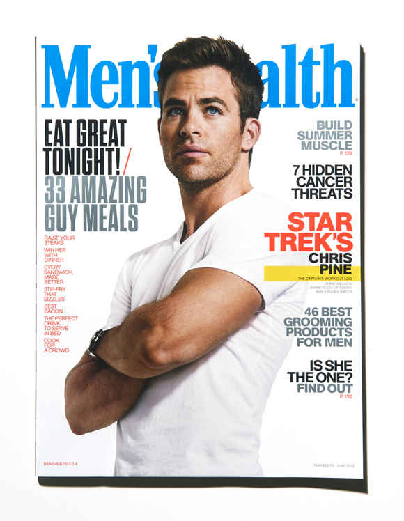
This year, Men's Health turns 25. As humans age, we begin to evaluate our ourselves, think about the past, and what we can change for the future. The magazine is no different. MH has expanded over the years into a beast. On a good month, Men's Health has 105 edit pages, 60 of which form the Front of Book. Within that, there are six sections, each jam-packed with tips on everything from heating up a quick chicken dinner to cooling down persistent erections. In layman's terms, that's a lot of sh#!+. MH CD Robert Festino walks us through their redesign process. 


Above: Men's Health, featuring Star Trek's Chris Pine, June 2013.
Creative Director: Robert Festino, Photographer: Ture Lillegraven. 


MORE
REDBOOK: Completely Reimagined

REDBOOK: Completely Reimagined

In April, the 110 year-old Redbook was reinvented with a fresh editorial vision and a radical redesign. The CD Holland Utley began by designing a new, all-lowercase logo- the first logo change for Redbook in thirty years. That was just the start. 

MORE
Something New on Madison Avenue

Something New on Madison Avenue

The venerable bible of Madison Avenue recently undertook its most radical redesign in years, helmed by Brooklyn design collective Athletics under the direction of the magazine's CD, Jesper Goransson. The biggest challenge the team faced was "going from [basically] a newspaper-based trade design to a newsweekly magazine-like approach to the content."

Read Goransson's comments and see more of the design after the jump...
MORE
Texas Monthly: TJ Tucker's tour of the redesign. Part 2

Texas Monthly: TJ Tucker's tour of the redesign. Part 2

Last fall everyone's favorite regional mag Texas Monthly underwent a total redesign under the creative direction of TJ Tucker and his team. Seven issues in TJ Tucker gives us some highlights. In part one we got a look at some of the FOB and typographic details. In this second part we get some insight into their feature well and learn what's next for Tucker and his team… MORE
Texas Monthly: TJ Tucker's tour of the redesign. Part 1

Texas Monthly: TJ Tucker's tour of the redesign. Part 1

Last fall everyone's favorite regional mag Texas Monthly underwent a total redesign under the creative direction of TJ Tucker and his team. Actually to call TM a regional maybe doing it something of a disservice. As we all know, everything is bigger out West and with a circ. of over 300,000 and a readership of nearly 2.5 million TM is no different. TJ follows in the footsteps of some real heavy hitters, former art directors include DJ Stout, Scott Dadich and legend Fred Woodward so to tweak the look of such a venerable design took balls...Tucker and his team rose to that challenge admirably and it turns out one of his many solutions was in fact to add more balls...to the logo at least!  TJ had so much great work to show (he's seven issues deep into this new look now) that I'm actually splitting this post into 2 parts so check back in tomorrow for more covers, department pages and the feature well...
MORE
Billboard Relaunches in Print, Web and Tablet

Billboard Relaunches in Print, Web and Tablet

Every magazine has a variation on a "List Issue," whether if be the Fortune 500, Time's Person of the Year, or Rolling Stone's Hot List. The beginning of these issues can arguably be ascribed to Billboard, the music industry's bible and the home to information about every No.1 single, album and artist in recorded music history.

Led by Bill Werde (Editorial Director), Andrew Horton (Creative Director) and Joe Levy (Editor) Pentagram's Michael Bierut & Laitsz Ho have redesigned Billboard in a manner befitting its OWN No.1 position. Billboard leads and informs the essential conversations around music and
the music business. This redesign was all about making that a reality.

MORE
The New Look of The Saturday Evening Post

The New Look of The Saturday Evening Post

The debut of the redesign of The Saturday Evening Post is one of the (at least to my eyes) most remarkable visual turnarounds of a consumer magazine in recent memory. The magazine has been relaunched with much media fanfare to reach a newer, younger audience, and the graphic transformation of the cover is eye-popping. Creative director Andrzej Janerka has taken the old, stale, retro-fied cover design and transformed it into a look that is dynamic, forward-looking, and very illustration-strong.

Janerka, who has previously worked as design director at AARP magazine, has been the consulting creative director for the bi-monthly Philadelphia-based mag since 2011. He says he took on the job because "redesigning the oldest magazine in the country was a no-brainer for me. Who could not take a challenge like that?"

Drawing on some Post logos from the 1950s for inspiration, Janerka has put a new twist on the classic spirit of the original magazine, all with "a modern perspective" as he explains. The illustration style on the cover has been updated; the first redesigned issue features a great portrait of Shirley MacLaine by illustrator Jody Hewgill. "The covers will continue to be illustrated, but rather than attempt to copy the look and feel of the classic Norman Rockwell covers, we will maintain a contemporary approach," says Janerka.

Check out the turn page for some pages from the inside redesign of The Saturday Evening Post, plus some logo design sketches.

(Above): The Saturday Evening Post, January/February 2013. Creative director: Andrzej Janerka, illustration: Jody Hewgill.
MORE
A New Look Field & Stream

A New Look Field & Stream

Over the last few months Field & Stream Design Director Sean Johnston and his hard working art and photo teams have been pretty busy. Not only do they now over-see the design and production of all the Bonnier outdoor titles (including Outdoor Life, Shot Business and the ASME and SPD favorite Field & Stream) but since taking the reins they've been quietly and smartly retooling each of these legendary all-American brands. The OL redesign was a gradual one which they rolled out over a series of issues last year...Field & Stream on the other hand got a front to back redesign all at once, the results of which are available on newstands across the country today. Here Johnson reveals his philosophy and gives us a preview of some terrific looking pages...… MORE
ShopSmart Redesign

ShopSmart Redesign

The Consumer Reports ShopSmart magazine was relaunched in January with a bright, sharp new design. The 300,000 circulation magazine is aimed at women 35-60, and is densely packed with consumer service material, charts, lists, best and worsts, and much more. The redesign is a remarkable structuring and ordering of a huge amount of editorial stuff, all crisply articulated and bright and engaging. This is a really smart redesign, one which gives the magazine a huge jumpstart and a powerful visual identity. We've got a nifty gallery of selected pages from the January and February 2013 issues of ShopSmart.
MORE
A New Look for British Airways' High Life Magazine

A New Look for British Airways' High Life Magazine

While you're waiting for that flight to take off, have a look in your seat back pocket. Some great new work is being done at the inflight magazines of airlines around the world. 

British Airways has recently relaunched their inflight magazine High Life with a brand new look. Creative Director Stuart Purcell of Cedar Communications, along with Editorial Director Mark Jones developed the vision for the relaunch of the nearly 40 year old title - one of the longest running inflight titles in the industry.

"The new design reflects a very British sense of irreverence, wit and attitude" says Purcell, "We wanted British Airways' High Life magazine to speak to the new breed of 21st century traveller - the mobile tribe for whom global inside knowledge is currency."

Here's a preview of the new High Life... 
MORE
Southern Living: Redesigning an Institution

Southern Living: Redesigning an Institution

Few brands in publishing have as dedicated a readership as the 46 year old regional lifestyle magazine Southern Living. So how do you go about evolving the design of brand with such reader loyalty...carefully...as Design Director Robert Perino explains... … MORE
Luke Hayman Redesigns T+L. Again.

Luke Hayman Redesigns T+L. Again.

Via Pentagram:

Pentagram's Luke Hayman and team have redesigned Travel+Leisure with a dynamic new format that matches the magazine's chic, sophisticated tone. The redesign launches with the June issue, on newsstands now.

Hayman worked closely with EIC Nancy Novogrod and DD Sandra Garcia on the project. Hayman was CD at T+L from 2002 to 2004, prior to joining Pentagram, and was familiar with the strengths and challenges of the magazine's existing design.
MORE
The New Brides

The New Brides

Creative Director, Cybele Grandjean, has been working on this redesign since December.  The May re-launch issue of Brides is on newsstands now.
MORE
Fixing Up a Rambling Wreck

Fixing Up a Rambling Wreck

You may know Atlanta-based CD José Reyes from his work at the popular indie music mag Paste. He and his firm, Metaleap Creativean award-winning creative firm known for the design of several other national and regional magazines, were recently hired to redesign the alumni magazine at Georgia Tech.

He gives us the story after the jump ...

MORE
A New Look at Glamour

A New Look at Glamour

Fresh on the heels of the Harper's Bazaar redesign, news comes of a new look & feel for Condé Nast's venerable Glamour magazine. The redesign was executed by DD Geraldine Hessler and her team.

Take at peek at some inside pages after the jump.


MORE
Taking A Look at the Prevention Redesign

Taking A Look at the Prevention Redesign

Rodale's Prevention is a digest-sized magazine with an outsize audience, an average of over 10 million readers per issue. Design Director Cass Spencer shares some of the background on his team's redesign of the health and lifestyle magazine aimed at women readers over 35:
Six months after the launch of the Prevention redesign, our creative team is excited to share some brief insights into our new look and the paths we took to get here.

Rebranding the over 60-year-old Rodale flagship was a task not to be taken lightly. Our readers have a passion for health and wellness. They are active and involved. We needed to create a feeling of community in the magazine that would be at once inspirational but obtainable, fun but also serious. Also, we needed to do this for an audience that is more media savvy, digitally interactive and discerning about how they obtain and process information than any generation of readers before.

Okay sounds good, right? But how do you do all this with in-depth health content, on a digest-size page, while maintaining authority and not looking like a text book?

Here are the highlights:
MORE
Fairchild Fashion Media:

Fairchild Fashion Media: "Smart, chic, and all business"

The Fairchild Fashion Media magazine group, the collection of fashion trade magazines published by Conde Nast, has undergone a major metamorphosis, thanks to creative director Nancy Butkus and editorial director Peter Kaplan. Butkus took over the creative helm of the group in October 2010, soon after Kaplan started. She has since led the redesign of five magazines as well as the relaunch of WWD. Butkus describes the look of the magazines as "smart, chic, and all business." It's the third collaboration for Butkus and Kaplan, who worked together at Manhattan Inc. in the 1980s and at The New York Observer in the 2000s.

All of the Fairchild Fashion Media magazines are oversized, 10" x 12" and have varying publication frequencies. Beauty Inc was relaunched in February, targeted to the cosmetics and fragrance industry. Menswear, launched in 2010, is a hybrid called B to C (Business to Consumer) and is sold on newsstands. It features industry insider news, fashion and style features, interviews and profiles. FN, formerly called Footwear News, is weekly, and was relaunched over the summer. The new design of WWD debuted in January, with two new sections, Style, which appears daily, and Men'sweek, which appears every Thursday.

(Above): FN, August 22, 2011. Photograph: Brian Klutch, art director: Elizabeth Slott.
MORE
Pentagram's Adweek relaunch

Pentagram's Adweek relaunch

Pentagram has just posted Luke Hayman's smart and authoritative redesign of the advertising trade magazine, Adweek...

Pentagram's design for the new Adweek captures the fantastic energy of these changes in advertising. Like the new editorial tone, the design is punchy, entertaining and authoritative, inspired by the spirit of the magazine's 1980s heyday and intended to set Adweek apart from Advertising Age, its main competitor. The designers worked closely with managing editor Hillary Frey, Executive Editor James Cooper and Digital Editor Nicholas Eckhart. The design of the magazine will be carried forth by Creative Director Nick Mrozowski. The website is also being relaunched with a new design by Area 17.

Read the full post and see more pages from the redesign here.

MORE
Sneak Peek: The Ebony Redesign

Sneak Peek: The Ebony Redesign

crooklyn.jpgVenerable Chicago-based Johnson Publishing went for broke last year in an effort to turn the tide at their flagship magazine, Ebony. First, they reached out and hired former Harper's Bazaar Deputy EIC, Amy DuBois Barnett. She, in turn, tapped Esquire's AD, Darhil Crooks, to revamp the magazine's look and feel. Here he gives us the inside scoop on their redesign process.

MORE
Sneak Peek: The New York Times Magazine's Redesign

Sneak Peek: The New York Times Magazine's Redesign

Here's a sneak peek of the upcoming The New York Times Magazine redesign which debuts this weekend. DD Arem Duplessis says that the redesign team looked back to move forward. Duplessis shares a little background on the project:

When Hugo Lindgren was announced as the editor of the magazine we knew he'd want change. This excited me because I felt like the design had moved too far away from the brand of the newspaper and this was the chance to get it right. Gail Bichler (Art Director of the magazine) and I divided the duties, she stayed on the weekly and lead the ship while I went upstairs to work on the redesign with Matt Willey, Caleb Bennett and Sara Cwynar. We used the newspaper and vintage magazine issues from the 50's, 60's and 70's as inspiration.

A look at a few pages...
MORE
A New Look at Parenting

A New Look at Parenting

Creative Director Michael Goesele tells us,
For the redesign of Parenting, the overall goal of the creative team was to design a clean and easy-to-navigate magazine for today's busy parents.
Get a closer look after the jump...
MORE
Just Add Water

Just Add Water

Publication design maestro Roger Black announced his latest venture today, Ready-Media, a collection of pre-existing templates for print and web publications. Ready-Media is a joint venture along with David and Sam Berlow of Font Bureau, publication designer Robb Rice, and newspaper designer Eduardo Danilo. The service offers a smorgasbord of already-designed magazines in a variety of formats, city/regional, trade, travel, etc., as well as newspaper and web designs. Clients can choose a variety of fonts online and even see how they'll look in the layouts. The new venture's website states "never before has world-class media design been so available, so accessible, so affordable." Pictured above are two of the formatted templates. Left is the "Trumbull," a city/regional magazine format, and right is "Vernier," for trade and B2B mags. … MORE
First Look: Travel + Leisure Redesign

First Look: Travel + Leisure Redesign

As reported, the August 2010 issue of Travel + Leisure features a major redesign for the travel book. Creative Director Bernard Scharf and his Art Directors, Mark Maltais and Wendy Scofield, sent us a look at the new, larger logo and the reformatted interior pages, after the jump...
MORE
Bloomberg Businessweek Redesign

Bloomberg Businessweek Redesign

The new Bloomberg Businessweek redesign has hit the newsstands this week. Have you had a chance to see it? 

The redesign has been making the rounds in the media world: New York magazine has a good redesign wrap-up while Fortune and New York Times have posted great insight into the merger between the two news resources. 


MORE
The Glee cover of TV Guide magazine

The Glee cover of TV Guide magazine

"They brought more energy and enthusiasm than we ever could have imagined" is how TV Guide magazine director of photography Rose Fiorentino described their recent cover shoot with the cast of Glee. The latest issue, which also debuts the magazine's new redesign, features this brilliant cover image by photographer Art Streiber. Using an upcoming Glee episode (April 20) as inspiration, Fiorentino and her crew dressed the various stars of the show in iconic Madonna outfits. 

I was part of the design team that helped revamp the look of TV Guide (that team also included James Reyman, and Katherine Dillon and Kate Thompson of DillonThompson). But we had nothing to do with this amazing cover and feature story, which was the creation of Fiorentino, Streiber, design director Gloria Pantell, and the editors and photo crew of the magazine. 

This is just one of a series of remarkable photographic images that Fiorentino has directed for TV Guide magazine over the past year. 

Cast of Glee, left to right: Matthew Morrison, Lea Michele, Dianna Agron, Jenna Ushkowitz, Amber Riley, and Jane Lynch.


MORE
The redesign of the Texas Observer

The redesign of the Texas Observer

The Texas Observer has an over 50-year tradition of being the only regular muckraking outlet for investigative journalism in the state. It's published biweekly, to a small audience of politically liberal readers. With the recent launch of the online Texas Tribune, a reporting competitor, the Observer decided to produce a long-overdue redesign. The work was done by Em Dash, a studio headed up by Erin Mayes and Kate Iltis, based in Austin. The challenge was to create a template that could be produced by one part-time art director with a $450 art budget per issue. The result: a sharp, smart, right on, low-budget, high-impact design, perfect for the magazine's mix of muckraking reporting and liberal politics.

MORE
Behind The New York Times Magazine's Redesign with DD Arem Duplessis

Behind The New York Times Magazine's Redesign with DD Arem Duplessis

In June of this year, The New York Times unveiled a major redesign of their Sunday magazine, the first in almost a decade, and one of only a handful ever in its more than 100 years. Under the leadership of Design Director Arem Duplessis, a more lithe version of the magazine (smaller by about 9% in trim size) has been greeted with much appreciation around the design community for its subtle transitions of typography and color palette that exude new energy while staying true to the NYT Magazine everyone knows and loves (and obsesses about). Almost six months later, with enough issues printed to have some room to look back, we asked Rem to talk with SPD about the redesign process and the modern magazine business at the Times these days. His generous, detailed, honest reporting after the jump... … MORE
Fast Company Goes Inside CNN.com's Relaunch

Fast Company Goes Inside CNN.com's Relaunch

A month after the relaunch, Fast Company goes inside the philosophy behind CNN.com's facelift (designed by HUGE). Read Alissa Walker's full story here.
Nypost.com: A User-friendly Redesign

Nypost.com: A User-friendly Redesign

The New York Post's website, nypost.com, re-launched this past September with new features and a new design. Whether you admire the daily's vibe or just find guilty pleasure in PageSix, fans of user-centric web design will admire its user-friendly nature. I chatted recently with Nick Gould, CEO of Catalyst Group, the folks behind the new look and feel.… MORE
GQ.com and Details.com Relaunch

GQ.com and Details.com Relaunch

Peeling the two sites apart, and removing them from the "men.style.something.iforget" umbrella, GQ.com and Details.com unveil their own redesigns.

What do you think?
MORE
Men's Health

Men's Health

Hey all,
Thought I'd take a moment to share some of the new Men's Health work we've been doing since I have been given the reigns of this beast (this honkin' thing's circ is more than my last three mags combined...oye).

The work, as always, in progress.
MORE
Heating Up the Charts: Billboard.com Redesign

Heating Up the Charts: Billboard.com Redesign

My former alma mater, Billboard, relaunched its consumer-facing website Billboard.com last week. I caught up with their VP of digital, Josh Engroff, about the goals, process and design elements of this project. Here's a look inside:

MORE
The Newsweek Redesign: Hit or Miss?

The Newsweek Redesign: Hit or Miss?

We all know what the process is like to get out a massive redesign. The meetings... The designs... Presentations... Focus groups... More designs... Launch. 

Well, it has been four issues for the Newsweek redesign by Number 17--a good number of issues to get your sea-legs. 

What do you think?
MORE
Boston Pops: A Conversation with Patrick Mitchell

Boston Pops: A Conversation with Patrick Mitchell

Last summer Patrick Mitchell set aside his design firm, PlutoMedia, to become Creative Director of Boston Magazine. He spent the Fall redesigning the nearly 40-year-old magazine. The redesigned book launched in January 2009. When I asked about his inspiration he said, "Boston is an old city and its connection with history is palpable. We went back to the city's beginnings (the 1600s!) to find our typographic and design cues. We looked through all sorts of early published/printed materials to get in the right frame of mind, and then gradually worked our way forward."

Recently I had lunch with my good friend, Patrick, at Boston's Brasserie Jo to talk about the old days at Fast Company (where we first worked together) and about his new gig. Read on for the whole story...

03-COVER03.jpg

MORE
Designing 'The Knot'

Designing 'The Knot'

If you've gotten engaged in the last ten years, then you've probably heard of The Knot -- one of the leading wedding brands online, also in print and video. As an online destination, TheKnot.com is a place where engaged couples and their friends find ideas, up-to-date wedding advice and inspiration.

I recently got in touch with Lori Richmond, Design Director of Online Editorial, and Kristen Dudish, Online Designer, for some insight into designing and working for The Knot. We also discussed some of the recent changes made to the site when they redesigned a few months ago.… MORE
The Atlantic's Redesign

The Atlantic's Redesign


The Atlantic has had eight redesigns in its 151 years. James Bennet writes in his editor's note, that the November issue's new design is, "...the eighth effort to harmonize The Atlantic's style with its substance and the timbre of the times."

The design was done by Pentagram and in that same issue Michael Bierut's article A Question of Balance describes the magazine's new look.
MORE
Time.com's Redesign: A Q&A

Time.com's Redesign: A Q&A

TIME.com recently launched a new home page design. Soon after it went live, I got in touch with the site's design director Sean Villafranca and Shivani York, their director of product development. Sean and Shivani are both former colleagues who spent several years working together at nytimes.com. In this Q&A, they take us through some of the significant changes made to the TIME.com site and explain the process they went through.

MORE

"Elegance and Toughness"

Our good pal Luke Hayman has just completed a redesign of Vibe, now in its 15th year. He describes the look on the Pentagram blog as drawing inspiration from the Gary Koepke, Bob Newman, and Florian Bachleda days, even bringing back the 1993 drawing of Vibe Gothic, combining it with Leitura Display (above).… MORE
The Blender Redesign: It's all about the

The Blender Redesign: It's all about the "E."

Before he became creative director of Blender late last year, Dirk Barnett held the enviable position of art directing both Play, the New York Times Sports Magazine, and Key, the New York Times Real Estate Magazine. He had landed at the Times after completing a highly-lauded redesign of Premiere, where he was art director from 2004-2006. Before that, as design director of Popular Science, he won a General Excellence award from the American Society of Magazine Editors.

Dirk's industry acknowledgements include recognition from the Type Directors Club, the Society of Publication Designers, the British Design and Art Direction Awards, the New York Art Directors Club, Communication Arts and Print. His work is included in the permanent collection of the American Institute of Graphic Arts. 

We were thrilled to have the talented Mr. Barnett sit down with us this week and discuss his  magazine, the challenges surrounding change, and his partnership with newly-minted Blender editor Joe Levy. 
MORE
Prepare Thine Mailboxes

Prepare Thine Mailboxes

All of you who've recently reupped your Interview subscriptions (like we have), prepare for the coming onslaught of greatness from the inimitable Mr. Fabien Baron. Folio has the scoop on the redesign--no, what we've been drooling over these past two months wasn't it--debuting next week. Unlike some magazines, this one will be getting bigger, up to 13" tall from the measly 12" height it sported before.
Dwell Redesign Interview with Kyle Blue

Dwell Redesign Interview with Kyle Blue

This week Chad Kloepfer from the Walker Art Center published an interview with Dwell Design Director Kyle Blue on their design blog. Chad talks with Kyle about the guiding principles, rejected covers, font choices and more that went into the current magazine.

A good Friday afternoon read.

Welcome to the New SPD.org: A Note from Your President

As visual journalists, we spend just about every waking moment of our lives making sure the magazines and websites we work for look great. Day in, day out, tending our very own little gardens--which is why it struck those of us on the SPD Board as particularly ironic that the old SPD site looked like it hadn't been touched since spring 1997. 
MORE

« September 2017