Student Competition
02.26.10
Competition Tips: Part 5
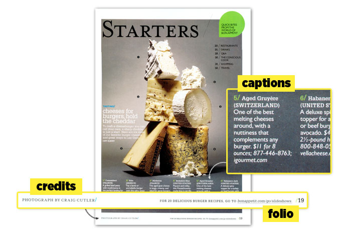
Tip #7: Captions, credits and folios should be treated as design elements just like everthing else on the page.
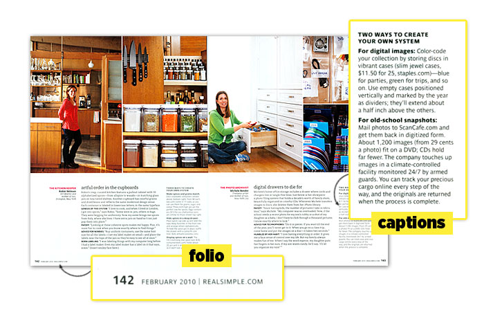
- Captions: These are the small text blocks that explain your photos/images, and many times, captions are the only thing readers read beyond the headlines. In some instances, a short caption defining the subject is all you need. Other times, captions can be more lengthy, building on the content of the story. And in other instances, sometimes long captions ARE the story. It depends on your story and how your images relate. Check out our examples below, and look at others on the newsstand to see how various magazines use captions.
Another thing to consider with captions is their design. Are they treated simply, or do they have a distinct design? Consider using mini-headlines, or using a graphic or icon along with them to help connect the caption to the image.
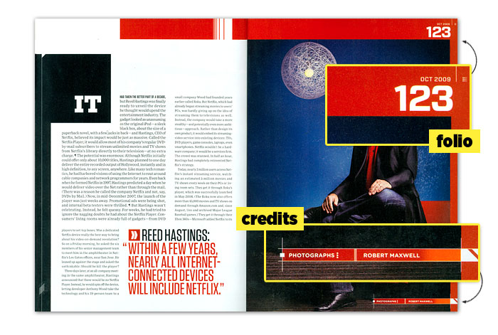
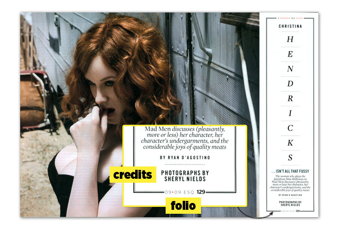
- Credits: If you read our "Where do I get the photos?" question a few days ago, you know you need to include source information for your images. But where do you put it? Well, you have several options.
If all your photos are from the same photographer, you can list them as a byline just like your story author. Otherwise, you'll notice that most magazines place credits in tiny type either along the gutter, the bottom margin on the page, or just under or beside the photo. Check out our examples below for starting ideas.
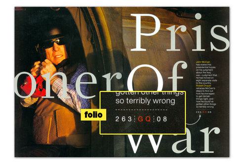
In most instances, the folio should be an almost invisible part of your layout ... it shouldn't interfere with your design. It should probably be in a typeface that is part of your publication's type palette and kept simple, though many do use bullets, icons, rules, color or other subtle design elements to better reflect the magazine's personality.
Some magazines, however, do treat the folio in a way that makes it integral to the page's design. Consider some of these treatments below ... in these first 3, the page number becomes part of the design for this particular spread and then goes back to its usual more simple placement in the rest of the magazine.
Here are some examples of caption, credit and folio treatments. Click on the images to see them larger:

Here are some examples of caption, credit and folio treatments. Click on the images to see them larger:


Missed our previous tips? Check them out:
Have other questions? Email us.
Image credits: (from top) GQ, Wired, Esquire, Real Simple, Fortune, Bon Appetit
Image credits: (from top) GQ, Wired, Esquire, Real Simple, Fortune, Bon Appetit
