Design
09.13.08
Part 17: Designing the Opener
 Time for design. But first, a little about the WIRED design department and how we work. It consists of me, design director Wyatt Mitchell, art directors Carl DeTorres and Maili Holiman, associate art director Margaret Swart, senior designer Christy Sheppard, and contributing designers Walter Baumann and Victor Krummenacher.
 Wyatt, Carl, Maili and I all design feature stories. Typically, Wyatt and I both work in equal measure in setting the pace and look of our features, but Carl and Maili are tremendously talented designers in their own right. This creates the lucky situation of being able to collaborate--passing pages back and forth--as well as acting as editors for one another, offering critiques and solutions for problems. And we often involve Margaret, Christy, Victor and Walter into this equation. As our FOB designers, they deal with small pieces of design all day every day and are sometimes better suited to deal with bitsy pieces, charts/infographics or marginalia.
At this point, the layout for Kaufman should already be well underway, but it's not. This is one of our largest issues of the year and we're cramming a hugely ambitious 18-page atlas into the mix, so it's taken all of Maili and Carl's time. That leaves Wyatt and I to design the rest of the well, and I've been in New York most of the week shooting for the very same atlas that Maili and Carl are working on. So I'm pretty far behind schedule.
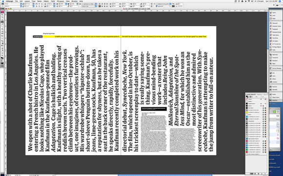
Today is Saturday and I'm up here at the office fleshing out my ideas for the opener. As I wrote about last night, I have this notion of doing something that will of course look good but fit the theme of recursiveness Jason has set up, and it needs to work without a photo on the opener. We've sort of nixed the idea of running the rough draft in agate type alongside the final story, simply because we felt like it wouldn't be a fulfilling exercise for the reader. Jason's 00 was so clean and well-structured, the edits were fairly minimal.
I asked Bob to write a headline and dek yesterday, and on his way out, he mentioned an idea that I had sort of been thinking about myself. He said we should just do a minimal hed/dek and just start the story out really huge, let the lede itself function as display copy.
I thought about that and decided to try it, but maybe going a little more unconventional with it, so I turned the graf on its side, cutting in some super tiny (5/6) type, which I decided should be the pitch letter.
So this took me about three hours of fussing and playing to get here. I'm liking it, visually. I'm not sure that it's the right way to go, but there's something there. I don't like the rag of the copy as it runs along the top edge. I think I want to make that dek shorter, so i can make the type larger (maybe privileging his name more), ensuring that when you open this spread, you quickly know it's about Kaufman. The pitch letter looks cool in there, the dramatic size and orientation shift of the copy provides a nice tension, I'm just not sure that we're doing something that makes sense yet. It will need a little blurb about it and the other marginalia, maybe there's a fun way to justify it with a punchy little hed/dek there.
I dunno.
