Design
09.19.08
Part 22: "The Wrong Theory"
 After my disastrous presentation to Chris, I slunk back into work on Tuesday and tried a new tact. I figured I would go completely stark, something strange and awkward. I received a new headline: "Charlie Kaufman, The Director's Cut" and started to play. I threw together a secondary spread, just to have something to work backward from. It looked like this:
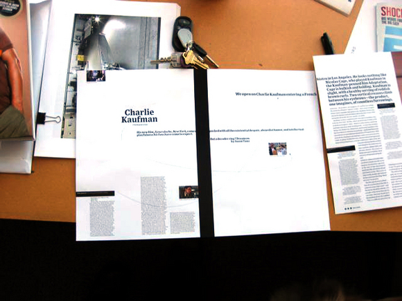
Working from there, I cleared the decks and started messing around with a big swath of white and little articulating pieces of copy, like so:

It felt a little generic, so I went with a bolder version of my sans serif, Exchange. I also moved the copy blocks around a bit, looking for more tension and awkwardness:

Somewhat satisfied, I emailed this version to Chris, who was traveling. He liked the direction, but was concerned that we were overplaying the pitch letter (the fine print in the above layout) so I enlisted my associate art director, Margaret Swart, to take up the task of exploring this idea and visualizing the turn pages. She's a tremendous designer, really attuned to the intracacies of white space, finding tension and sophistication with the most banal of things.
She came up with the following variations on this theme:


This last one was my favorite.
I have a design theory I've developed in my time here at WIRED. I call it "The Wrong Theory." In my years in magazines, whenever I've been pleased with a layout at the time I ship it to the printer, I'm usually disappointed with the result when I go back to it after some time has passed. It's like with a record. When you buy a new release and you love it immediately, it usually has a short lifespan. You play it till your ears bleed and two weeks later, it's discarded to a pile of CDs in the backseat of your car, never to be listened to again. But an album that's more challenging--something you don't like on first listen--can often be the most rewarding given time and attention. I have albums that I've hated on first listen, then let sit and age and when I come back to them with fresh ears, I've really enjoyed their complexity and novelty. I've experienced a similar phenomenon with design. Work (whether I've done it or someone else has) that I've actively disliked tends to grow on me with time and distance.
So my theory is: Take a layout you like and fuck it up. Ruin it. Add to it, take away from it, just do something that makes your skin crawl, and go with it. Ship it, print it, swallow your discomfort and go with it. (It doesn't work with everything; sometimes you really can ruin a nice piece, so be careful.) With time, you'll come around to it and again, in my experience, the work that I'm most proud of in my portfolio has been work that I've disliked with at completion.
In the past 18 months at WIRED, I've preached this theory with my designers and art directors and we all try and implement The Wrong Theory in our pages. We (and I) get flack for it. Bob doesn't always get it, and neither does Chris, but believe me, there's method to my madness.
So what appealed to me about this spread was all of the things that I've learned to be open to in practicing The Wrong Theory. Weird tension? Check. Awkward spacing? Check. Strange rag? Check. Placing photos against the bleed? Check.
So I showed Bob what I was up to. I don't think he liked it, but he understood the situation and my strange propensities and shrugged his shoulders. His one complaint was the echo of having "Charlie Kaufman" in the headline and the dek, so he suggested a new headline, which I did not like. But I knew I had just won a battle in the war, so I saved that conversation for another day. There was plenty more work to do.

