Redesigns
01.28.09
Rebranding LATINA
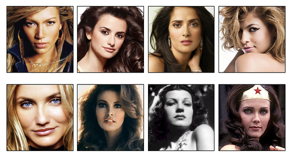 Say the word Latina, and what do many people think of? Women like
Jennifer Lopez, Penelope Cruz, Salma Hayek and Eva Mendes. But Latinas
are also as diverse as Cameron Diaz, Raquel Welch, Rita Hayworth, and
even Wonder Woman herself, Lynda Carter. The point is, there is no
"typical" Latina. They are an eclectic group of women and their
diversity became an editorial focal point for our redesign.
Say the word Latina, and what do many people think of? Women like
Jennifer Lopez, Penelope Cruz, Salma Hayek and Eva Mendes. But Latinas
are also as diverse as Cameron Diaz, Raquel Welch, Rita Hayworth, and
even Wonder Woman herself, Lynda Carter. The point is, there is no
"typical" Latina. They are an eclectic group of women and their
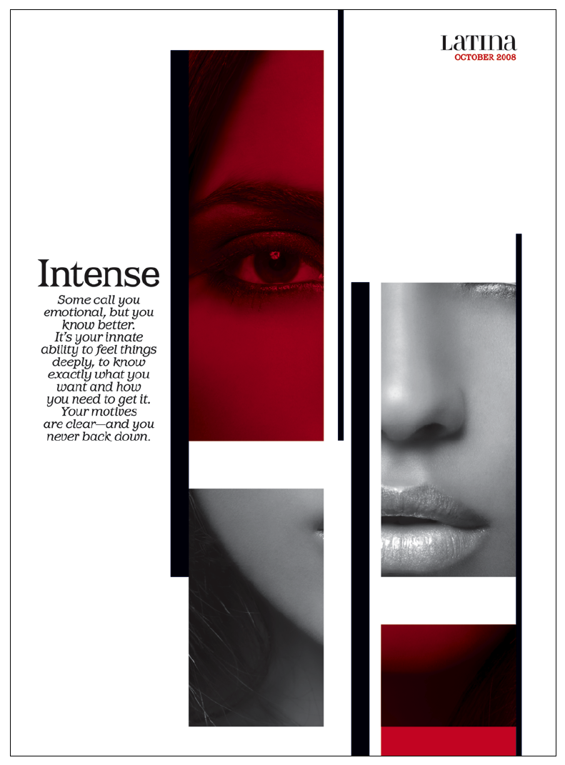
diversity became an editorial focal point for our redesign. The first task at hand was to redesign the logo. One concern was that the current logo, with its mixture of upper and lowercase, didn't feel unified enough. After many attempts with different typefaces, we decided to somehow make the existing Didot work.
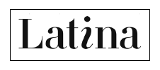 Setting the name in all caps didn't seem enough, and while we attempted to keep the clever italic letter "i," we instead looked to Bradbury Thompson's Alphabet 26, which simplified the alphabet by using either an uppercase or a lowercase for each of the 26 letters.
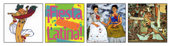
For the inside, our goal was a visual vocabulary that made sense culturally without using stereotypical graphics--no Chiquita bananas or overly festive typefaces. We also avoided beloved artists like Frida Kahlo or Mexican muralism for inspiration. Instead, we chose to dig deeper and embrace more diverse elements found in this culture.
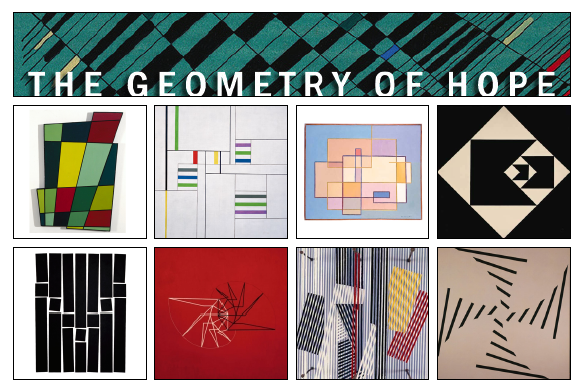
 We found our inspiration in a fine arts show called "The Geometry of Hope," an art movement unknown to many, which featured Latin American artists whose work was characterized by abstract, geometric shapes.
 Roberta Smith wrote in The New York Times: "Latin American abstraction has tended to be ignored in North America, when not dismissed as fussy, gimmicky and a tad kitschy. This show of about 105 works by nearly 30 artists invites a reconsideration of such attitudes. Working through its riches is both humbling and thrilling; you encounter your ignorance and have a chance to rectify it."
Their approach became the building blocks for our redesign, and ended up shaping much of the format.
These are the slugs for our four main sections and an example of a feature well opener.


The geometric shapes of each feature well opener then dictate the design of some of the following features in that issue.

The photography for Latina at times presented a different set of challenges. Director of Photography George Pitts to PDN last year:
"Thinking back on the Vibe years, one of the unsaid, very clear imperatives was to deliver photography of ethnic groups, people of color, racial minorities, at the level that we see in all magazines we consume on a regular basis. One finds that the photography community has to be encouraged and invited to participate in photographing people of other races, other backgrounds. Many of them are extremely keen on doing it, some need some motivational direction."

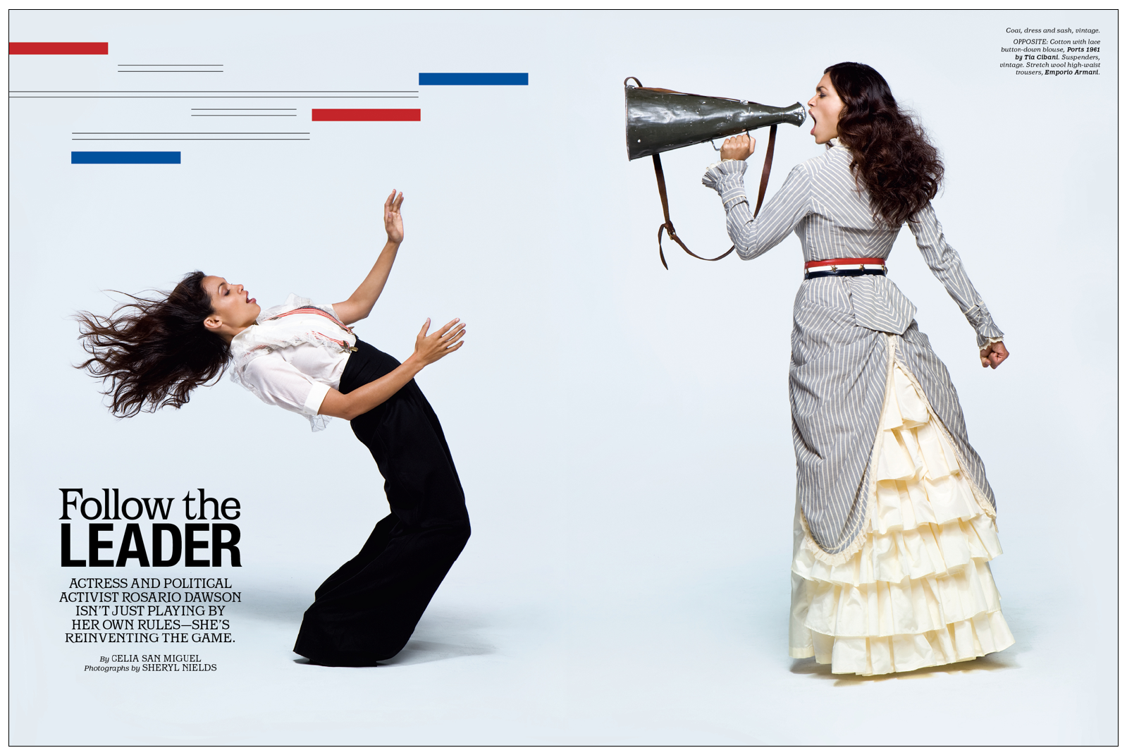
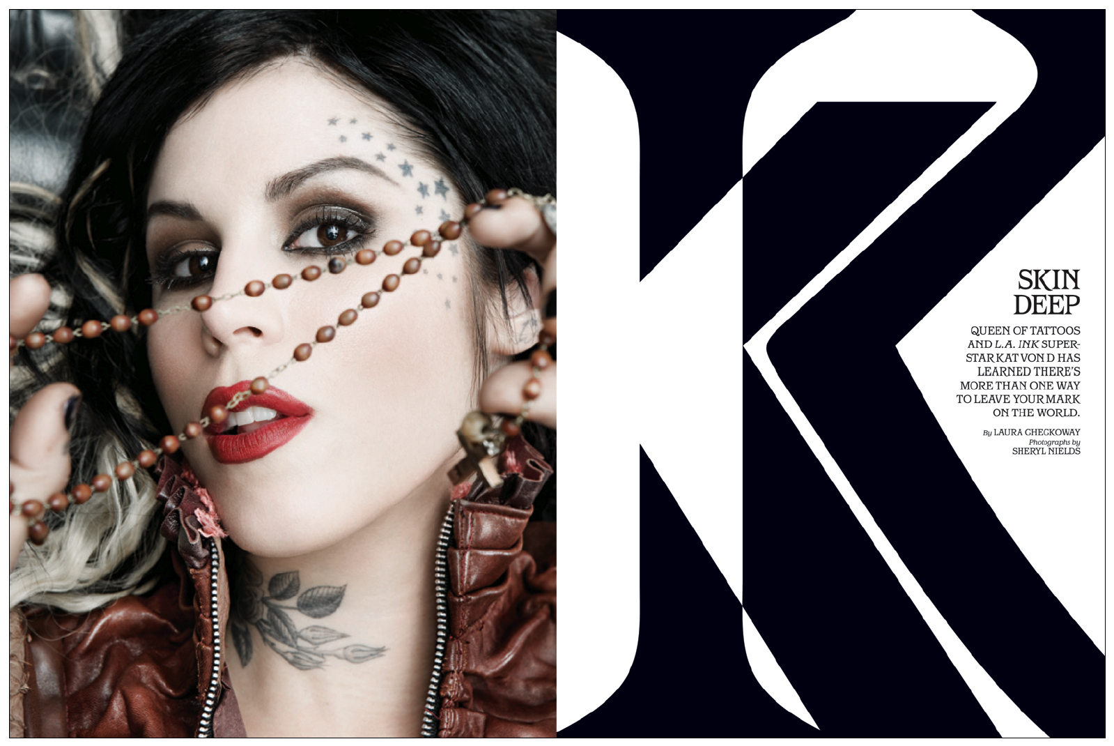
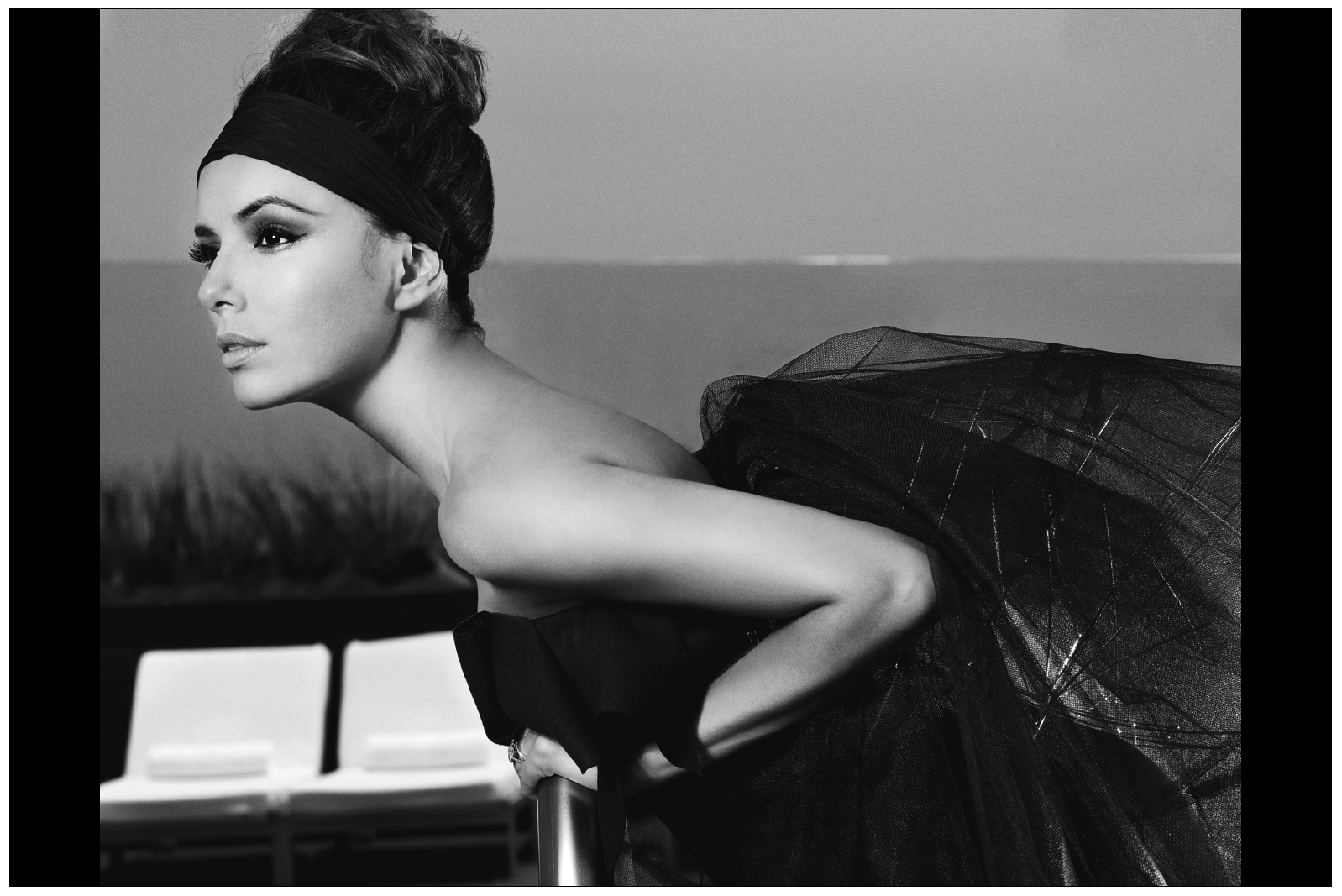
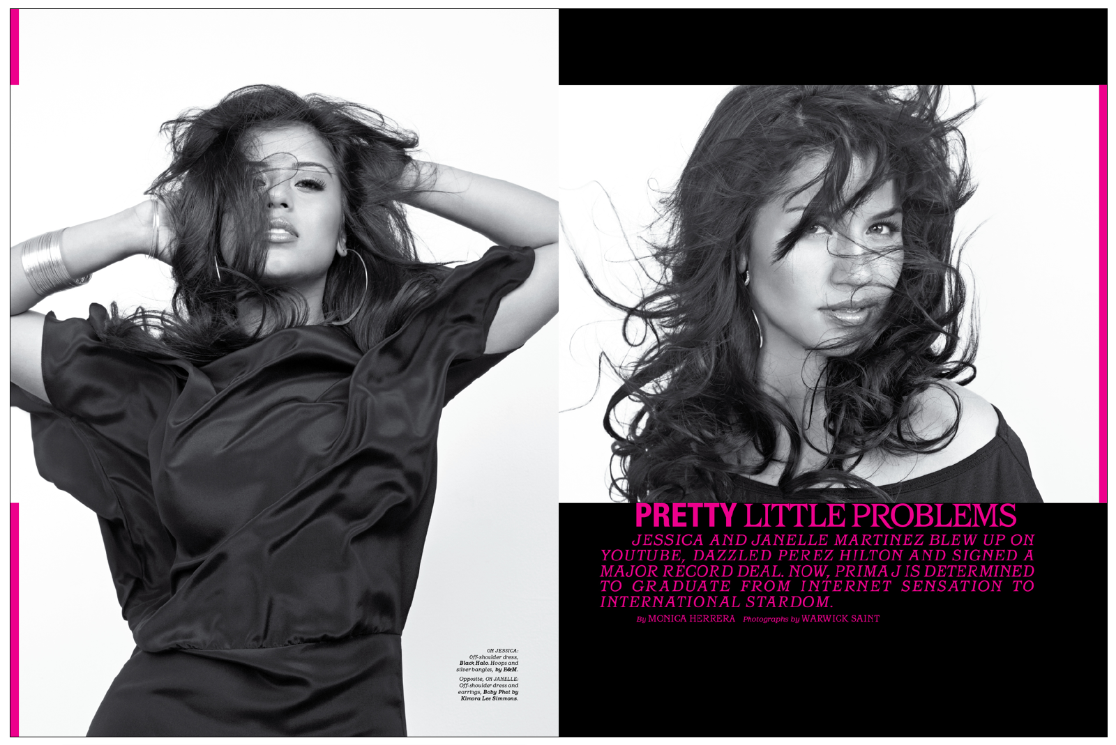
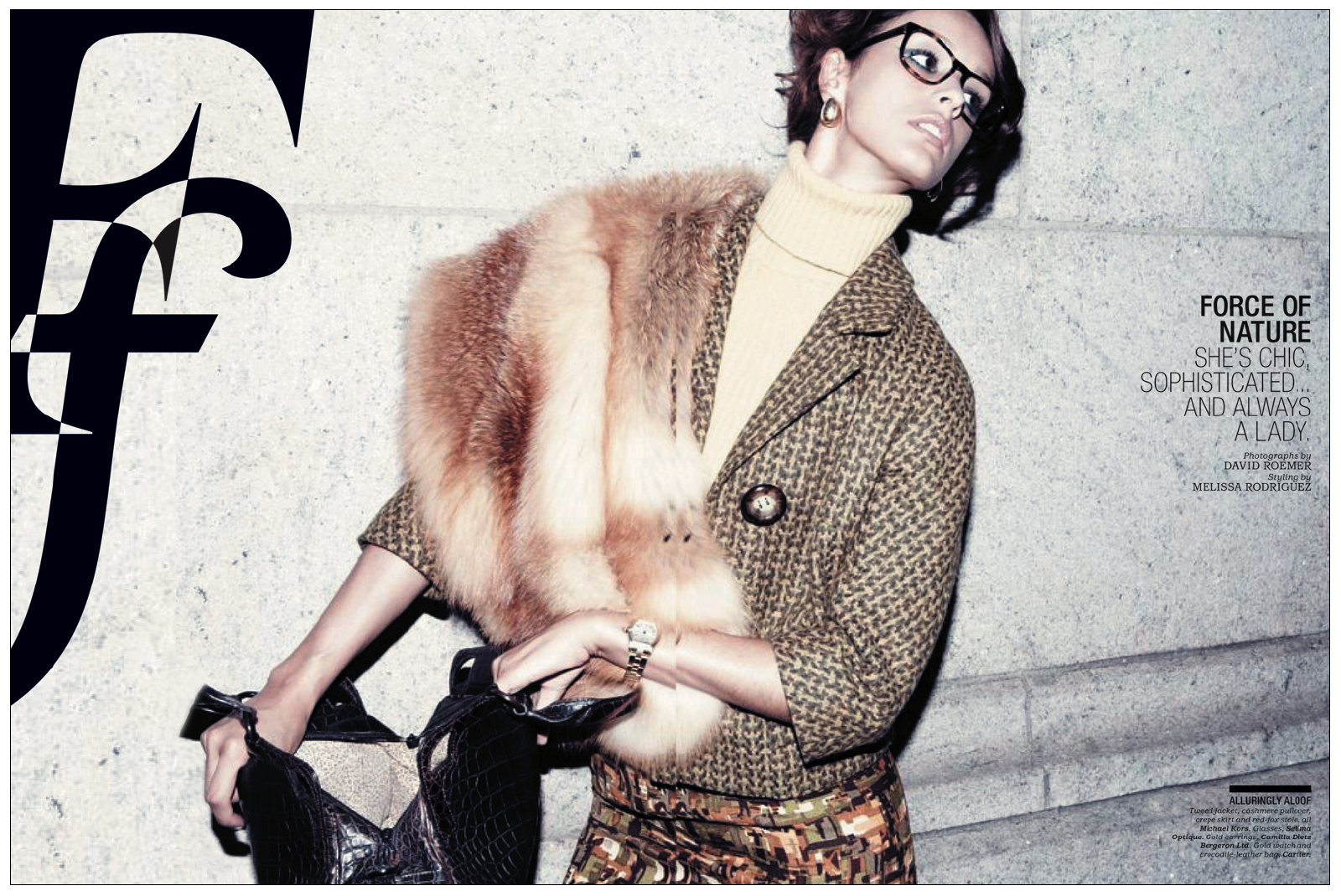
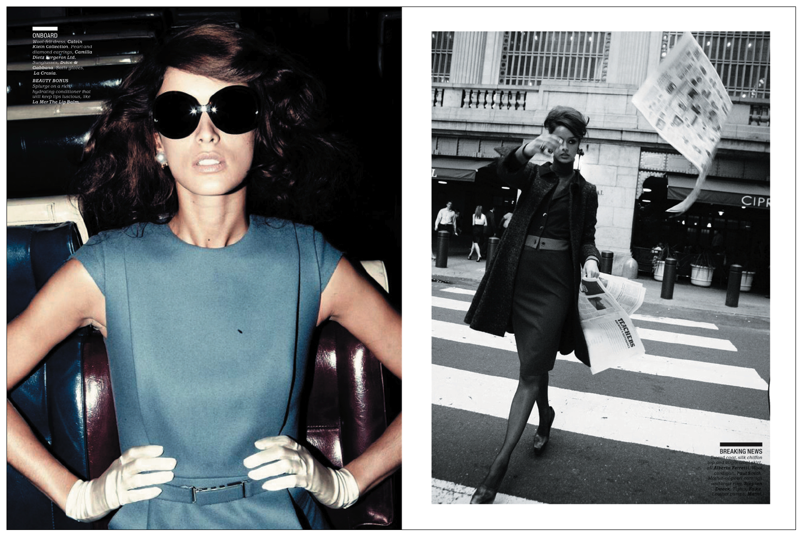
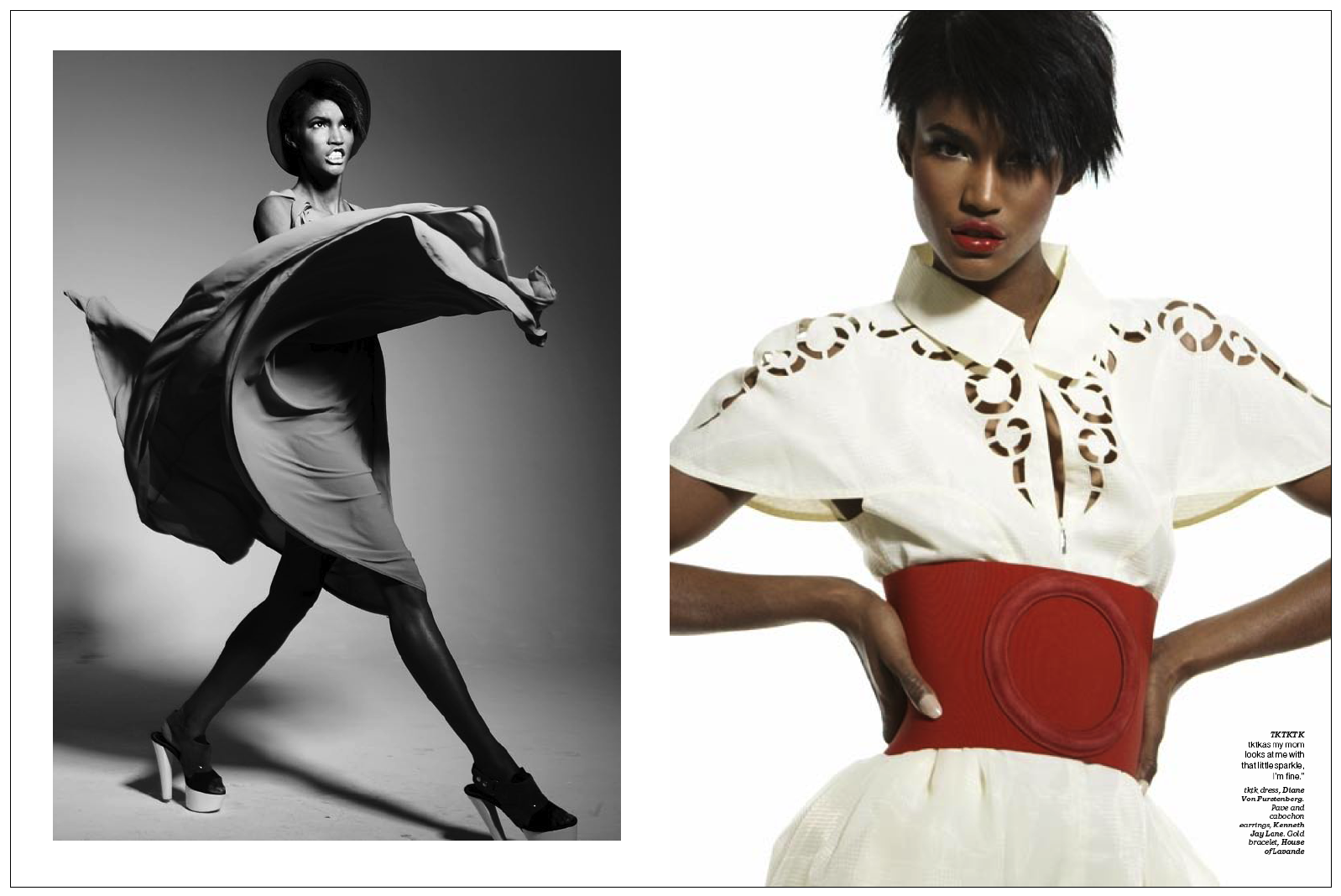
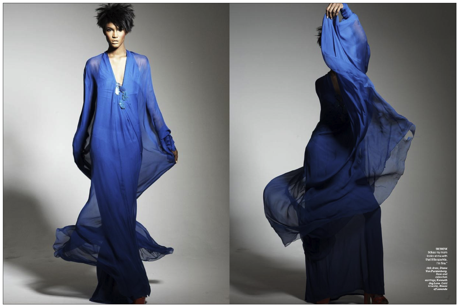
Here are several more examples of various cover, fashion, and beauty stories from the past year, which I feel met the level that George spoke about:
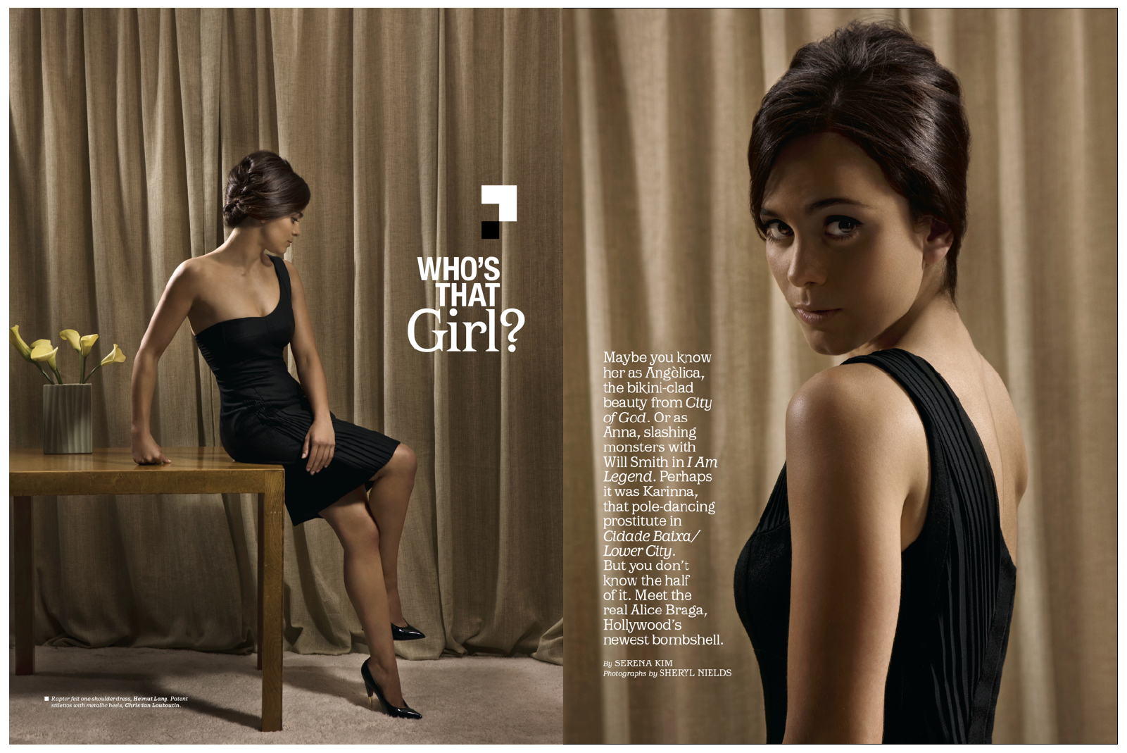
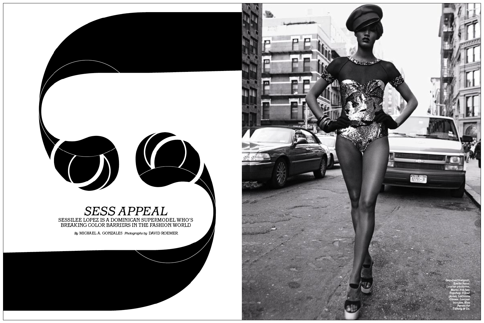
This is part of a 14-page cover story on 20-year-old Dominican model Sessilee Lopez, one of the fastest-rising dark-skinned Latina models in the world, photographed by David Roemer. Here we're having fun with the ball terminals of the "a" letterform from our logo.
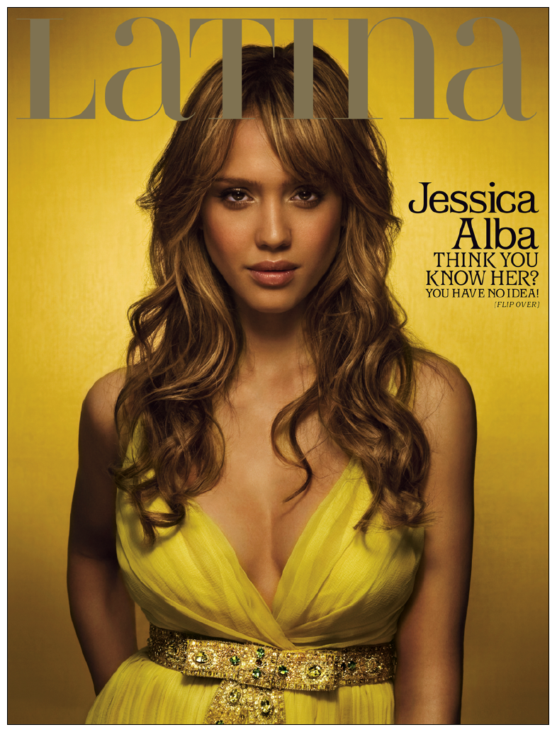
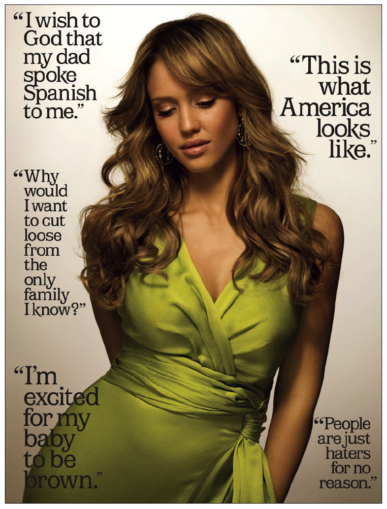
When Jessica Alba appeared on our March cover, many Latinas were convinced she was ashamed of her Mexican heritage due to false Internet gossip. Not only is she extremely proud of her Latina roots, she provided us with enough quotes to make her case on the back cover.
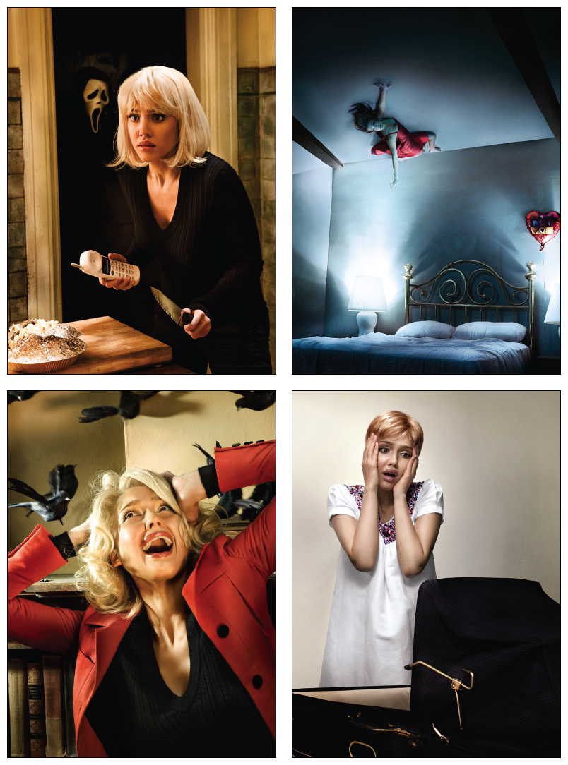
Since Alba was starring in the psychological thriller "The Eye," she worked with photographer Sheryl Nields to recreate scenes from classic horror movies like "Psycho," "Scream," "Poltergeist," "The Birds," and even "Rosemary's Baby." Considering she was four months pregnant at the time, we thought her sense of humor spoke volumes, as did her proud papa.


The goal of presenting culturally relevant, but unexpected design solutions is a fascinating challenge. In rebranding Latina, we also hope our magazine pages are a gentle reminder that any ethnicity is a lot more diverse than we sometimes think it is.
The Latina team is Editor-in-Chief Mimi Valdés Ryan, Director of Photography George Pitts, Design Director Denise See, Photo Editor Jennifer Sargent, Associate Art Director Phoebe Flynn Rich, Photo Assistant Christie Del Nero and Creative Director Florian Bachleda.
If you have content (big or small) that you think would be great for The Sandbox; behind-the-scenes stories, the process of a design, illo, photo, logo, typography...really anything about the way we put a magazine or website(!) together...forward it to Brandon at TIPS@SPD.org.
