August 2008 Archives

Beautiful Losers

Beautiful Losers

"Um I'd like one ticket for, Beautiful Losers." I went warily to this documentary last night, thinking it was going to be another rags-to-riches story of a hip art clique, complete with footage of the cool parties you could never get into. But okay, I'll go see it...heck Shepard Fairey is in it.

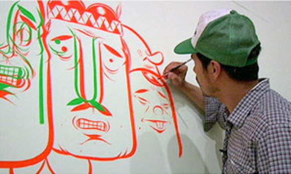
I've seen films on the cultural significance of graffiti and the skate culture, those of disenchanted youth angry at the world, this one is more about the behind the scenes creative process and collective energy of a group of witty DIY artstars. Shot in NYC, LA and SF in the mid '90s, it covers their rise from a tiny gallery to international corporate campaigns, then ends on a surprisingly touching moment. The film slowly shows that they aren't just well-funded hacks lazing around the Lower East Side, but reveals how their unity propels them and how each is simply, driven. (a plump Harmony Korine says in the end, its almost a "duty".)
MORE
Persepolis

Persepolis

I finally Netflix-ed Persepolis, Marjane Satrapi's moving autobiographical graphic novel turned animated film. Some of the night scenes outside with the tanks and the marches as well as the scene of Persepolis' family going down the stairs of their building towards the basement, with their expressionist shadows, were reminiscent of the illustrator David Cowles' work; the sharp angled silhouettes against the charcoal textured background. The entire movie is hand drawn, giving each line so much character and personality, and mostly done in black and white. It's nice to be reminded of the power of a stripped down color palette and amazing to know that in this computer generated era, there is still work being done in the old fashioned way.

Alice Alves, Deputy Art Director Fortune
MORE

"I'll Eat Anything"

Can't live on magazines alone! I am like a goat: I'll eat anything. Ed Ruscha paintings and Max Huber posters are great, but so are photoblogs of vintage bottle caps, comic books (old and new), and mod pharmaceutical packaging. Look around: hand-painted signs at a butcher, 70's muscle cars, those receipts the conductor gives you when you have to buy your ticket on the train. It's all eye food. Eat up.

--Tom Alberty, Deputy Art Director, GQ
MORE

"I've Retreated to a Safer Place"

Whenever I'm in Universal (on Broadway) I get kind of panicky. It's all too good... there is too much of it. The goodness I mean. Even pets have good magazines now. Foil and fluorescent, matte stock and UV--there is so little to distinguish the good from the bad. And where is the ugly? The mediocre? The crap? That by which we behold the awesome! The foil for the foil?
MORE
Powerful Web Photojournalism

Powerful Web Photojournalism

From my pal, Jeremy LaCroix, over at CBS Interactive:

Too often, the most basic ideas get lost in online editorial in a struggle to prop up page views so sites can catch the eye of the coveted advertisers through our display of robust data points (err...page views) and not quality of the product or brand. Unfortunately, it's the viewers who lose out. (Notice I don't call them "users." How rude is that term anyway?) How many times have you said to yourself, "Yeah the Web is getting better, but I miss large-format photography and the power it wields in conveying feeling and telling a story."

Boston.com has changed this perception for me with its franchise simply titled BIG PICTURE.
MORE
Olympic Typography Skills (in 1968)

Olympic Typography Skills (in 1968)

I don't know about you, but I've caught this Olympic fever; the more I watch, the more I find myself picking out the ubiquitous "Beijing 2008" Olympic logo on everything (I mean everything). I can't help but think to myself, "only in the digital age." Right?

Then this morning I came across this "Mexico 68" logo.
MORE

"Ruptured? Get Relief This Proven Way!"

I love me some Pop Mechanics.

Old, as in 1940's old.

If I were a shrink, I'd hand them out to my patients after sessions, because you can't seriously dive into one without smiling, and be reminded of better times. What other magazine lists the five quintessential rules for under sea movie making, illustrates how a juke box is disassembled, then reassembled, or shows you how to eavesdrop through 24 feet of steel? Well, maybe WIRED. But the real reason we should all pick up an old POPULAR MECHANICS MAGAZINE are the ads. They're chock-full of gorgeous old retro typefaces and hand-drawn clip art, and the pages in general serve as a never ending pool for ideas, humor, and inspiration. "STOP DAY-DREAMING AT WORK!", "LET US SHOW YOU HOW TO MOUNT BIRDS!", "LEARN PLASTICS!", and my favorite, "RUPTURED? GET RELIEF THIS PROVEN WAY! 

--T.J. Tucker, Art Director, Texas Monthly

"Knocks My Socks Off"

This might not seem original to the photo world. But I've been really getting into the stock site Photoshelter.com. It's really made looking through collections of stock imagery more interesting, actually refreshing. The site has 37,000 photographers around the world uploading their images everyday. So it's a great place for me to find fresh and most importantly contemporary images. Also a good place to find photographers for assignment. (More of Leslie's thoughts on stock photography, and the finer details of photo editing at Time, at Rob Haggart's blog, APhotoEditor.com. --Ed.)
MORE

"Here's a list of things currently sitting on or under my coffee table"

Magazines
Huge (Japan), Summer 2008
Popeye (Japan), July 2008
Monocle (GB), May 2007 and Aug 2008
Studio Voice (Japan), July 2008
Transworld Skateboarding, Aug 2008
W, July 2008
MORE

"The Covers Are Wild and Illegible (and Totally Inspiring!)"

Lately I've been looking at issues of House Beautiful from the late 1960s. I love the pages of illustrated merchandise. It's so modern!

MORE

"I Raved About It To My Magazine Store Clerk."

I hate to say it but I have been ogling the latest issue of Bon Appétit. It was the cover that got me! I wanted to eat up that ice cream cone right there in the magazine store. I raved about it to my local magazine store clerk. Asking him how many people have bought it? Who is buying it? Does he like the cover? (Magazine clerks know their covers!) Bon Appétit has exquisite typography, the structure is inviting and the photography is slick and tangible.

MORE

Archives | September 2008 »