New Work
02.17.09
WIRED
 The San Francisco technology chronicle debuts its package about "design under constraint" on February 24, the March 2009 issue. Creative director Scott Dadich explains the thesis in his introductory essay (after the jump).
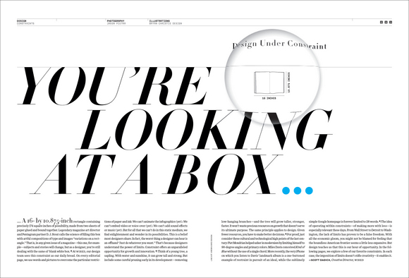
 You're looking at a box...a 16- by 10.875-inch rectangle containing precisely 174 square inches of possibility, made from two sheets of paper glued and bound together. Legendary magazine art director and Pentagram partner D. J. Stout calls the science of filling this box with artful compositions of type and images "variations on a rectangle." That is, in any given issue of a magazine--this one, for example--subjects and stories will change, but as a designer, you're still dealing with the same ol' blank white box.
At WIRED, our design team sees this constraint as our daily bread. On every editorial page, we use words and pictures to overcome the particular restrictions of paper and ink: We can't animate the infographics (yet). We can't embed video or voice-over (yet). We can't add sound effects or music (yet). But for all that we can't do in this static medium, we find enlightenment and wonder in its possibilities. This is a belief most designers share. In fact, the worst thing a designer can hear is an offhand "Just do whatever you want." That's because designers understand the power of limits. Constraint offers an unparalleled opportunity for growth and innovation.
Think of a young tree, a sapling. With water and sunshine, it can grow tall and strong. But include some careful pruning early in its development--removing low-hanging branches--and the tree will grow taller, stronger, faster. It won't waste precious resources on growth that doesn't serve its ultimate purpose. The same principle applies to design. Given fewer resources, you have to make better decisions.
For proof, just consider these cultural and technological high points of the last century: Piet Mondrian helped usher in modernism by limiting himself to 90-degree angles and primary colors. Miles Davis conceived Kind of Blue without the use of a single chord. More recently, the very iPhone on which you listen to Davis' landmark album is a one-Âbuttoned example of restraint in pursuit of an ideal, while the sublimely simple Google homepage is forever limited to 28 words.
The idea of operating within constraints--of making more with less--is especially relevant these days. From Wall Street to Detroit to Washington, the lack of limits has proven to be a false freedom. With all the economic gloom, you might not be blamed for feeling that the boundless American frontier seems a little less expansive. But design teaches us that this is our hour of opportunity. In the following pages, we explore a few of our favorite constraints. In each case, the imposition of limits doesn't stifle creativity--it enables it.
--Scott Dadich, Creative Director, WIRED
Scott Dadich, creative director
Wyatt Mitchell, design director
Maili Holiman, art director/designer
Christy Sheppard, designer
Carolyn Rauch, photography editor
Jason Pietra, photographer
Bryan Christie, illustrator


