New Work
04.19.11
GQ iPad App v2.0
 You get an email saying that Fred Woodward would like to show you the new GQ iPad app that's about to launch. What do you do other than say "I'll be up there faster that you can spell "Galifianakis"?
The new version of the GQ iPad app has launched today. It was built with the Adobe Digital Publishing Suite also used by big titles like Glamour, WIRED and Reader's Digest. GQ's new take on the app goes beyond the previous RSS-feed style. In contrast, the new app is based on the print magazine driven by Fred Woodward's design direction and executed by the GQ art department, thus reflecting the look and feel of the print publication.
Overall, I would call this a huge leap forward in terms of the translation of GQ onto the iPad. It is done with a keen eye, reworking an already great design onto the tablet screen. I look forward to seeing the future iteration of the app from this talented staff, and hopefully its expansion into more utility-based mini apps with the same elegance and attitude. And yes: the gentleman from the print edition spine made it to the masthead screen at the end of the app.
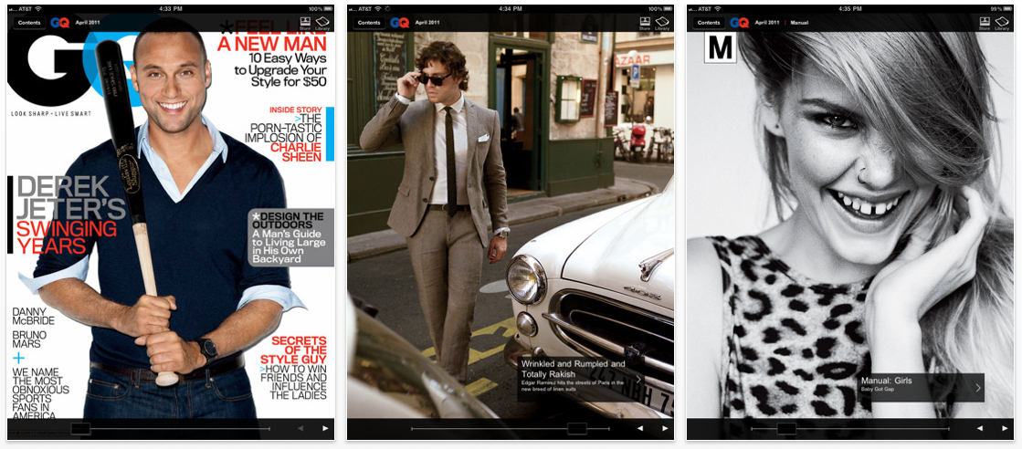
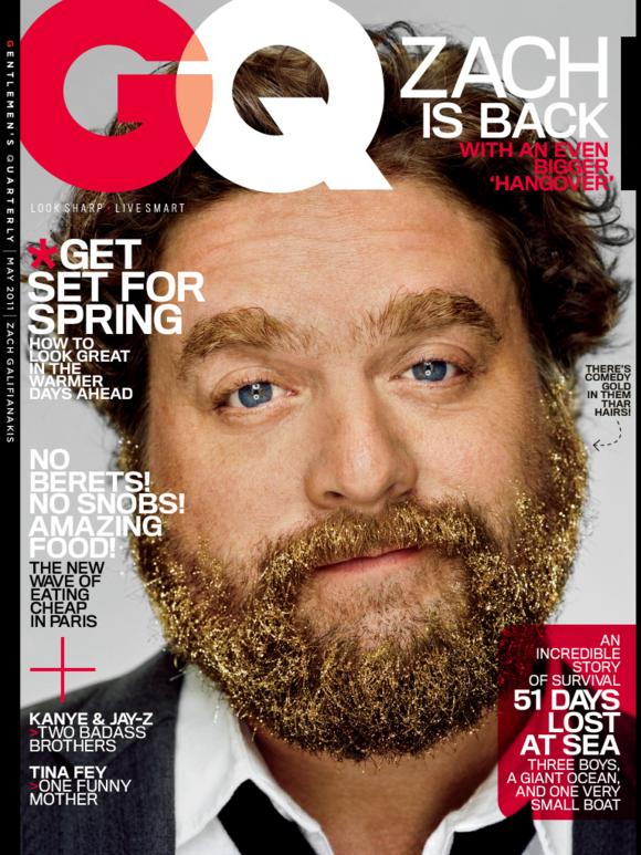
Top: GQ, May 2011 iPad app cover featuring Zach Galifianakis, photographed by Martin Schoeller. Above: The previous version of the GQ iPad app (April 2011 issue).
. . . . . . . . . . . .
The pages of the app are a solid translation of the printed page. They do not look exactly like the magazine, but more importantly, look like "GQ." The app guides the user through the issue with a series of arrows & triangles. A large "X" marks the spot where you're done with a story.

Above: GQ, May 2011 TOC. Below: The iPad version.

. . . . . . . . . . . .
The app maintains the content from the print edition (with a few bonus features), and reorganizes it for the iPad user with these poster-like frontice screens that allow the user to quickly tap right into a story.


. . . . . . . . . . . .
Department like Manual and Intelligence (below) leverage stripped down design elements from the print edition.

. . . . . . . . . . . .
During the design process, Fred says, the department sections of the book (Manual, Intelligence, etc.) translated gracefully to the tablet screen. However, the features were a bigger challenge:
Pretty early on we felt that some of the features that we loved best in the magazine didn't work quite as well on the smaller iPad screen. Suddenly they seemed a little too complicated, too crowded, maybe too eclectic typographically. The power of both the photo and the display type, packed together on the same screen, felt diminished. It was indeed a 'replica,' something a bit less authentic than the original.We had heard that a common complaint with other apps was that people couldn't tell the difference between the ads and the edit (neither could my mother, by the way). By this time, we also knew that we might lose the protected sanctuary of the feature well in the digital version.While everyone else continued to work hard designing the rest of the book and their conversions to the tablet, Tom Alberty (GQ Art Director) and I broke away and concentrated solely on the features for about a week. We imagined ourselves working for Apple, set with the mission of designing magazine content for their new apparatus. Even though the clock was ticking fast, this little head game allowed us to hit 'reset,' attack the problems fresh, strip it all the way down and build it back new.We distilled the typography to its most distinctively recognizable GQ state (a font we've used for some time, ironically enough called 'Replica'). We modified the structure of the issue and added frontice pages that served as sectional contents pages. We found different, almost cinematic, ways to roll out a story that seemed bolder and truer to the medium--in fact, made possible by it.As simple as it all may sound now, this was the breakthrough moment. We we're designing for the machine.

GQ, Zach Galifianakis feature opener in print.
Below: The first two portrait screens from the app version.


Of note: The design team has included a breadcrumb-style navigation approach within stories to give the users a sense of where they are within stories (left).
. . . . . . . . . . . .

Above: GQ, "Destroying Detroit" feature opener in print.
Below: The first four landscape screens from the app.

. . . . . . . . . . . .
By design, the GQ app uses limited multimedia elements. Below is a feature that did not make it into the print edition. For this opener, hand written footnotes animate onto the screen when selected by the user. Fred says the they added multimedia assets selectively, promising "not to hold the reader captive."


. . . . . . . . . . . .
Inside this fashion feature, detailed close-ups of watches may be viewed via pop-overs--a feature unique to the iPad app.


The app maintains the content from the print edition, but reorganizes it for the iPad user with these color coded section starts that allow the user to tap right into a story.
. . . . . . . . . . . .
As with all apps, utility is key. Not to be overlooked as an important feature, GQ has expanded their Where to Buy/Directory section in the app to include lots of useful links to buy what's in the issue--a very useful feature when I want to follow-up on GQ's recommendations. I'm looking forward to future versions that could expand on this concept.

Postscript: There was, of course, lots (lots!) more to be done before this beast was put to bed, and plenty of major contributions made by everyone in design. A special tip of the hat to Dora Somosi, Chelsea Cardinal, Mary Stiehl, Devin Gordon, Michael Hainey and Jim Nelson.
Download the app here, and let us know what you think of it.
Hey! You've probably got some NEW WORK to share, and we want to see it! We'll welcome anything that's gone to the printer recently, something you're especially proud of and think might be inspiring to the membership and readers of Grids. We'll note the credits and the publication and shine a little light on the latest and greatest in publication design.
Please reduce your layouts to no larger than 1200 pixels wide and don't forget to include all relevant credits and a little background (if you feel like). Send your submissions to tips@spd.org and we'll post them as we get them.
Please reduce your layouts to no larger than 1200 pixels wide and don't forget to include all relevant credits and a little background (if you feel like). Send your submissions to tips@spd.org and we'll post them as we get them.
Previously in New Work:
Runner's World: For Obsessives and Newbies, May's Your Issue
Redesigning SpaThe Year In Ideas 2010
The Hollywood Reporter Relaunch
A Look at the Redbook Redesign
Behind the Scenes: Fortune Goes to the iPad
Twin Cities Metro: Choose Your Own Adventure This Summer
The ABCs of XYZ
Complex with No Coverlines (Sort of)
SPIN Turns 25, Zips Up, Counts Down
Psychology Today Gets Serendipitous
Runner's World Takes on Bigfoot
American Cowboy Redesigns
