01.18.12
How to (re) Make Money: Part 1, Print
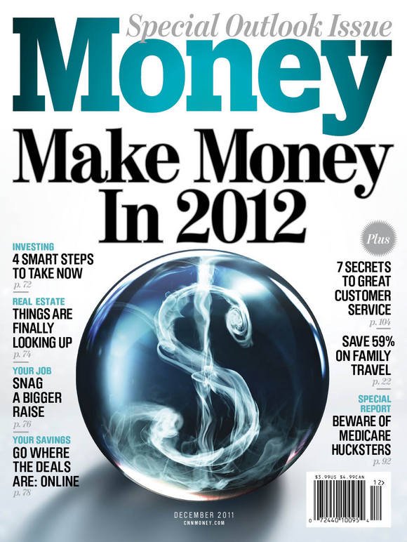 2012 marks the 40th anniversary of Money Magazine and what better way to ring in a birthday year than with a new look and a bold new tablet app. Here in part 1 Design Director Neil Jamieson gives us some insight into how he and his team refined the look of the personal finance magazine in print. (In part 2 he'll tell us all about Money's tablet version, look for it next week!)

Photographs by Travis Rathbone
Getting Started
This new look was about 6 months in the making. Why so long? This is some pretty complex content and in order to deliver it in a clear, concise and hopefully engaging way I thought it was super important that the art department (all of us personal finance mag newbies) really had a handle on it. This learning period bought us a level of trust from our editors and meant all of our design decisions came from an informed place.


We started with the most simple of elements...an ad separating rule...this 1 pica thick black bracket became the hallmark of the new look and served as a nice piece of structure to work around. It acted as a barrier between our edit and some pretty terrible looking ads.
A New Display Face: Early on in the process we fell in love with a font drawn by the Swiss Foundry Lineto called Brauer. The condensed face felt modern and unfussy but it still had lots of personality while being legible and clear. It also was fairly gender neutral which was appropriate for our readership and I liked that it didn't feel too feminine when knocked out. It also paired really nicely with our serif face which we kept from the old design (good ol' Benton Modern). The good folks at Lineto extended the family for me to include custom light and thin weights which made it a little more versatile.


Illustration by Oliver Munday
Navigation:
We then started developing our navigation (which obviously had its uses in the tablet version... more on that in part 2) and defining each section by an accent color (plan: green, health: red etc) which we picked up in the art for each section
Some pages just needed a spring clean...
a couple of before (left) and afters (right) Illustration by Brett Affrunti
 Photograph by Ryan Donnell
...Others needed More attention: Sometimes a 500 word narrative isn't the answer, we tried to figure out smarter, more dynamic story telling solutions
 Illustration by Vault 49
 Infographic by Luke Shuman

Features: The feature well became bolder and more graphic. The art has more room to breathe and the content is more organized and less fussy. Kudos to photo director Ryan Cadiz and his team for their ambition and tirelessness and for turning some super complex ideas into extraordinary images

 Photograph by Dan Saelinger
Some Highlights from our double "investor's guide" issue


Attention to Detail: Data is our bread and butter. Readers love numbers, charts, scorecards, performance tables, you name it...design of these pages may not be especially showbiz but requires great skill and attention to detail

Illustrations by L-Dopa

Soon after we started prototyping we learned that our tablet version was given the green light for a December 2011 launch which meant we had the unique opportunity to develop both print and tablet at the same time, one was able to inform the other and vice versa. More on that in part 2!
Art Department
Design Director: Neil Jamieson
Deputy Art Directors: Rich Morgan, Laura Renga
Tablet Art Director: Linda Tran Tutovan
Photo Department
Photo Director: Ryan Cadiz
Deputy Photo Editor: Shayla Hunter
Associate Photo Editor: Ryan Messina
Behind the Scenes: Fortune Goes to the iPad
Twin Cities Metro: Choose Your Own Adventure This Summer
The ABCs of XYZ
Complex with No Coverlines (Sort of)
SPIN Turns 25, Zips Up, Counts Down
Psychology Today Gets Serendipitous
Runner's World Takes on Bigfoot
American Cowboy Redesigns
