Amid Capeci, 1961-2012
In Memoriam 02.29.12
We received the very sad news today that one of our own, art director Amid Capeci passed away. He was an award-winning art director for Rolling Stone, Newsweek, and Entertainment Weekly, and SPD Board member who worked with so many SPD members. He will be missed.
Jeff Giles shared this letter from Amid's wife, Amy via the Newsweek alumni Facebook page this morning:
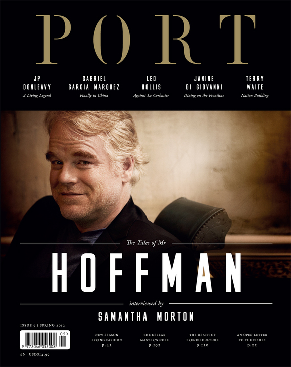
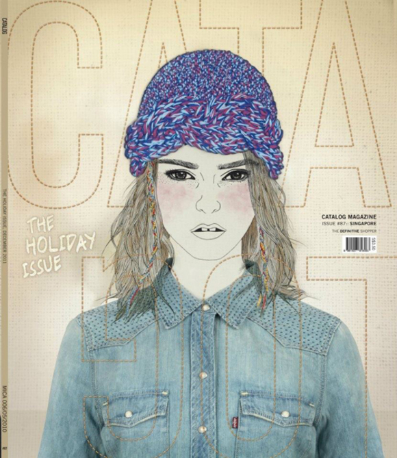
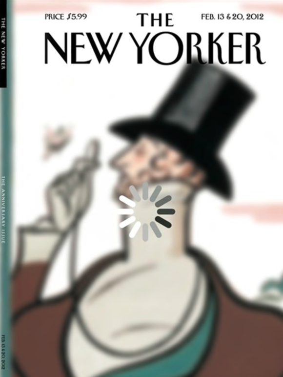
See some of Amid's covers after the jump...
… MORE