Redesigns
05.10.13
Inside the Men's Health Redesign
This year, Men's Health turns 25. As humans age, we begin to evaluate our ourselves, think about the past, and what we can change for the future. The magazine is no different. MH has expanded over the years into a beast. On a good month, Men's Health has 105 edit pages, 60 of which form the Front of Book. Within that, there are six sections, each jam-packed with tips on everything from heating up a quick chicken dinner to cooling down persistent erections. In layman's terms, that's a lot of sh#!+. MH CD Robert Festino walks us through their redesign process.
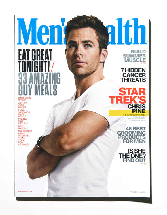
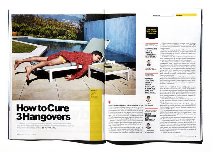
Above: Men's Health, featuring Star Trek's Chris Pine, June 2013.
Creative Director: Robert Festino, Photographer: Ture Lillegraven.
So, how do you organize that?
The design department here often looks to the past for design inspiration. We are disciples of Swiss design, and we approach everything from a functional point of view. Our goal for the redesign was a simple solution that can be easily rebuilt into iPad, iPhone, and whatever other gadget people will be using tomorrow.Our solution is a modular system that could offer enough variety to make each FOB section distinct, yet cohesive.This graphic system, which we call "The Wheelhouse," consists of a few elements which provide structure and unity throughout the magazine. The main ingredient is "The Notch," which serves as the anchor for all of the FOB openers. It appears in the same proportions on all pages, both solid and reversed out. Functionally, it compartmentalizes smaller bits of information like bylines and tag lines. It also works on turn pages to anchor quotes and smaller elements.
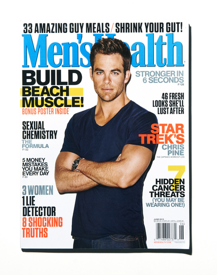
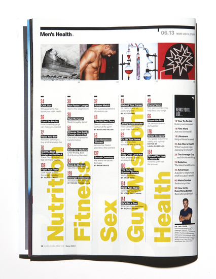
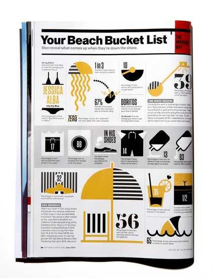
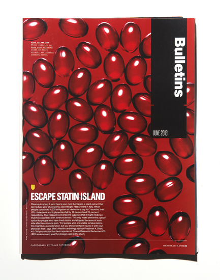
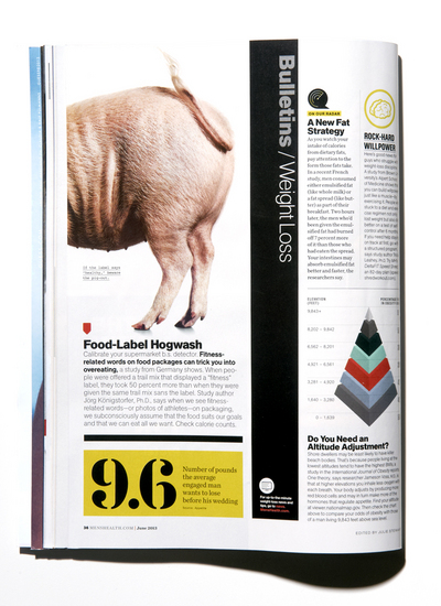
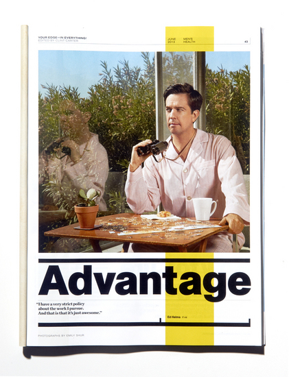
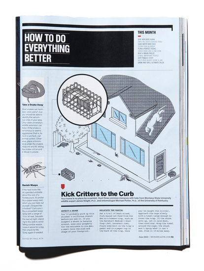
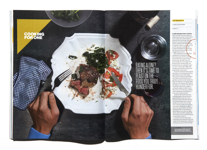
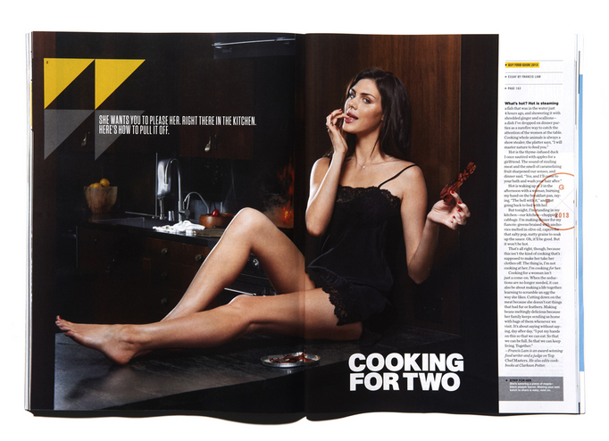
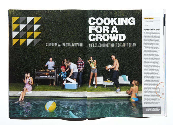
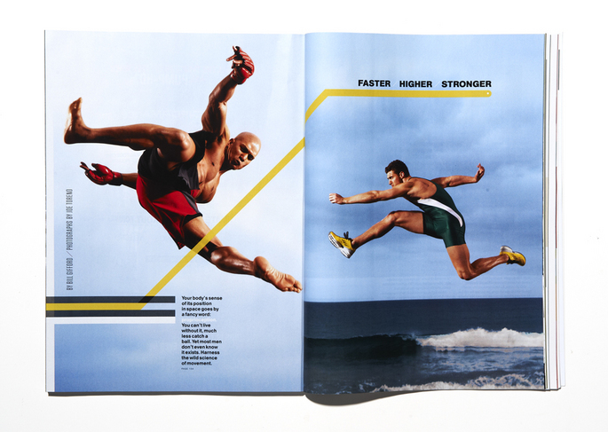
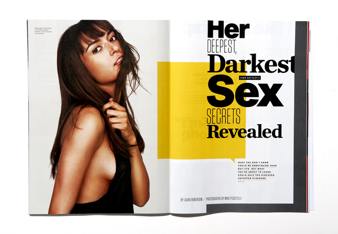
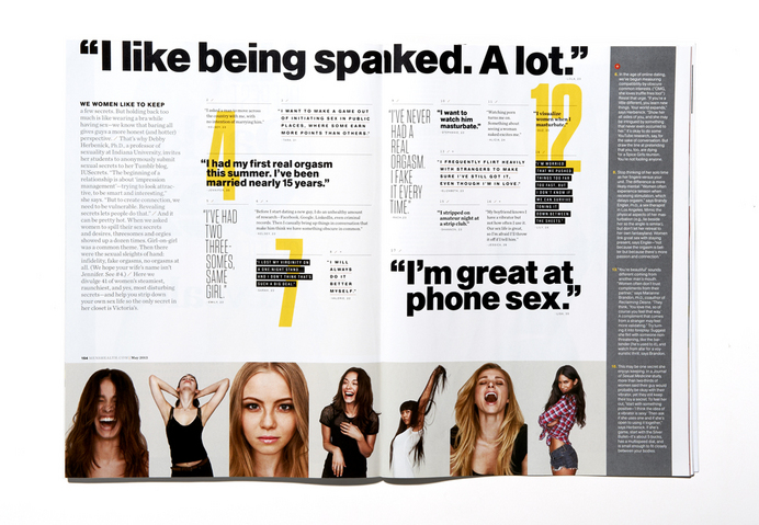
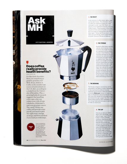
Being the lovers of all things Swiss, our obvious type choice was Akzidenz Grotesk. Why? Because it is bold, masculine, and easy to read. And it looks great on mobile platforms. As a wink to our tutelage we're conservatively using a stencil for numbers resurrected from the blueprints of Le Corbusier. A majority of the magazine is now sans-serif including everything from sidebar headlines to display type and nameplates for section openers.Those nameplates are all unified through a reoccurring black box which lets the photography and illustration shine. The black box remains in the same proportion in How To Do Everything Better and Bulletins, varied by horizontal and vertical alignment.Bulletins is our "news" section, with late breaking studies on health, sex and other topics. The vertical black bar, known as "The Grip", gives a fast-paced feel by sliding from left to right across the pages. Main articles on those pages are flagged by a red arrow, known as "The Bomb", which then reappears on all other FOB pages as well. That vertical bar then rotates back to horizontal alignment and serves as the header for all of the departments.Our grid structure stemmed from the design of our newly named Advantage section, formerly known as "The Best Life". It's perhaps our most complex section, home to 20+ pages of tips on every aspect of a man's life.Since our editors generously see white space as more space, we created "The Attic," a consistent amount of white space at the top of the page. Functionally, it serves as space for small infographics and quick tips. We also created "The S#!+ Gutter", which is a column that we leave mostly empty on our grid, only for a web tout or other "S#!+". Our editors have lovingly adopted this term into their everyday conversation.Men's Health is a very data driven magazine. Editors dig through piles of information on single topics such as Fear, The Beach (sharks!) and Ballparks, then hand it to us to craft into a page. "Instant Expert" approaches this problem typographically. Key words are front and center, and in-depth data stems off that language. On the other hand, "The Average Guy is illustrative. We send the data off to an illustrator who then breaks it off into bite-size bits.Features tend to stay away from overly bespoke packaging, and focus on structural elements. This year, our Guy Food Guide was split into three chapters of Cooking for One, Two and a Crowd. Therefore, we created a triangular signage system that subdivides in a similar fashion. On a feature about the science of motion, a graphic line moves across the page to direct towards section breaks. Or sometimes, we have some really good quotes on sex from women, and we just make them big. Of course paired with pictures of gorgeous ladies.
With the new logo, you went for evolution, not revolution. Why?
The last piece of design you'll notice is the evolution of our logo. This is quite intentional. As a large international brand with 48+ editions across the world, Men's Health is more than just a magazine. We understand the importance of brand retention, and would never mess with that for the sake of aesthetics. Despite this, we felt the logo needed an update. So with this major overhaul of the book's design this was the time. Again, in terms of our approach the refinements are all practical. We eliminated most of the fussy flourishes that were inherent to the original logotype. The new mark has less rounded corners and edges. While keeping the look and feel of the original characters, the letterforms now have a consistency and balance in stroke widths, curves, counters and angles. This achieves a visual harmony not seen in the original. For practical purposes, the squaring off of serifs and details make the logo less distorted when rendered in pixels, where more often than not we see our brand misrepresented.
So as we reach our silver anniversary, along with our new Editor-in-chief Bill Phillips, we will continue to advance the magazine. As we've built up a structure for the magazine, we are going to take it apart. We'll (hopefully) find new ways to package all of this information on chicken, erections, fear and beaches. We hope you enjoy what we're doing!
The Men's Health redesign team:
Robert Festino, Creative Director
Tom O'Quinn, Art Director
Michael Schnaidt, Deputy Art Director
Justin Long, Assistant Art Director
