Recently in New Work Category

The Secrets Behind PORT's Success

The Secrets Behind PORT's Success

Gym Class editor-in-mischief Steven Gregor's back on SPD. This time chatting with Port magazine's creative director Kuchar Swara. Can't get enough of the mag love!

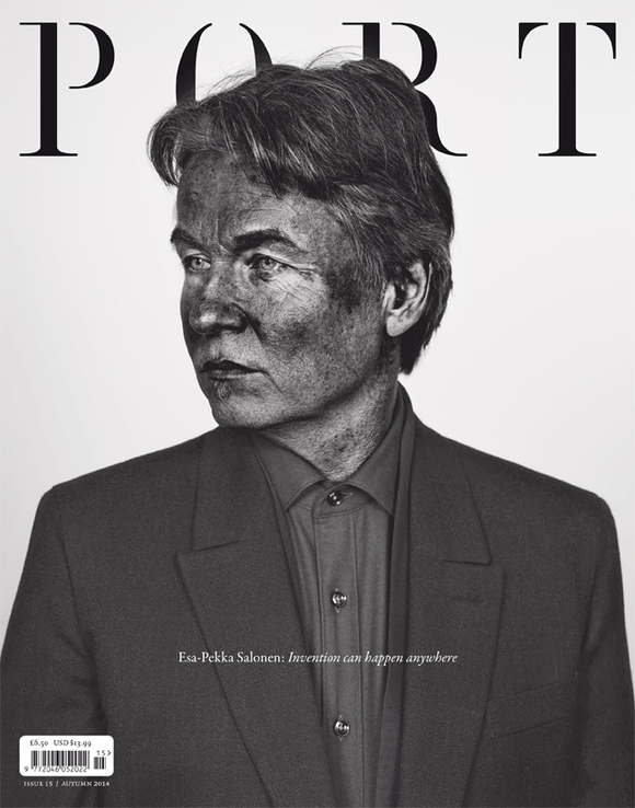
Hey Kuchar, thanks for chatting with us. Wow... the 15th issue of Port is rockin' an epic cover by photographer Pieter Hugo. Congrats. He's a favourite of yours. Talk us through the decision to have Pieter shoot the cover, and for the shoot to be in his signature 'pigmented' style.
Always a pleasure, sir. We have a new photo editor working with us at Port, Rebecca McClelland. She initially pitched the idea. I'd always considered Pieter a great art photographer, so working with him on an editorial feature was a real honor.

I wanted Pieter's aesthetic to be as prominent as the cover star. The cover is not only a well art directed cover and interesting subject, but also an art object in its own right.

MORE
Lollipop Magazine Brings a Unique Take on F1 Racing

Lollipop Magazine Brings a Unique Take on F1 Racing

We here at SPD HQ love when that magical combination of imagery, design and words compels you to buy and read a magazine even if you don't care about the actual topic. A recent example of this for us is Lollipop magazine, a collaboration between Brooklyn-based photographer Joshua Paul and British Columbia-based art director Tom Brown of TBA+D. As the cover states, Lollipop is "a magazine for Grand Prix enthusiasts", but we think even non-racing fans will be enthused by what they see. Read on for the backstory and a sampling of pages from the launch issue.


MORE
Birth of a Magazine: Houstonia

Birth of a Magazine: Houstonia

It is not very often that you get the chance to start a major city magazine from the ground up in your hometown. Especially a hometown that doesn't have an established city magazine to compete with. That is exactly the chance Design Director Chris Skiles got this past winter when he returned to Houston to launch Houstonia, a completely new magazine that just sent it's third issue to the printer. We had to a chance to catch up with Chris and hear about this once in a lifetime opportunity.
MORE
Wired's Next Reel

Wired's Next Reel

Something for the weekend? Check out the reel for Wired's November issue...after the jump


MORE
Priest and Grace's Howler!

Priest and Grace's Howler!

Remember that feeling of genuine excitement you'd get when you were a kid the night before your favorite comic was due to show up in your mail box...for me it was Roy of the Rovers and I was about 7 years old. Yeah it sounds a bit cliche and nostalgic but every Tuesday night I'd wait with baited breath for news on Roy's Melchester Rovers and how they planned on topping the league, avoiding relegation or evading swamp beasts and kidnappers (they'd travel a lot in the off season!)...well guess what, that feeling is back...in a big way! When Priest and Grace's latest offering, the soccer mad magazine Howler showed up at my house last week it blew me away, both as a football fan and a designer...… MORE
Creating Daily Magazine Covers at the Political Conventions

Creating Daily Magazine Covers at the Political Conventions

When Bloomberg decided to publish a daily magazine at the Republican and Democratic conventions this year, it was a natural choice for them to tap former Time art director Arthur Hochstein to be the creative force for their covers. Hochstein had done a stint doing covers for Businessweek while it was being redesigned by Richard Turley in 2010, and he also spent some time crafting covers for Tina Brown at Newsweek while Dirk Barnett was developing their new design. Norman Pearlstine, the chief content officer of Bloomberg, wanted covers that were distinctive, smart, and provocative, and done fast and with a limited budget. The visually striking photo-illustration style that Hochstein honed on countless Time covers was the perfect solution.

Hochstein shares some background on the creation of the convention covers, as well as showing off some great outtakes and rejects.
MORE
How to (re) Make Money: Part 2, Tablet

How to (re) Make Money: Part 2, Tablet

As a follow up to last week's post all about the print redesign, design director Neil Jamieson gives us more Money with some insight into the development of their tablet versions
MORE
How to (re) Make Money: Part 1, Print

How to (re) Make Money: Part 1, Print

2012 marks the 40th anniversary of Money Magazine and what better way to ring in a birthday year than with a new look and a bold new tablet app. Here in part 1 Design Director Neil Jamieson gives us some insight into how he and his team refined the look of the personal finance magazine in print. (In part 2 he'll tell us all about Money's tablet version, look for it next week!)

MORE
Inspired Thinking from Healthy Living

Inspired Thinking from Healthy Living

Jamie Ezra Mark, the Creative Director for Akers Media in Florida, shares another making-of story behind one of their latest issues. (You may remember him dousing his cover subjects at Ocala Magazine.) From Jamie:
Our company publishes a few local titles in a small market North of Orlando. It may sound trite, but we believe what we lack in budget and staff, we make up for with heart. And while we throw our hearts into every single story, some stories truly just have a lot of heart all by themselves. Such is the case with Nick Vujicic.
MORE
Katachi Magazine: An Engaging iPad Publication Launches

Katachi Magazine: An Engaging iPad Publication Launches

From an Austin, TX BBQ to Norway, a small creative team launches an incredibly interactive magazine app for the iPad, along with a brand new publishing platform. Here, Katachi magazine Managing Editor Max Alexander Berg shares the story behind their debut issue:

Katachi was born out of Texan BBQ. When the iPad launched in 2010 Ken Olling and Axel Haugan, founders of the company, were at SXSW, when the iPad was hailed as the saviour of all things publishing. It soon became clear that big publishers were looking to republish print content on the iPad, and that thinking was and still is completely wrong to us. Unhindered by any print skeletons we set out to create a truly interactive magazine but soon learned that the tools available just didn't cut it. So what started out as creating an interactive iPad-magazine grew into creating a state of the art publishing tool. We've made everything ourselves; the app, the design tool, the typeface, the content, the design.

We bring a lot of inspiration, respect and experience from print and web into publishing for the iPad. And as much as we love the two you simply can't translate either one to the tablet and expect it to work. One of the great things about creating our own tools is that it allows us to dream up completely new ways of doing editorials. We often discuss new stories and end up saying 'can we do that?'. Sometimes we can, sometimes we can't. But our developers implements features on the fly, allowing us to constantly push our ideas forward. The launch issue is content-heavy and explores loads of various ways of doing publishing on the iPad. Some, of course, works better than others. All our focus in the following issues is on creating engaging, iPad-specific content.
MORE
Inked Takes Day of the Dead High Fashion with Zombie Boy

Inked Takes Day of the Dead High Fashion with Zombie Boy

Can't get enough of The Walking Dead? We know. Inked's Creative Director Todd Weinberger, always ahead of the curve, tells us about the fashion shoot with Zombie Boy in their November issue:
Normally I would not have profiled Zombie Boy were it not for his recent jump into the high fashion world, starring in Lady Gaga's "Born This Way" video and walking in Thierry Mugler's show this past winter. We're technically a "tattoo magazine" but I think of us more as a lifestyle magazine for people with tattoos. I decided that in honor of Halloween it would be very cool to shoot Zombie Boy and since our deadline coincided with fashion week, I knew he would be coming to NYC which would be easy on our limited production budget.
Read how it all came together, and see the full-fashion zombified shoot, after the jump...
MORE

Fast Company's United States of Design Cover Challenge

Fast Company's October issue (and stand-alone app) is dedicated to their Masters of Design package, and features four special cover designs commissioned around the idea of "The United States of Design." Creative Director Florian Bachleda tells us more:
The theme for this year's annual "Masters of Design" issue was to focus on American Design, and one of the ideas was to commission select graphic designers to execute a Fast Company cover, with the subject and coverline being "The United States of Design". The only criteria for selecting the designers was that they weren't currently working at a magazine. You don't often get a chance to reach out to people like Paula Scher, Gail Anderson, and Carin Goldberg, but this seemed like a perfect project for three Hall of Fame designers. But we then also wanted at least one more of an alternative selection, someone who was not a designer. I've always been a huge fan of the commix work of Jayr Pulga. He's one of the original RAW Commix contributors, and wildly under-appreciated in my humble opinion. Jayr's beautiful drawing was a perfect compliment to the wonderful (and very different) designs that Carin, Gail and Paula did, and I hope people enjoy all four of them.
See all four covers after the jump...
MORE
FontShop Brings 620,000 Fonts to Your iPad

FontShop Brings 620,000 Fonts to Your iPad


FONTBOOK.jpgYou've had their iconic yellow and black book on our shelves for years. Now it's available on your iPad. FontBook, from FontShop, contains over 620,000 typeface specimens from 110 type foundries. Use the FontBook app to look up and view fonts by name, style category, typographical subclassification, designer name, foundry name, year of publication, or by similarity of design. Compile your own list of favorite fonts, and use the "compare" tool to test-drive fonts.

FontBook is primarily an online browsing application-- it displays its full content only when your device has internet access through a WiFi or 3G mobile connection. However, if you have no online access, you can temporarily switch the "include online content" setting to "off". This will enable the app to display a reduced pool of selected content which will work offline.
MORE
Redesigning Bicycling

Redesigning Bicycling

A look at the redesign of Bicycling magazine with Design Director David Speranza:

Our plan for the redesign was to break away from iconographic photography and take a less-produced approach to the shoots. In the past, we deliberately planned shoots with a single rider and low, flat vistas, with loads of blue sky. The cyclist's speed was controlled so that lighting was optimized and blur was virtually non-existent.

With the redesign, we want to embrace the motion and the environment. Foul weather, high tree lines or low sunlight won't necessarily disqualify a shoot from being worthy and therefore attempted. Additional lighting, if any, will be a challenge in that our goal is to have the appearance of only natural light but our hope is that result will be a more "outdoorsy" feel to the cover and interior photos.

Cover photograph (above) by Bryce Boyer
MORE
GQ iPad App v2.0

GQ iPad App v2.0

GQ icon.pngYou get an email saying that Fred Woodward would like to show you the new GQ iPad app that's about to launch. What do you do other than say "I'll be up there faster that you can spell "Galifianakis"?

The new version of the GQ iPad app has launched today. It was built with the Adobe Digital Publishing Suite also used by big titles like Glamour, WIRED and Reader's Digest. GQ's new take on the app goes beyond the previous RSS-feed style. In contrast, the new app is based on the print magazine driven by Fred Woodward's design direction and executed by the GQ art department, thus reflecting the look and feel of the print publication.

Overall, I would call this a huge leap forward in terms of the translation of GQ onto the iPad. It is done with a keen eye, reworking an already great design onto the tablet screen. I look forward to seeing the future iteration of the app from this talented staff, and hopefully its expansion into more utility-based mini apps with the same elegance and attitude. And yes: the gentleman from the print edition spine made it to the masthead screen at the end of the app.

GQ_old app.jpg
Top: GQ, May 2011 iPad app cover featuring Zach Galifianakis, photographed by Martin Schoeller. Above: The previous version of the GQ iPad app (April 2011 issue).
MORE
An All-New 'Ap'

An All-New 'Ap'


The good people at Bon Appetit have just posted a slide show of their latest redesign.

MORE
Runner's World: For Obsessives and Newbies, May's Your Issue

Runner's World: For Obsessives and Newbies, May's Your Issue

Now that Winter's long grip seems to be releasing us, you may have decided it's time to get back out into the world and actually do something -- if you're thinking it's time to start running, the May 2011 issue of Runner's World, "The Special Beginner's Guide" (It's like they know us -- Ed.) is the one for you. Design Director Kory Kennedy sends along the openers from the feature well and some backstory on each to let us know what's coming...
MORE
Blood Sweat and Ink! Creating The Village Voice Comics Issue

Blood Sweat and Ink! Creating The Village Voice Comics Issue

In early February Village Voice Art Director John Dixon and his team had a great idea: Instead of using a ton of photo and pickup art to populate the pages of the iconic paper, why not use comic illustration... heck they could even use comic illustration for the cover...and why not the feature well...while they're at it maybe every department, the TOC, the reviews...every rubric, every folio, every section header...and before long the Comics Issue was born!
MORE
u + me Debuts With a Bang

u + me Debuts With a Bang

Nomad Editions' fifth launch debuts today, u + me, the digital magazine that spotlights just a few of the moments and stories taking the social media world by storm: as Editor Chris Kaye says,
"This is a weekly magazine about social media - an ever-shifting territory that's tough to predict. Put it this way: When we started this in December, Egypt was all about mummies and pyramids."
And so he and Creative Directors Nancy Campbell and Trevett McCandliss worked to come up with a cover that would be "simple but provocative, capturing the irreverance and metaphorical expansion of the culture they're hoping to capture." Check it out here, and get your issue of u + me at the Nomad site.

Redesigning Spa

Redesigning Spa

For many of us this season, it's a Winter that can't end fast enough, and those subway ads about "Your Florida Waits" are too cruel. (That can't be just us, can it?) Imagine then getting the mandate to redesign Bonnier's Spa Magazine. AD Donna Reiss has, and shares some of the work, and the behind-the-scenes, with us all here...
Spa is the authority on spa, travel and wellness, and the team behind the magazine, a small group of just five amazing women, are so proud of what we've done.

As Art Director and the only designer on the magazine (yes, I need to say that), Spa is my fourth redesign with Bonnier Corporation. My other previous (and redesigned) loves were Garden Design, Babytalk and American Photo. What made this redesign unique and special was the fact that I was able to take everything I've learned from the past and use that to reapply, rethink and devote a fresh, exciting and new energy into the brand.
MORE
Working Mother Redesigns

Working Mother Redesigns

Working Mother has been the go-to resource for a generation of moms striving to balance kids and career. Creative Director Ebelinda Antigua has just finished a redesign of the Bonnier title and shares some of the thoughts behind their process...
For the redesign of Working Mother, the overall goal of the creative team was to design a simple and clean magazine to reflect a working mom's life.
MORE
The Year In Ideas 2010

The Year In Ideas 2010

Sunday brings another big bold cover package with online must-see extras from The New York Times Magazine, their 2010 Year In Ideas issue. Design Director Arem Duplessis gives us some backstory:
2010 marked the 10th Year Anniversary of the "Year In Ideas" issue so we decided to celebrate. For the cover our mandate was to do a Q.R. or "quick response" code so we commissioned Karim Charlebois-Zariffa to come up with an innovative way of representing the code.
MORE
The Hollywood Reporter Relaunch

The Hollywood Reporter Relaunch

The Hollywood Reporter recently relaunched in print and online and debuted a sharp hybrid print/web iPad app. The 80-year old tinseltown trade pub relaunched in print in early November, shifting from a standard sized daily to oversized weekly magazine. The blog style website leverages the print publications typography through dynamic web fonts, and their ipad app shifts between weekly print publication and up-to-the-minute web-based news based on iPad orientation. The print side of their iPad app serves up articles on both sides of their pay wall.
THR creative director Shanti Marlar takes us behind the scenes:

The mission was to create a large-format magazine (10" x 13") that was glamorous and up-scale but still newsy and informative. The magazine needed to transcend B2B and become B2Influener, could sell on the newsstand and still fulfill the subscribers demands. Think Vanity Fair meets the Economist.
MORE
China Reform Magazine

China Reform Magazine

For the past nine months, New York-based Nai Lee Lum has been consulting creative director for China Reform magazine, based in Beijing. Before starting this project, Lum was the Fortune international edition art director. She has teamed up with illustrator Edel Rodriguez to create a remarkable series of covers for China Reform. Here are four of our favorites.

(Above): December 2010. The China Reform logo is based on actual calligraphy by former Chinese premier Deng Xiaoping.
MORE
The Infamous Graffiti Magazine

The Infamous Graffiti Magazine

The Infamous is a graffiti magazine based in Philadelphia that published its second issue this week.

Art directed and designed by Shaun Baron, The Infamous showcases content and imagery in a smart and original way, very different from previous efforts at presenting this art and culture. There are pages with tips on color theory, technology, and quality control, and of course, lots of examples of graffiti art. Baron has harnessed the talents of the graffiti scene to create bold illustrative covers and features, but all contained within a tightly-formatted and minimal design architecture. This is a brilliantly-conceived and executed magazine, completely produced and designed by one person on a very limited budget. And of course, here at SPD we love to see low-end challenges turned into high-end publication design results. See more pages from The Infamous on the next page.

(Above) Issue #1 cover illustrated by Pre, vectorized by Waldemar Delgado.


MORE
ESPN's NBA Comic Book Preview

ESPN's NBA Comic Book Preview

ESPN's NBA Preview issue not only features a cool comic book cover illustration of Kobe Bryant, Lebron James, and Kevin Durant, but inside they created 30 original comic book cover illustrations, one for each team. The mag approached Marvel Entertainment (coincidentally owned by the Walt Disney Company, who also own ESPN) about creating concepts and "variant covers." Under the direction of the mag's editors and design director Siung Tjia, Marvel's artists created a brilliantly creative spin on the traditional preview issue. If this was the NBA All-Star game, we'd say that the team at ESPN just won the slam dunk and three-point throw contests, and the MVP award!

(Above): Pencils by Joe Quesada, inks by Danny Miki, colors by Richard Isanove.
MORE
New Work from Portland Monthly Magazine

New Work from Portland Monthly Magazine

One of our favorite city magazines is Portland Monthly, art directed by Jason Blackheart. It's a smartly-designed magazine, with lots of energy and overall coolness, much of it accented by Blackheart's own typographic illustrations. Here are some examples of recent pages from Portland Monthly.

(Above): Portland Monthly, July 2010. Typography/illustration by Jason Blackheart.
MORE
A Look at the Redbook Redesign

A Look at the Redbook Redesign

In March, Holland Utley became the new Creative Director for Redbook, with a mandate to redesign the over 100 year-old women's magazine. She shares her thoughts on the process here, and a look at some of the new pages after the jump:
I approached the redesign by thinking about our next generation of readers: young moms who would appreciate a modern look. I focused on mixing arresting typography with rich, exciting imagery, and the results give this venerable 107-year-old magazine a fresh spin. The design is clean but dynamic, and information is presented in a way that is both easy to follow and feels incredibly current.
MORE
UCLA's Tribute to Coach Wooden

UCLA's Tribute to Coach Wooden

In June, UCLA lost a legendary figure in Coach John Wooden, and the university magazine, led by Creative Director Charlie Hess, dedicated the October issue to honoring his legacy.
He's considered one of the greatest college basketball coaches of all time. But more importantly, he retired at 65 and then lived a productive life for another 35 years -- teaching his philosophy, The Pyramid of Success , and generally mentoring another couple generations. He passed away just before his 100th birthday. I tried to capture his humility and quiet spirituality with this cover.
MORE
TV Guide's Weekly Photographic Treats

TV Guide's Weekly Photographic Treats

Earlier this year I worked with James Reyman, Kate Thompson, and Katherine Dillon on a redesign of TV Guide magazine. We worked with editor-in-chief Debra Birnbaum to revamp the structure and architecture of the magazine, introducing new typefaces, color palattes, and a new approach to structuring stories.

What we didn't change was their remarkable approach to cover and feature photography. TV Guide creative director Rose Fiorentino and design director Gloria Pantell have created an amazing collection of feature spreads and covers. The strategy for the magazine is simple: pack as much material into the pages as possible in terms of listings, news, and updates, and then devote one spread to an original photograph of a TV show cast. The result is a weekly treat for TV Guide readers, who love to see their favorite stars (in character) in intimate settings. With a small staff, limited resources, and a weekly production schedule, the TV Guide folks are creating exciting, engaging, original, and artful photographs and page designs. Of course we like to think that the redesign gave Fiorentino, Pantell, and Birnbaum just the right tools to frame their brilliant work, but actually a number of the pages featured below were done before the redesign.

(Above): Lost, photo illustration by Joe Zeff Design. Cover design by Gloria Pantell.
MORE
Behind the Scenes: Fortune Goes to the iPad

Behind the Scenes: Fortune Goes to the iPad

Fortune joined the other members of the Time Inc. family on the iPad (TIME, Sports Illustrated, EW's Must List, and the LIFE Wallpaper app) this month with their own iPad launch. Deputy Design Director Emily Kehe and Fortune.com editor Dan Roth sent us an in-depth look at the newest addition and some of the thinking behind its development:
When we set out to bring Fortune to the iPad -- and, down the road, to whatever tablets arise -- we laid out a few goals: Find a way to bridge the timeless narratives of the magazine with the timeliness of the Web; look for new methods for telling the best stories in business; amplify our historic dedication to photos and illustrations; and use the new technology to bring even more service to our readers.
Much more after the jump...
MORE
Twin Cities METRO: Choose Your Own Adventure This Summer

Twin Cities METRO: Choose Your Own Adventure This Summer

Twin Cities METRO CD Bryan Nanista sends us their take on the traditional "summer guide" package, done for 2010 in the form of our favorite major life decision-making tool, the Choose Your Own Adventure model.  … MORE
The ABCs of XYZ

The ABCs of XYZ

A deeper look at the newly redesigned RISD alumni magazine from Criswell Lappin [RISD MFA '97]:
An alumni magazine should be about alumni activity. One of the biggest problems with Rhode Island School of Design's previous alumni magazine, risd views, was that it felt too institutional--a magazine ostensibly for the entire RISD community, but produced by the administration and largely focused on its internal concerns. So in February, when our firm, WellNow Design, was invited to redesign the magazine as an alumni-centered publication, our biggest priority was to create a dynamic new vehicle that would do justice to--being by and about--RISD's creative community of 25,000 alumni.
MORE
Complex: No coverlines! (Almost.)

Complex: No coverlines! (Almost.)

DD Tim Leong sends a look at his final issue at Complex before he heads out west, the June/July 2010 issue:
At Complex, the demographic is incredibly graphically aware -- more so than a lot of other audiences. So the mindset behind each cover has been to pick the coolest image possible. That approach has mostly worked for us this past year, but this issue in doing so we picked two great images... that had no room for coverlines. Or rather, we didn't have room for coverlines without destroying the visual integrity of the images. So...
MORE
SPIN's 25th Anniversary Cover Zips Up, Counts Down

SPIN's 25th Anniversary Cover Zips Up, Counts Down

SPIN Creative Director Devin Pedzwater shares some of the thinking that went into the magazine's new anniversary issue:
There has been a lot of excitement in the SPIN office in anticipation of our 25th anniversary. With the May issue, we carefully curated a list of 100 impactful moments that reflected the past 25 years and SPIN's role as an observer of--and at times, participant in--that cultural history. The package presented us with a unique cover design challenge.
MORE
Psychology Today: Serendipity

Psychology Today: Serendipity

Creative Director Ed Levine shares some of the behind-the-scenes work that went into putting together Psychology Today's newest issue on luck, serendipity, lust, obsession... you know. All those everyday things it's so easy to talk about.
The focus at Psychology Today is on human behavior and helping readers to live healthier, happier lives. Many of the feature stories can be very  abstract dealing with topics that do not exist in the physical, observable world but our inner lives.
MORE
Runner's World Takes On BIGFOOT

Runner's World Takes On BIGFOOT

It's not uncommon for so many in SPD: how should we tackle a story, a package, we've done before? Something we do ALL THE TIME, and yet, keep it fresh? Runner's World DD Kory Kennedy shares a solution from the magazine's recent weight-loss package:
Here at Runner's World, we give our readers a lot of service. A LOT. It's what the people want and lucky for us, they want it over and over again each month. This is a great thing for the health of our newsstand sales and circulation, but for a 3-mile-max-running, design-director-creative-type with a desire to try all 31 flavors, it can get a little "Groundhog Day" around here.
MORE
American Cowboy

American Cowboy

Backpacker's Design Director, Matthew Bates, shares some highlights from sister mag (and new HQ fave!) American Cowboy:
This past fall I had the opportunity to, temporarily, trade in my hiking boots and work on the redesign of our sister publication, American Cowboy. I collaborated with AC's amazing one-woman art department, Art Director Eva Young, and now that there has been a couple of issues out the door, we wanted to share couple pages...
MORE
SKI Magazine's best of the season

SKI Magazine's best of the season

SKI Magazine's Art Director, Eleanor Williamson, just wrapped-up the seasonal title's 7 issues before the tackle their next project (more on that later in the post), and in honor of these closing days of winter, offered to share a look back at their best design and photography of the season. … MORE
UCLA Goes Plush

UCLA Goes Plush

Charlie Hess of Chess Design sends along the story of his first plush: commissioned sculpture + the April 2010 UCLA Magazine cover here = a great story. Read about the making-of after the jump... … MORE
Real Simple: Time to Celebrate

Real Simple: Time to Celebrate

With daylight savings time set to begin this Sunday, we might all be wishing we had a better understanding of time Monday morning. Real Simple's ahead of us on this: for their tenth anniversary issue this month (April 2010), Creative Director Janet Froelich decided just one cover would not be enough. The magazine's focus on time-saving and simplifying went conceptual, and then multiple. As reported in The New York Times on Monday,
"Time is a very intangible thing -- there isn't a picture of time, and there isn't a particular image that comes to mind,".... So Ms. Froelich decided to commission clocks from industrial designers, who usually create consumer products or conceptual sculptures.
A look at all the covers, photographed by Craig Cutler, and the specially-commissioned screensaver, after the jump...
MORE
New Look for Fortune

New Look for Fortune

John Korpics shares a sneak peek at his Fortune redesign. Here's a look:… MORE
Hockey Challenge 2010

Hockey Challenge 2010

Longtime (!!) fans of New Work on Grids might remember one of our earliest submissions, the Hockey Challenge from 2009. Creative Director Lou Maxon shares some pages from this year's edition, a complete redesign for the custom editorial. Take a peek after the jump... … MORE
Australia's Monument Re-Imagined

Australia's Monument Re-Imagined

The very first New Work entry for 2010 comes from Dan Peterson, Art Director for Australian architecture magazine Monument:
In 2010, Australian Architecture magazine Monument undertook a comprehensive re-imagining. This involved reconstructing the entire creative direction of the title. We aimed to establish ourselves as the most progressive title in our market, to engage an expanded audience, and provide and inimitable product for the newsstand and subscriber base.
MORE
Rolling Stone: The 00s

Rolling Stone: The 00s

With a huge decade in the music/culture business to look back on, Rolling Stone created a cover that couldn't be more perfectly, well, Rolling Stone. We asked RS Art Director Joseph Hutchinson to tell us about the making-of: … MORE
Dwell: The Future

Dwell: The Future

For Dwell's December/January issue, "The Future," the magazine commissioned just one photographer, Dean Kaufman, for their feature shoots. Photo Editor Amy Silberman tells us about the thinking that went into the commission and a little of the work Kaufman sent back from his shoots... … MORE
New York: The 00s

New York: The 00s

For some of us, the best part of this time of year is the lists: best of (even more when they're meta), worst of, top-selling, favorites, and anything else that can be list-ified. The end of a decade means even more bounty in this department. New York joined the party this week with their 00s cover commissions. Covers and slideshow after the jump...  … MORE
Twin Cities METRO Goes Foodie

Twin Cities METRO Goes Foodie

Twin Cities METRO AD Bryan Nanista shares the story behind their December issue:
MORE
New York: Fantastic Mr. Fox's Gift Guide

New York: Fantastic Mr. Fox's Gift Guide

This week's issue of New York showcases their annual holiday gift guide, featuring the stars of Wes Anderson's new stop-motion animated film, Fantastic Mr. Fox. Five foxes, a badger, a rabbit, and a possum flew in from England for the shoot in Dumbo, accompanied by a prop stylist who fashioned the gifts out of extra wallpaper from the movie set, a puppeteer, and a hairdresser. Check out a behind-the-scenes video of the shoot after the jump...… MORE
Earnshaw's: Splendor in the Grass

Earnshaw's: Splendor in the Grass

The creative team from Earnshaw's sends along a Friday fashion fantasy from their latest issue... … MORE
Latina: ¡Viva Mexico!

Latina: ¡Viva Mexico!

Florian Bachleda, Creative Director at Latina, shares a look behind their latest issue:
As of late, Mexico's reputation has suffered greatly in the mainstream news media. With the constant reports of drug wars, violence and H1N1, you'd think it was the worst place on Earth. Here at Latina, we decided it was time to use our platform to combat that negativity, so we decided to devote an entire issue to the culture, beauty and people of Mexico, showcasing its many positive contributions (which you'll never hear from Lou Dobbs).
MORE
The FADER: Double Vision

The FADER: Double Vision

Last year, The FADER's annual photo issue focused on the AIDS crisis in the United States; this year #64 marks the 6th annual photo issue for the music mag, and features "the changing landscapes and people across America" with photography by Peter van Agtmael and Victoria Sabunaris, and an interactive feature that brings the reader into the photos.
MORE
My Midwest: Mercury Rising

My Midwest: Mercury Rising

INK Publishing CD Shane Luitjens sends some new work from their MyMIDWEST title: a feature on Ultramarathoners. As NYC gears up for the New York Marathon this Sunday, we get a look at some of the only people who could put those 26.2 milers to shame... … MORE
American Photo: Redesigned

American Photo: Redesigned

American Photo's new Art Director (and still-AD for Bonnier's sister-pub Garden Design) Donna Reiss shares new work from the issue's fresh redesign.
The magazine just hit newsstands this month with a complete redesign. I would love to hear what the design community thinks about it.
After the jump, a before and after cover comparison and some of the feature openers... … MORE
Australian Financial Review: Power List

Australian Financial Review: Power List

Tony Rice, Design Director for the Australian Financial Review, sends us some in-depth backstory on their recent issue, a great look at problem-solving when you're faced with that recurring best-of or lists issue... once again:
With the 10th Anniversary of the AFR Magazine's annual 'Power in Australia' issue looming -- and having been the design director of each successive issue -- I dreaded the thought of yet another three-quarter shot of the current prime minister gracing the cover.
MORE
Solitaire

Solitaire

Maryjane Fahey sends along some new work from a redesign her firm recently completed for Singapore's Solitaire, a luxe consumer magazine catering to the jewelry industry. Prepare for your daily dose of lovely luxe after the jump...

MORE
Neville Brody Guest Art Directs Arena Homme +

Neville Brody Guest Art Directs Arena Homme +

Once again Neville Brody (The Face, founding AD of Arena) is in the guest-art directing biz with a collaboration on men's fashion title Arena Homme + and their latest issue celebrating iconic stylist Ray Petri and the spirit of the Buffalo fashion movement. This is the first time in several years that Brody has worked with the art direction, typography and layout of a full magazine. … MORE
Runner's World

Runner's World

We're closing out the New Work week of Vertical Titles Appreciation with a look at the November issue Runner's World just shipped...

MORE
Field & Stream: The Rut

Field & Stream: The Rut

Fashion bibles have their September issues... Field & Stream has The Rut. Art Director Neil Jamieson makes sure we'll never be ignorant about the importance of the November issue again...
MORE
Backpacker: Rip & Go!

Backpacker: Rip & Go!

Matthew Bates, DD at Backpacker, sends along a look at some new pages:
Here at Backpacker, we are constantly trying to come up with new ways to create unique pages that help go beyond the beautiful scenic photo. We are blessed with a subject matter that lends itself to stunning images of beautiful locations, but as a vertical title, we are always looking to create pages that change up the pace a bit or add some extra texture to the outdoors. We redesigned the magazine this past spring with this in mind.
Read on for a fantastic in-depth look at the mag's Rip & Go pages and more, and be prepared to want to take off, immediately, yourself...
MORE
Ocala Magazine

Ocala Magazine

Jamie Mark, the Creative Director at Ocala Magazine, sends along some of the work and making-of process for their recent "Water" issue:
I am currently the creative director for a small publishing company in the city of Ocala in North Central Florida. We run an extremely modest operation out of an old Victorian house in the city's historic district. As members of the Florida Magazine Association (FMA), we attended their annual conference last week showcasing our new issue of Ocala Magazine. It generated a lot of discussion during the conference based not only on what we did, but how little we spent to do it. I know we are just a tiny magazine, but since magazines big and small are struggling with budgets, I thought it was worth sharing...
 
MORE
Complex: Style and Design Issue

Complex: Style and Design Issue

Tim Leong, Design Director at Complex, sends a behind-the-scenes update from their Aug/Sept issue on stands now:
It's our 5th Annual Style and Design Issue, in which we did collaborations between artists and the photoshoots for both of our covers and cover stories.
MORE
Footwear Plus

Footwear Plus

The creative team at Footwear Plus sends along some spreads from a recent story:
Our great challenge is to show shoes in an interesting way. This was shot by Aneta Bartos, styled by Michel Onofrio, designed by Trevett McCandliss and creative directed by Nancy Campbell. Aneta's style lent itself to romantic images created using an antique polaroid camera. Trevett went for a clean and classic type treatment to complement the beauty of the photography.
The full story, after the jump...
MORE
Psychology Today

Psychology Today

A deep look into the just-shipped October issue of Psychology Today, from Creative Director Ed Levine:
Psychology Today's October issue is an example of the exciting conceptual challenges the art department regularly tackles. Many of the articles are abstract, about things that cannot be observed by the eye and require creative problem solving. The solutions are a result of close collaboration with our great contributors, thought provoking editorial material, and Kaja Perina, Editor-In-Chief.
A closer look at the cover and several features after the jump...
MORE
IEEE Spectrum: We Choose Mars

IEEE Spectrum: We Choose Mars

On the 40th anniversary of the date Apollo 11 launched to take Armstrong, Collins and Aldrin to the moon, we thought it appropriate to share some work embodying that same "next frontier" spirit: IEEE Spectrum shares a special issue they put together on the human exploration of Mars.
MORE
Runner's World

Runner's World

Speaking of Dan Winters, Runner's World Design Director Kory Kennedy sends along a little related backstory about a project Dan recently worked on for them:
We recently contacted him to illustrate the opener image for "Turning Up the Heat," a sweat-drenched report by one of our editors who volunteered to run in a heat chamber for sixty minutes at marathon pace (all while being poked and prodded by grad students) and coming to the brink of heatstroke. The assignment: visualize how running in extreme heat affects a runner.
MORE
Popular Mechanics: Illustrations

Popular Mechanics: Illustrations

How do you come up with strong visual infographic solutions for such diverse articles as "Marine Minesweepers," "Volcano Watchers" and "Backyard Digital Playground"?
ʉ۬Hire great illustrators! 


In the July issue of Popular Mechanics, they got to do just that -- read on for the details about three of July's PM illustrations, straight from the team...
MORE
GLAMOUR

GLAMOUR

It's more than reassuring to pass by a newsstand and see magazines celebrating major-milestone birthdays these days... one of those, Glamour, hit recently with an issue devoted to celebrating its 70th! Design Director Geraldine Hessler and Photo Director Suzanne Donaldson and their team dedicated months to making this more than just another "special issue" and we're happy to share one of their big anniversary features here:

In honor of the magazine's seventieth anniversary, we asked 10 of America's top female artists to define the concept we're named for: glamour. They answered using charcoal, paint, cameras, neon lights, resin, dollhouse furniture and pink sugar. Take a look!
MORE
King

King

A preview of some new work from King that just shipped to the printer, and a farewell:

As you may or may not have heard, after 8 years of publication and 51 issues, King magazine folded last week due to the economic climate. Sadly our June issue will be the last issue to hit newsstands. Between issues 50 and 51 our team worked on a complete re-design of the book to function better with a reduced budget and staff, while also freshening up the appearance of the magazine. Looking over this final issue has been incredibly bittersweet, it will be remembered as both one of the best issues in the King collection, as well as our final chapter.

MORE
LA, The Los Angeles Times Sunday Magazine

LA, The Los Angeles Times Sunday Magazine

I recently worked on a photo essay about Las Vegas by Albert Watson for LA...The Los Angeles Times Sunday Magazine and wanted to share it with everyone. The Creative Director is Rip Georges whom I have worked with over the years, and it was a great project to work on. The cover is a dream as it is all about the picture with just a small but beautiful type treatment and the inside spreads are fun as well.

MORE
WIRED UK

WIRED UK

Hot on the heels of the new WIRED Italia comes the return of WIRED UK. Thanks to Andrew Diprose for the sneak peek at the May launch issue. … MORE
Complex

Complex

Tim Leong, DD at Complex, shares a look at their latest cover with Kanye West:

We just debuted our new cover online. It's Kanye West -- and it typical Kanye fashion, he wanted to do something extra crazy. The process is a long story, but to boil it down, we collaborated with Kanye and video director Chris Milk (Jesus Walks, All Falls Down) and the effects studio that did "The Curious Case of Benjamin Button" to do a 3D body scan of Kanye. The studio built a CGI model of him and we worked together to create images for the story. It's basically a 100% 3D-rendered photoshoot.
Some behind-the-scenes video after the jump...
MORE
Missbehave

Missbehave

In one of our not-favorite trends, some new work from a magazine we might not be seeing more of in the future: Sally Thurer, Creative Director at Missbehave sends along their final cover before the magazine goes website-only, and a little backstory:
I wanted to submit the last cover of Missbehave (we suspended publication), featuring work from Jeremy Scott. He is amazing!

I've adored him since his 1997 Rich White Women collection which Björk wore for her Homogenic tour. He has a great sense of humor, and his collections themes like "Food Fight" (junk food) and "Tut TV." Recently, he has become known for his iconic prints. Missbehave has been featuring his designs since our very first issue, and we absolutely fell in love with his "Let Them Eat Gas" collection. Since Katy and Jeremy are friends, we thought they would be a perfect match for our cover. I was particularly drawn to the "Floral Flights" print on Katy's dress because it is partially inspired by Boy London -- a brand from the 80s/90s that I'm obsessed with. Jeremy was kind enough to send me the flowers from the dress to incorporate into the cover design.

MORE
Eddie Guy

Eddie Guy

Keeping in mind that tonight is our Do It With Illustration: Under the Influence with Today's Most Arresting Illustrators panel at FIT, a little New Work today from illustrator Eddie Guy, who's been trying out some new tricks of the trade:
Here's a few experimental images I've been working on. I have always been interested in sculpture,  and have recently discovered how to "build" images through 3D software. 3D rendering has provided a way to approach imagery as a sculptor and it has been a nice variation from my usual routine. These images include a studies of a Skull (above), Hellboy, a Biker Girl and Nike (after the jump).
Don't forget that there are signed posters for the first guests at tonight's SPD@FIT event, so be there when the doors open at 6:30, and click through for more inspiring illustration...
MORE
New York

New York

The folks at New York magazine sent us a peek behind the scenes at their cover for the annual "Best of" issue:
For this week's "Best of New York" issue, New York magazine invited several designers, artists, and advertising creatives to submit ideas for the cover art.  We went with the design from Brooklyn-based street artist KAWS, a.k.a. Brian Donnelly, whose career has skyrocketed recently with exhibitions in Miami and New York last year and a just-opened solo show in Los Angeles (the line to get in reportedly stretched 700 yards down La Cienaga).  He designed Kanye West's latest album cover, which is currently installed on a Times Square billboard.
More from KAWS about the cover, and a few samples from the slideshow of other submissions after the jump...
MORE
Best Life

Best Life

Brandon Kavulla, Design Director at Best Life, sends some of the work his team's poured some love into over the past few months....
Typically every issue of Best Life, at the end of a production cycle I shoot around some feature layouts to a few trusted colleagues to get opinions and feedback. (Thanks Rem, Flo and Rocky.)

Here are a few of the most recent...
MORE
Popular Mechanics

Popular Mechanics

From the creative team at Popular Mechanics, some new work featuring, well, UFOs (let your inner MythBuster loose, ok? We all have one). And other fun stuff, courtesy PM Design Director Michael Lawton:
We've worked hard since coming to Popular Mechanics to revamp the look and feel of this century-old magazine, so it was a bit of a challenge when we were presented with the idea of running a UFO feature AND cover. How do you package a clichéd story in an effective, modern way?
more after the jump...
MORE
WIRED

WIRED

The San Francisco technology chronicle debuts its package about "design under constraint" on February 24, the March 2009 issue. Creative director Scott Dadich explains the thesis in his introductory essay (after the jump).
MORE
Portland Monthly

Portland Monthly

Hector Sanchez, new Creative Director for SagaCity Media's Portland Monthly, shares some details about, well, beards:
The great thing about working on a city mag is the opportunity to observe and document a city's native culture. Having worked for three great city mags, I found that Portland is home to an amazing creative community and is truly, as we recently called it, the "beardiest city in America!" Shortly after arriving here, Editor in Chief Paige Williams and I noticed all these "beardos" (localspeak for beards + weirdos) and wanted to explore why beards are so rooted in the Pacific Northwest. We asked them how they felt about their beards and not only were surprised by their candor and creativity and eloquence--these guys really thought about their whiskers--but also by the response in Portland and around the country. Who knew beards could be so zeitgeist?
MORE
Hockey Challenge

Hockey Challenge

Lou Maxon of Maxon Inc. in Seattle sends along some samples from a magazine supporting the annual Hockey Challenge which supports Ronald McDonald House Charities of Western Washington.

MORE
 Inked

Inked

From Todd Weinberger, Creative Director at Inked:

We shot Jaime King for our latest cover and feature story. I worked with photographer Warwick Saint and we both immediately knew what the shot would be for the opening spread: she has the word "King" tattooed on the back of her neck, and back tattoos are always a challenge to shoot. When our prop stylist set up the shot and Jaime sat down in front of the mirror, Warwick and I immediately knew that this would be a good opening photo and a great way to show her King tattoo. I happen to instantly come up with a title, ran it by my editor, and cranked out the layout on the flight home from L.A.
MORE
TV Guide

TV Guide

Change is in the air, and it's affecting everyone! From Glen Karpowich, Assistant AD at TV Guide, a report about their cover story on stands now:

We feature President Obama and his wife, Michelle on the cover and the issue includes a 7-page story on how President Obama and his Presidency will impact America, and possibly even change TV.
MORE
Texas Monthly

Texas Monthly

A few goodies from the cowpokes down in Austin, headed to a newsstand near you. T.J. Tucker, art director; Caleb Bennett, associate art director/designer.
MORE
From Croatia: AMZ News

From Croatia: AMZ News

Nikola Mileta, Art Director for AMZ News in Croatia sends along some work from a project intended to reach out with love to the advertisers:

These are few spreads from out latest free business magazine that we are sending to our partners and advertisers. This issue's main topic was [the] online advertising that's starting to grow over here in Croatia (yes, we are a bit late from you guys). It was hard to find a good cover image so finally I decided to use a billboard as general symbol of advertising. On it I placed the web page of our celebrity magazine and headline "Online advertising." The rest of the headlines perfectly fit the building below the billboard.


MORE
Backpacker

Backpacker

Ask and ye shall receive: from Matthew Bates, Design Director at Backpacker, some work from their Adventure Travel issue.
We just finished up our Adventure Travel issue here at Backpacker. Because we are primarily a magazine that focuses on North American travel, it was a rare treat for us on the photography side to have the the entire world to explore. Berne Broudy (Iceland), Christopher Thomas (Austria), and Andreas Strauss (Austria) brought shot some of the worlds best unknown treks while Matthieu Paley traveled with a Chinese hiking club through the backcountry of China for us. I was also able to work with a great illustrator named Dushan Milic on a fun story about finding adventure right in your own backyard.

Can't wait to see what others are working on.

--Matthew
MORE

« September 2014