New Work
05.26.10
Complex: No coverlines! (Almost.)
 DD Tim Leong sends a look at his final issue at Complex before he heads out west, the June/July 2010 issue:
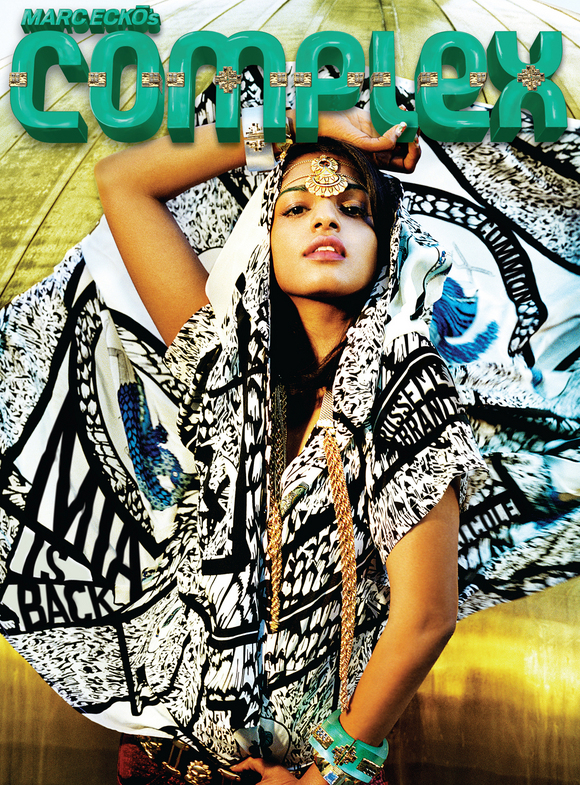
At Complex, the demographic is incredibly graphically aware -- more so than a lot of other audiences. So the mindset behind each cover has been to pick the coolest image possible. That approach has mostly worked for us this past year, but this issue in doing so we picked two great images... that had no room for coverlines. Or rather, we didn't have room for coverlines without destroying the visual integrity of the images. So...
...after a lot of failed attempts to try and make the conventional coverline approach work we finally asked ourselves: What if we didn't have coverlines on either cover? At least, not in the standard sense. Our Editor-In-Chief, Noah Callahan-Bever, backed our play so long as we went all out. We were happy to accept the challenge. For the MIA cover (above), shot by Alex Prager, we stripped down the coverlines to the bare essentials and manipulated the text so it looked like it was part of her crazy fabric. We also worked with retouching house Statik|Digital to help build the logo based on her jewelry. We've taken a lot of liberties with the logo recently, but it's all been to try and create coherent packages with the covers -- so the logo, coverlines, and image all work together as a seamless unit. All in all, the Complex team put in about 35 man (and woman) hours into tweaking and redoing (and then redoing) different bits in Photoshop and I couldn't be more proud of them.
 (ABOVE: the opening spread for the M.I.A. feature)
For the Russell Brand cover shot by F. Scott Schafer (below, along with opener) we had even less room to play with. We played with a bunch of ways to do the coverlines and came down to two approaches -- 1) designing it like a CD cover and 2) trying to make it like a poster and design the coverline like an autograph. So we called Russell and had him actually come up with the dedication and then write it in his handwriting. It was a pretty big risk for us because it eliminated any other sells we'd want to do, and was also a real gamble in terms of legibility. We also put it in a metallic pantone which is pretty much a crapshoot. Totally worth the risk in the end though. In terms of the logo, we had designer Brent Rollins give the Complex logo a Metallica-inspired treatment (for Russell's movie, "Get Him To The Greek," he plays a rock star). I was skeptical at first but Brent really came through and delivered that was close enough to the original logo but enough of a departure.


The creative team at Complex includes:
Design Director: Tim Leong
Assistant Art Director: Jason Sfetko
Designer: Anthony Clarke
Photo Editor: Greg Garry
Assistant Photo Editor: Krystal N. Atwater
Hey! You've probably got some NEW WORK to share, and we want to see it! We'll welcome anything that's gone to the printer recently, something you're especially proud of and think might be inspiring to the membership and readers of Grids. We'll note the credits and the publication and shine a little light on the latest and greatest in publication design.
Please reduce your layouts to no larger than 1200 pixels wide and don't forget to include all relevant credits and a little background (if you feel like). Send your submissions to tips@spd.org and we'll post them as we get them.
PREVIOUSLY IN NEW WORK:
SPIN Turns 25, Zips Up, Counts Down
Psychology Today Gets Serendipitous
Runner's World Takes on Bigfoot
American Cowboy Redesigns
SKI Magazine's Best of the Season
UCLA Goes Plush
Real Simple's 10th Anniversary Covers
