Behind-the-Scenes
02.16.12
Men's Journal Gets a New Logo
 We recently caught up with Men's Journal's new CD, Benjamen Purvis, to ask about what went into the making of the magazine's new logo--a collaboration with legendary typographer Jim Parkinson. Here's what Ben had to say ...
(after the jump)
I left Seattle for New York City in March of 2011 to join Men's Journal as its new creative director. I was hired by Rolling Stone veteran Jason Fine, who had just been named by Jann Wenner as the magazine's new editor. Most of Men's Journal's art and edit staff joined the magazine in the last year, including photo director Catriona Ni Aolain (who came from ESPN) and deputy editor Mark Healy (who came from GQ).
MJ's logo has been tweaked many times in the past 20 years, but it never strayed from an upper and lower case serif format. In October of 2011, we decided to again change the logo, to better express the spirit of the magazine today. But I didn't want us to design in a vacuum, so I rounded up the logos of all the magazines that typically show up next to ours on newsstands. I presented Men's Journal's upper and lower case logo next to the upper and lower case logos of Men's Health and Men's Fitness to persuade my bosses to completely overhaul the logo and go with an all upper case sans-serif look.Back when I was being interviewed for this job, I told Jason that I thought MJ's design should evoke the sprit of European auto race posters from the 1930s and '40s. The ones I had in mind are disciplined yet bold, clean but masculine, and they have a timeless cool to them. I began assembling a collection of jpegs of these posters after I got the job, and I turned to these images for inspiration for the look of the new logo. I knew we'd have to go with condensed characters in order to keep the logo roughly the same height on the cover, and I liked the idea of sturdy, monoline shapes. So I edited the collection down to four different posters that employed that kind of typography, and sent them off to legendary designer Jim Parkinson to begin the redesign process.
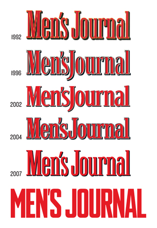
Jim and I went back and forth on the look of each character, and Rolling Stone design director Joe Hutchinson weighed in on each draft with an impartial eye. An early draft was perceived as too masculine by some of my coworkers -- one of whom remarked that the logo was looking "very Cold War." I surmised that the blocky lettering felt militant and imposing, so I asked Jim to change the shape of the S, the R and the A, and to slightly round some of the corners throughout. In the end we got something that looks masculine and authoritative and modern, and it wouldn't feel at all out of place on one of the 80-year-old posters we referenced.
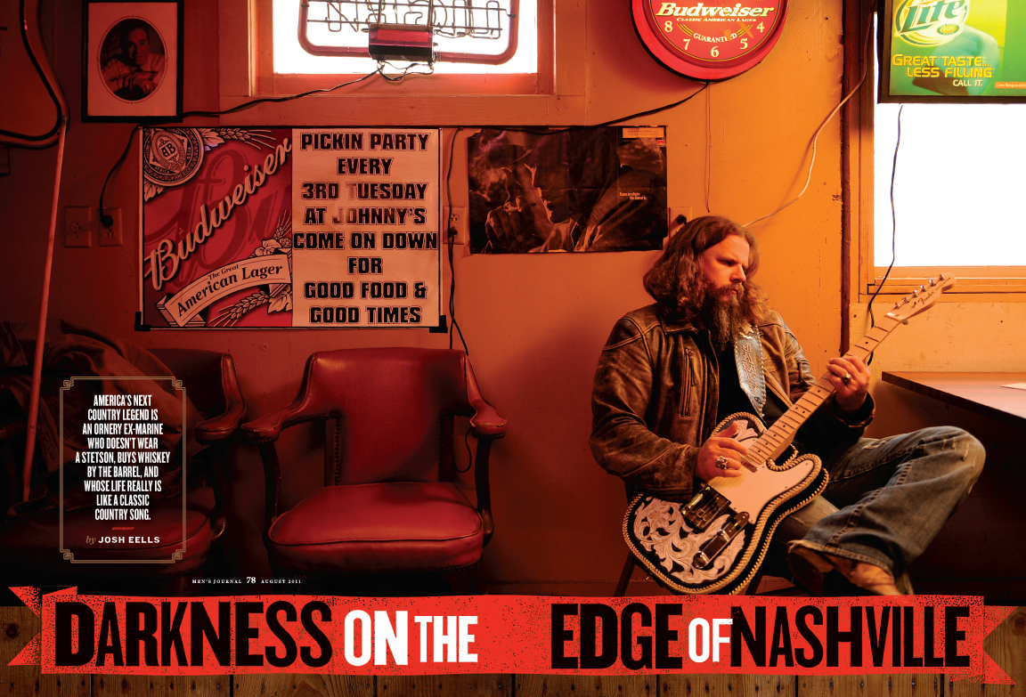
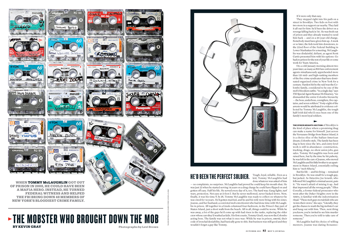
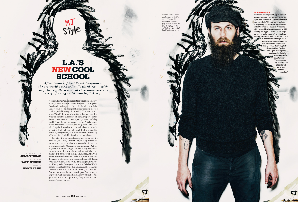
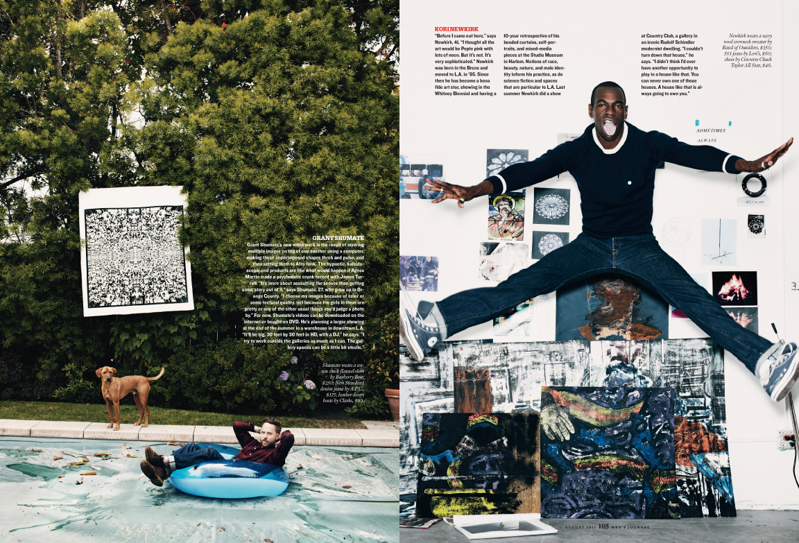
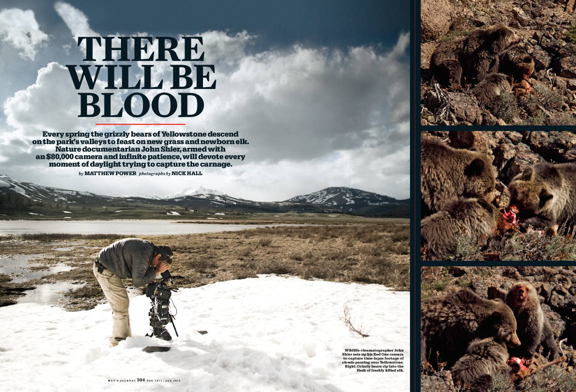
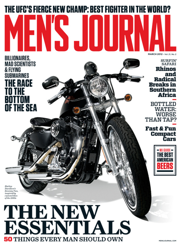
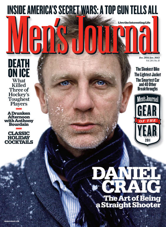
Here's a look at some of the work that Benjamen and his team have been churning out at Men's Journal: