August 2008 Archives

The Blender Redesign: It's all about the

The Blender Redesign: It's all about the "E."

Before he became creative director of Blender late last year, Dirk Barnett held the enviable position of art directing both Play, the New York Times Sports Magazine, and Key, the New York Times Real Estate Magazine. He had landed at the Times after completing a highly-lauded redesign of Premiere, where he was art director from 2004-2006. Before that, as design director of Popular Science, he won a General Excellence award from the American Society of Magazine Editors.

Dirk's industry acknowledgements include recognition from the Type Directors Club, the Society of Publication Designers, the British Design and Art Direction Awards, the New York Art Directors Club, Communication Arts and Print. His work is included in the permanent collection of the American Institute of Graphic Arts. 

We were thrilled to have the talented Mr. Barnett sit down with us this week and discuss his  magazine, the challenges surrounding change, and his partnership with newly-minted Blender editor Joe Levy. 
MORE
Fifty Pence

Fifty Pence

I came across this newly minted Fifty Pence coin while cycling through Wales and was excited by the interest in the origins of words. The coin is roughly the size of the US Quarter, but unlike our relatively new State Quarters which use imagery to describe each state, I appreciated the attention paid to the written, typed word with this quote from Johnson's Dictionary 1755. On this small coin the designer managed to fit the word's pronunciation, origin and part of speech. Pretty nifty, fifty. As pictures are increasingly the international language, it is refreshing to find a dictionary quote on this UK coin. And hey, who can name this typeface?
Avedon & BRIDES

Avedon & BRIDES

In preparation for BRIDES' big birthday in January (a girl never tells her age!), my photo team and I have been muddling through decades of archived issues, starting in the 1930's. So, in the next few weeks, for your viewing pleasure, I will be posting a blog about BRIDES covers through the decades, some are just ASTOUNDING, others--umm, less so. (thank you, 1970's).

MORE
Bookmark SPD.org on your iPhone

Bookmark SPD.org on your iPhone

It's time to bookmark SPD.org on your iPhone and iPod Touch! We've now got more than thirty magazine professionals signed on to blog for the Society, so you'll want to check back to SPD.org several times a day for the latest in magazine publishing news. To that end, we've designed this site (and this blog, Grids) to display nicely on your iPhone/Touch, so go ahead and press the "+" sign while you're on this site on your phone and you'll immediately see the brand-new SPD logo adorning your home screen. 

All the kids are doing it. 
Remixing Blender

Remixing Blender


If your August has been anything like our August, chances are pretty good you've been drooling over Blender's fabulous redesign, debuting in the Lil' Wayne issue, now on newsstands. (Not coincidentally, you're looking at a sneak-peek at next month's Pussycat Dolls extravaganza.) Dirk Barnett, CD extraordinaire and Vice President of SPD, recently sat down with us for an in-depth look at the how and the why of this music-mag "evolution." Stay tuned for an exclusive, behind-the-scenes look at his new magazine. 
In Search of the Perfect Notebook

In Search of the Perfect Notebook

As designers, we're extra-fussy about the little things that others just don't take the time to savor. I spend way too much time pecking away at endless e-mails, so when I do get to put pen to paper, I've become surprisingly particular about exactly what paper that is. I thought I'd found the perfect notebook in the Oh Boy line, with its heavy, lovely-patterned bookboard covers and thick, lined pages, but felt guilty about spending $10 every time around (I mean, it's a notebook). I figured since I don't spend that much time writing on real live paper anymore, I deserved something special.

MORE
Alternative Newsweekly Design

Alternative Newsweekly Design

I recently gave a presentation to the annual convention of the Association of Alternative Newsweeklies. There's some great design being done at those papers, ranging from super slick to down and dirty, almost all of it being done fast and cheap.

One of the best alt weekly designs is the Las Vegas Weekly. Their art director, Benjamen Purvis, uses a lot of design and typographic tricks to create a visual version of the noise, color and neon of Las Vegas, with plenty of 3D type and bold photos and graphics. It's wonderful stuff, super-sophisticated, in the design world of Esquire or Los Angeles, as good or better than what many national magazines with much bigger budgets are doing.


MORE
Dylan Went Electric and Ed Fella Has a Website

Dylan Went Electric and Ed Fella Has a Website

Probably one of my favorite typographers and artists is a gent by the name of Ed Fella. If you aren't familiar, you're in for a treat. If you are very familiar...you're STILL in for a treat.

MORE
The Drawing Board

The Drawing Board

Folks, as you may have already heard, I've finally found my partner in crime (Judith Pucket-Rinella - Senior Photo Editor, T) to co-host this year's 44th annual competition with yours truly. So it's about that time on our SPD calendar where we'll be joining forces to brainstorm the genius idea/root/theme that will package the quick approaching 44's festivities.

Despite the agony of having to top Scott Dadich and Dirk Barnett's amazing, (and I mean AMAZING) leadership and teamwork during this past Pub 43 as well as the great competitions in the past, our  wheels are turnin', and our feeling's burnin'.

Stay tuned for some sneak peek updates...
Church? State? L.A. Times Mag Launch Plays With the Paradigm

Church? State? L.A. Times Mag Launch Plays With the Paradigm

On September 7th, the Los Angeles Times re-launches its magazine, to be titled LA (with clear, though unspoken, deference to the success of the New York Times' T). So why has the staff been hired by the ad side, not the newsroom? [UPDATED]… MORE
Kent

Kent "Dr. Evil" Brownridge Is Kicked Upstairs at Alpha Media

After only a year as CEO of Alpha MediaGroup, which publishes Blender and Maxim, Kent Brownridge, former CEO of Wenner Media from 1975-2006, has given up the title for the role of chairman. And from what we hear, it was not voluntary. Due to massive micro-managing, sinister sneers and numbers that have yet to dazzle owners Quadrangle Capital Partners, he was asked to step down from his everyday duties. Click here for more details.
Art Directors vs. Illustrators: A Throwdown

Art Directors vs. Illustrators: A Throwdown

A throwdown in a nice way. It was a tradition way back to drag the solitary artists out of their studio to meet the people who are usually stuck emailing them from cubicles. If you are here in NYC Thursday evening (TOMORROW NIGHT!) please come have a beverage with magazine folk, drawing folk and all kinds of folks. It's too far to the AI-AP party to wait to mingle.
MORE
Prepare Thine Mailboxes

Prepare Thine Mailboxes

All of you who've recently reupped your Interview subscriptions (like we have), prepare for the coming onslaught of greatness from the inimitable Mr. Fabien Baron. Folio has the scoop on the redesign--no, what we've been drooling over these past two months wasn't it--debuting next week. Unlike some magazines, this one will be getting bigger, up to 13" tall from the measly 12" height it sported before.
PENCIL PAPER:  My Talk with Brian Cronin

PENCIL PAPER:
My Talk with Brian Cronin


BC_0080_lrz_web[7]_1.jpg"Brian Cronin: 25 Years and Change"
Retrospective 1983--2008
Casa da Cerca, Center for Contemporary Art
Lisbon, Portugal
(On view through August 30, 2008)


fred4.jpg"Going Over Home: Photographs by Fred Woodward"
401 Projects
401 West Street (at Charles Street), NYC
(On view through August 24, 2008)


* * * * *
Brian Cronin came up to my office at 4 Times Square late last February--dapper as always--asking if we could do a little interview to be used in the catalog that would accompany an upcoming retrospective in Lisbon of his illustration career.

I borrowed a recorder and a couple of cassettes, and we talked until I ran out of tape.

He was in the very early stages of working toward a fine-art show (also to be shown in Lisbon this October). We talked about the source of his creativity, his early and present influences (Glaser and Bergman), art versus commerce, growing up in a Dublin bed & breakfast, starting over at age 50, racing the clock, and that elusive thing called joy.
MORE
Optima vs. Gotham: Campaign Typeface Smackdown '08

Optima vs. Gotham: Campaign Typeface Smackdown '08

There has been much interweb chatter (some of it here! -- Ed.) of not only Hoefler & Frere-Jones's Gotham as the official font of the Obama campaign, but also of a graphic discipline and consistency throughout this election season that companies like Apple and Nike would be proud of. It also didn't hurt to have Shepard Fairey's Obama poster turn into the must-have wall art of the politically aware.
MORE
Great News! From Texas!

Great News! From Texas!

Today, we found some great news on the interwebs! There's a new magazine launching in Texas! And it's all about good news! Not any of that "if it's negative, it's news" nonsense from those cynical downers at Texas Monthly!MORE
Road Trip!

Road Trip!

I was tolerated (barely, I think, but with love!) on a recent road trip through Utah, when I insisted on backtracking to get this photo of the Thunderbird sign. What better combo of old-school roadside neon AND an opportunity to gawk at a truly unfortunate, permanent grammar mistake?
HO-MADE PIES ?!
I love it.
MORE

Library Love

While researching typography for "a major motion picture," SpotCo art director Darren Cox unearthed a treasure trove of design goodness at the NY Public Library's Digital Archive. In this age of Google Images and big stock agencies, we often forget that the Library's one of the best (and cheapest) places to go--if you're willing to do a little leg work. Take a look at some of the great book covers Darren found--and we'll let you know if our poster sees the light of day....


MORE
Tribute to Barbara Fierros

Tribute to Barbara Fierros

With great sadness we honor prop stylist Barbara Fierros who passed away on August 1st after losing her near 2-year battle with cancer. Many in the magazine and advertising communities are grieving the loss as so many of us were honored recipients of her great talent and beautiful spirit. … MORE
Even Dogs Get Bored in Walk-through Meetings

Even Dogs Get Bored in Walk-through Meetings

A little levity for your Monday afternoon. At WIRED, we're allowed to bring our dogs to the office.  … MORE
All Graphics, All The Times©

All Graphics, All The Times©

Check out the torch decoder the NY Times cranked out, (do any of them sleep over there?)
MORE

"Did you try... "

"Maybe you should..."
"{Insert Editor's Name} would like to see..."
"Photo really wants..."


Depending on where you sit in the Art Department, you've either uttered these words, or had them unloaded on you. You probably DID try...or, at least, you THOUGHT about it. But your co-workers want hard proof; I know I certainly do!

And, why is it that, sometimes, the answer is not so clear?

MORE
Dwell Redesign Interview with Kyle Blue

Dwell Redesign Interview with Kyle Blue

This week Chad Kloepfer from the Walker Art Center published an interview with Dwell Design Director Kyle Blue on their design blog. Chad talks with Kyle about the guiding principles, rejected covers, font choices and more that went into the current magazine.

A good Friday afternoon read.
Double Take

Double Take

In a post-Photoshop world, wondering if a picture is real is second nature.  In judging American Photo's emerging artists competition there were two photographers using digital manipulation to create the final image.  Kelli Connell makes naturalistic reenactments of one couple's intimate relationship, while Edith Maybin creates somewhat creepy images of herself and her daughter. 
MORE
New Favorite Magazine: FOAM

New Favorite Magazine: FOAM

I'm afraid I'm a little late to the party on this one but Foam: International Photography Magazine based out of Amsterdam is simply amazing.  I was lucky enough to come across it at the NY Photo Fesitval in Dumbo--directed to it by my pal Ryan Mesina in the Real Simple Photo Department.  We were both instant fans.  Each specially themed issue feels like you've stumbled into a little photo gallery on a city street that is filled with gems the likes of which you haven't seen before.  … MORE
Pub 44 Co-Chairs Announced

Pub 44 Co-Chairs Announced

It's with a tremendous amount of pride and excitement that we announce that our very own member of the Board of Directors (and art director of W), Nathalie Kirsheh, will be joined by Judith Puckett Rinella, senior Photo Editor of T, The New York Times Style Magazine, as the 2008-2009 co-chairs of Pub 44.… MORE

"The Stranger" Cover Archive

One of my favorite online publication site trends is the creation of cover and issue archives. So I was very happy to find that the complete collection of Entertainment Weekly covers is now available on their website as part of a complete issue archive. There are over 1,000 covers, art directed by Michael Grossman, John Korpics, Geraldine Hessler, current DD Brian Anstey, and even a couple years art directed by myself. This is very cool stuff, some amazing photography, and it's fun to see how the EW cover has evolved over the years. It's also a wonderful snapshot of popular culture since 1991.
Even better, The Stranger, the alternative weekly based in Seattle, has posted the last 10 years of their covers. The Stranger covers are like the cool punk version of The New Yorker, with illustrations, photographs and graphic design that are stand-alone visual statements, with lots of attitude and passion. Like The New Yorker, The Stranger covers are the visual voice of the publication, a dialogue each week between the paper and its readers.
MORE

"Rolling Stone" to Shrink

Sad news for magazine lovers here and here.
MORE
Destination: DestinAsian

Destination: DestinAsian

I was first introduced to DestinAsian magazine about four years ago, when I was with a  photographer friend in Bali, and we had dinner with the editor-in-chief, Christopher Hill. Based in Jakarta, the Asian luxury travel and lifestyle magazine is quite hard to find in the States unless you go to a really on-top-of-it international magazine store, but it is all the rage in big cities across Asia, and well-represented in the SPD design annual.
MORE
Black Power!

Black Power!

My Saturday evening typically consists of the following: A late workout, maybe a swing by the Whole Foods, an errand or two, and then a quick jaunt by my corner deli for a hot-off-the-press copy of Sunday's New York Times. (Must. See. New. Magazine.) Yes, I need a life, but hey, Rem Duplessis and his gang always manage to inspire and impress; this past weekend was no different.
MORE
The Peter Tunney Experiment

The Peter Tunney Experiment

"DON'T PANIC"

"EVOLVE"

"THE REAL VOYAGE OF DISCOVERY CONSISTS NOT IN SEEING NEW LANDSCAPES BUT IN HAVING NEW EYES"

These are the words and phrases that hit me as I walked down 52nd street. Not because I was deep in thought trying to figure out the solution to all my problems. But because they were there. Large and bold. Painted and silkscreened and collaged together. All inside a storefront, along with a sign that read "Who is Peter Tunney?".
MORE
Designer's Block

Designer's Block

We know visual stimulant is all around us but, when I have designer's block I sometimes need immediate optical motivation for concepts/type treatment. When there's no time to run out to the book store or my fav eccentric magazine stand, I turn to the wondrous world wide web.
So when I'm often asked "where do you get your quick inspiration from online?," one particular design studio's site that comes to mind is www.fwis.com. Not only is their gallery chock full of motivational imagery, but they also feature a blog called "Covers."

Book cover art is featured and updated several times a week and open for commenting. I like to think of it as a virtual wall meeting where random viewers can critique the art director's motive. Check it out, and let me know about your own favorite "quick fix."

Design Inspires Change

Design Inspires Change

It's not every day we get to brag about one of our dear friend's spectacular pieces of typography that's not only beautiful and innovative, but world-aware, but today is indeed one of those happy occasions. Marian Banjtes has just completed a stunning laser-cut poster for sale, with the proceeds benefiting the Academy for Educational Development's Speak for the Child project, which provides assistance to children orphaned by HIV/AIDS in Kenya. Go buy yourself a couple here. But hurry, there are only 100 available.  … MORE
Have you seen Monocle?

Have you seen Monocle?

Produced out of the UK by Tyler Brule of Wallpaper* fame, Monocle is a magazine aimed at the world traveler. Covering global affairs, business, culture and of course design it was recently mention to be one of the 30 most notable launches of the year. It has garnered attention for its use of matte paper and smaller trim size inside a luxury magazine.
MORE
Roadside Type: Name that Font at 60mph

Roadside Type: Name that Font at 60mph

If you are on the Montauk Highway in Amagansett this summer, there are two reasons to pull over at Lunch and grab a quick bite.… MORE
Charts Don't Have to Suck

Charts Don't Have to Suck

As anyone I work with will testify, I hate me some charts. To me, they're a tool of the lazy editor, a way to excise a particularly verbose or complicated section from the third section of some bloated profile of yet another middle-aged white guy. "Just make a chart; it's the art department's problem." But seriously, charts suck, right? Not necessarily! Check out this badass box office tracker on xach.com. It's truly a gem. Almost as good as the Jedi Name Generator.

How Logo Can You Go? (A ChiTrib quiz for mag nerds)

How Logo Can You Go? (A ChiTrib quiz for mag nerds)

As a sidebar to their annual "Our Fifty Favorite Magazines" feature, the Chicago Tribune has compiled a little test for all you (um...we) type-weenies with a competitive streak. Careful, there's one trick question. (Otherwise I'd have gotten them all. Grrrr.)
Be Careful What You Wish For

Be Careful What You Wish For

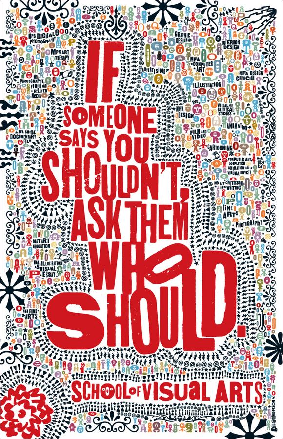
Michael Walsh, the art director of the Visual Arts Press, asked me to do the next SVA subway poster this past January. I was completely blown away, and of course, said I'd be honored. The next day, the lovely Ric Grefe from AIGA called to tell me I was getting the 2008 Lifetime Achievement Medal. I assumed that before the end of that glorious week, I'd get clocked by a car on my bike ride home and would linger in a coma that would last beyond both the poster deadline and the big AIGA gala in September. Surprisingly, I've been spared (though I'm still waiting for an anvil to fall on my head). … MORE

« July 2008 | Archives | September 2008 »