New Work
10.15.10
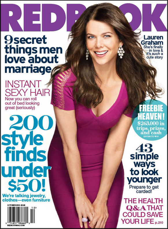
A Look at the Redbook Redesign
 In March, Holland Utley became the new Creative Director for Redbook, with a mandate to redesign the over 100 year-old women's magazine. She shares her thoughts on the process here, and a look at some of the new pages after the jump:
I approached the redesign by thinking about our next generation of readers: young moms who would appreciate a modern look. I focused on mixing arresting typography with rich, exciting imagery, and the results give this venerable 107-year-old magazine a fresh spin. The design is clean but dynamic, and information is presented in a way that is both easy to follow and feels incredibly current.
Hey! You've probably got some NEW WORK to share, and we want to see it! We'll welcome anything that's gone to the printer recently, something you're especially proud of and think might be inspiring to the membership and readers of Grids. We'll note the credits and the publication and shine a little light on the latest and greatest in publication design.
Please reduce your layouts to no larger than 1200 pixels wide and don't forget to include all relevant credits and a little background (if you feel like). Send your submissions to tips@spd.org and we'll post them as we get them.
PREVIOUSLY IN NEW WORK:
UCLA's Tribute to Coach Wooden
Behind the Scenes: Fortune Goes to the iPad
Twin Cities Metro: Choose Your Own Adventure This Summer
The ABCs of XYZ
Complex with No Coverlines (Sort of)
SPIN Turns 25, Zips Up, Counts Down
Psychology Today Gets Serendipitous
Runner's World Takes on Bigfoot
American Cowboy Redesigns
