12.01.11
Katachi Magazine: An Engaging iPad Publication Launches
 From an Austin, TX BBQ to Norway, a small creative team launches an incredibly interactive magazine app for the iPad, along with a brand new publishing platform. Here, Katachi magazine Managing Editor Max Alexander Berg shares the story behind their debut issue:
Katachi was born out of Texan BBQ. When the iPad launched in 2010 Ken Olling and Axel Haugan, founders of the company, were at SXSW, when the iPad was hailed as the saviour of all things publishing. It soon became clear that big publishers were looking to republish print content on the iPad, and that thinking was and still is completely wrong to us. Unhindered by any print skeletons we set out to create a truly interactive magazine but soon learned that the tools available just didn't cut it. So what started out as creating an interactive iPad-magazine grew into creating a state of the art publishing tool. We've made everything ourselves; the app, the design tool, the typeface, the content, the design.
We bring a lot of inspiration, respect and experience from print and web into publishing for the iPad. And as much as we love the two you simply can't translate either one to the tablet and expect it to work. One of the great things about creating our own tools is that it allows us to dream up completely new ways of doing editorials. We often discuss new stories and end up saying 'can we do that?'. Sometimes we can, sometimes we can't. But our developers implements features on the fly, allowing us to constantly push our ideas forward. The launch issue is content-heavy and explores loads of various ways of doing publishing on the iPad. Some, of course, works better than others. All our focus in the following issues is on creating engaging, iPad-specific content.
Katachi is a quarterly magazine about design, people and business, presented intelligently as inspiration for the curious. We're approaching publishing from a content-specific point of view, where content forms design, not the other way around. We tailor the design of each story to reflect and further the content. Each issue is structured around six sections but will differ quite a lot from the previous ones, as we're just getting going on exploring the possibilities of the iPad. In the beginning we didn't even know if we could call it a magazine. There was just so much media going on that we couldn't be sure what it was. So for now it's best to buckle up and enjoy the ride without knowing exactly where it leads.
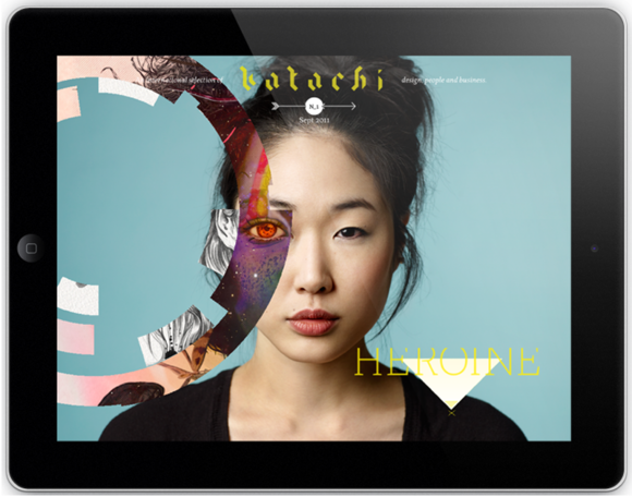
The cover (above). All magazines starts here. When you see our cover you've already purchased the magazine so it's not reason for it to bang you over the head with information and reasons to buy. We wanted to strip it down, drawing inspiration from old Colors covers. Each time you touch the screen various illustrations bursts out in a circle before fading off the edges of the screen. The thought was to touch through to the theme 'Heroine', and show how different people have different sides and different layers within them. And of course do things you can't do in print; have random cover images and feature interactive works from fantastic illustrators.
Herz bag (below). Sliding your finger from left to right unveils the front and back of the bag. An easy way to show products, but also a feature that can be used to great effect in other editorials. The text is written to be read as one sentence altogether, or be read as two separate sentences when you're browsing either side. Yes, we paid for our writer's painkillers.

The page flip (below). Print is beautiful. The tactile experience and the feeling you get from flipping through a well-composed photo story is great. On the iPad the page flip tries to emulate that experience, but it just does not work. The iPad is not print. We wanted to translate that feeling onto the iPad, not the page flip itself. So we thought about what we like about print, and one of things is this subtle expectation you get from flipping through it. For our photo galleries we make the picture come forth from underneath. The motion is the same as when you normally scroll and it won't be in the way if you do it quickly. However, if you spend time with it you'll hopefully get that subtle, emotional feeling you get from print.

Parallaxing (below). The photo is made up of numerous layers. By tilting the iPad from side to side different layers reveal themselves to the reader, creating a 3D-like effect. Playing with layers gives this fashion shoot that little touch it needs to be elevated from print material. Working with contributors has at time been difficult as many of the methods we use haven't really been used before. We'll see more of this technology in future issues as it has great storytelling potential.

Cargo Cult (below). The idea was to show all the products we feature, and to do it in a highly interactive way. When you swipe upwards you travel forward, the overlay text disappears and you move through the five featured products. If you swipe down you travel back to the opening screen.
In this feature we wanted to play with how to handle video. Usually people think of video as horizontal, we swipe left and right to move through time. The same can be done by swiping up and down. In Cargo Cult, what you're doing is swiping back and forth in a video. We hired the heaviest dolly in town, mounted a boom to it and attached a DSLR at the end. After hours of tripping silently back and forth we got the shot we wanted and it turned out quite nice in the end. If we didn't plan it in the beginning exactly as we wanted it to work it could never have been presented on the iPad like it's done. When you're creating content specific for the iPad the idea is as important as the execution.

The sidebar (below). Digging up information about contributors to a print magazine can be a hassle. We wanted to give our contributors as much love as possible. We've done away with all credits on-page, instead putting all information regarding each page into the sidebar. All information like website, e-mail, and portfolio about contributors to that particular story is accessible inside the magazine. Find something you like? Contact them instantly.

Dynamic vs static content. The launch issue of Katachi will be as easily accessible when we (hopefully) launch our 100th issue as it is today. It'll always be available for new and old readers through the bookshelf. A lot of our content is static in the way that it won't change after the issue has been published, something more in line with print magazines. At the same time we're publishing on a dynamic platform connected to the Internet and have to give readers ways to interact with each other and with the magazine. The story "Visage" (below) argues that all women at some point or another will be a heroine to someone, encouraging them to upload a picture of themselves through the app (or our webpage if you're on an iPad 1). Once a picture is uploaded it's pushed to all other readers.

Behind the Scenes: Fortune Goes to the iPad
Twin Cities Metro: Choose Your Own Adventure This Summer
The ABCs of XYZ
Complex with No Coverlines (Sort of)
SPIN Turns 25, Zips Up, Counts Down
Psychology Today Gets Serendipitous
Runner's World Takes on Bigfoot
American Cowboy Redesigns
